FabCon is coming to Atlanta
Join us at FabCon Atlanta from March 16 - 20, 2026, for the ultimate Fabric, Power BI, AI and SQL community-led event. Save $200 with code FABCOMM.
Register now!- Power BI forums
- Get Help with Power BI
- Desktop
- Service
- Report Server
- Power Query
- Mobile Apps
- Developer
- DAX Commands and Tips
- Custom Visuals Development Discussion
- Health and Life Sciences
- Power BI Spanish forums
- Translated Spanish Desktop
- Training and Consulting
- Instructor Led Training
- Dashboard in a Day for Women, by Women
- Galleries
- Data Stories Gallery
- Themes Gallery
- Contests Gallery
- QuickViz Gallery
- Quick Measures Gallery
- Visual Calculations Gallery
- Notebook Gallery
- Translytical Task Flow Gallery
- TMDL Gallery
- R Script Showcase
- Webinars and Video Gallery
- Ideas
- Custom Visuals Ideas (read-only)
- Issues
- Issues
- Events
- Upcoming Events
The Power BI Data Visualization World Championships is back! Get ahead of the game and start preparing now! Learn more
- Power BI forums
- Forums
- Get Help with Power BI
- Desktop
- Convert list to table for graph
- Subscribe to RSS Feed
- Mark Topic as New
- Mark Topic as Read
- Float this Topic for Current User
- Bookmark
- Subscribe
- Printer Friendly Page
- Mark as New
- Bookmark
- Subscribe
- Mute
- Subscribe to RSS Feed
- Permalink
- Report Inappropriate Content
Convert list to table for graph
Hi there,
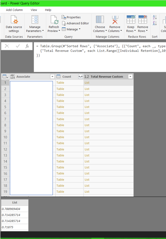
I currently have a custom column that groups each associates' total revenue sorted by date. For instance, in the "Total Revenue Custom" column, this has multiple lists for each associate showing their total revenue ordered by the date in which they started. For the purpose of explanation, you can see in the screenshot Month 1 Total Revenue is 0.788; Month 2 Total Revenue is 0.714 etc for that particular associate.
What I wanted to do is to visualise this data. This means that I want all associates' Month 1's total revenue, all associates' Month 2's total revenue data on a line chart. As people started in different months, I felt this was the only way to standardize everyone's data to ensure it is Month 1, Month 2 (any other ways to achieve this would also help!).
However, as I have lists in each cell, I have no idea how I can convert this to a column that has Month 1 which then shows the first row of the list for each associate, then I can do this for Month 2 (with the second row from each associates' lists) etc.
Any help in getting to my solution would be much appreciated 🙂
Solved! Go to Solution.
- Mark as New
- Bookmark
- Subscribe
- Mute
- Subscribe to RSS Feed
- Permalink
- Report Inappropriate Content
@ajd33 ,
It seems that you may change type number to list in the code.
If this post helps, then please consider Accept it as the solution to help the other members find it more quickly.
- Mark as New
- Bookmark
- Subscribe
- Mute
- Subscribe to RSS Feed
- Permalink
- Report Inappropriate Content
@ajd33 ,
It seems that you may change type number to list in the code.
If this post helps, then please consider Accept it as the solution to help the other members find it more quickly.
Helpful resources

Power BI Dataviz World Championships
The Power BI Data Visualization World Championships is back! Get ahead of the game and start preparing now!

| User | Count |
|---|---|
| 38 | |
| 36 | |
| 33 | |
| 33 | |
| 29 |
| User | Count |
|---|---|
| 132 | |
| 86 | |
| 85 | |
| 68 | |
| 64 |


