Get Fabric certified for FREE!
Don't miss your chance to take the Fabric Data Engineer (DP-600) exam for FREE! Find out how by attending the DP-600 session on April 23rd (pacific time), live or on-demand.
Learn more- Power BI forums
- Get Help with Power BI
- Desktop
- Service
- Report Server
- Power Query
- Mobile Apps
- Developer
- DAX Commands and Tips
- Custom Visuals Development Discussion
- Health and Life Sciences
- Power BI Spanish forums
- Translated Spanish Desktop
- Training and Consulting
- Instructor Led Training
- Dashboard in a Day for Women, by Women
- Galleries
- Data Stories Gallery
- Themes Gallery
- Contests Gallery
- QuickViz Gallery
- Quick Measures Gallery
- Visual Calculations Gallery
- Notebook Gallery
- Translytical Task Flow Gallery
- TMDL Gallery
- R Script Showcase
- Webinars and Video Gallery
- Ideas
- Custom Visuals Ideas (read-only)
- Issues
- Issues
- Events
- Upcoming Events
Next up in the FabCon + SQLCon recap series: The roadmap for Microsoft SQL and Maximizing Developer experiences in Fabric. All sessions are available on-demand after the live show. Register now
- Power BI forums
- Forums
- Get Help with Power BI
- Desktop
- Re: Conditionally Format Column Chart
- Subscribe to RSS Feed
- Mark Topic as New
- Mark Topic as Read
- Float this Topic for Current User
- Bookmark
- Subscribe
- Printer Friendly Page
- Mark as New
- Bookmark
- Subscribe
- Mute
- Subscribe to RSS Feed
- Permalink
- Report Inappropriate Content
Conditionally Format Column Chart
Hi,
I am currently working with an unstructured dataset that looks like this.
It basically shows the year, the different subjects (A,B,C) and the number of students obtaining the marks 50-60 at school and state level. The data is to be read in rows.
Eg Subject A, 1 student got a mark of 52 at school level where as 123 students got the same mark at state level.
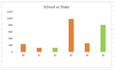
I want to create a custom column chart where it has the marks (50-60) on the x-axis. The number of students on the y-axis. The column chart is to display data of students at state level however, where there are students obtaining the same marks at school level it must show that "bar" as a different colour. See Image below for desired results for subject A visual
As I hover over the score 52 and 55, I can see there were 1 and 4 students who recieved the same mark. Obviously, will need slicers namely in subjects and year.
I'm able to do this in excel, but can't seem to figure it out on Power Query/Power BI.
Any help/direction is greatly appreciated.
Solved! Go to Solution.
- Mark as New
- Bookmark
- Subscribe
- Mute
- Subscribe to RSS Feed
- Permalink
- Report Inappropriate Content
Hi,
You may download my PBI file from here.
Hope this helps.
Regards,
Ashish Mathur
http://www.ashishmathur.com
https://www.linkedin.com/in/excelenthusiasts/
- Mark as New
- Bookmark
- Subscribe
- Mute
- Subscribe to RSS Feed
- Permalink
- Report Inappropriate Content
Hi,
Share data in a format that can be pasted in an MS Excel file.
Regards,
Ashish Mathur
http://www.ashishmathur.com
https://www.linkedin.com/in/excelenthusiasts/
- Mark as New
- Bookmark
- Subscribe
- Mute
- Subscribe to RSS Feed
- Permalink
- Report Inappropriate Content
Hi Ashish,
Here you go.
| 2022 | Subject A | 50 | 51 | 52 | 53 | 54 | 55 | 56 | 57 | 58 | 59 | 60 |
| 2022 | School | 1 | 4 | 5 | 8 | |||||||
| 2022 | State | 235 | 116 | 123 | 979 | 257 | 807 | 651 | 224 | 932 | 330 | 797 |
| 2022 | Subject B | 50 | 51 | 52 | 53 | 54 | 55 | 56 | 57 | 58 | 59 | 60 |
| 2022 | School | 10 | 3 | 6 | 4 | 1 | ||||||
| 2022 | State | 928 | 918 | 362 | 191 | 59 | 642 | 794 | 249 | 164 | 646 | 201 |
| 2022 | Subject C | 50 | 51 | 52 | 53 | 54 | 55 | 56 | 57 | 58 | 59 | 60 |
| 2022 | School | 13 | 5 | 6 | 8 | 9 | ||||||
| 2022 | State | 113 | 822 | 72 | 787 | 378 | 917 | 880 | 494 | 303 | 134 | 259 |
- Mark as New
- Bookmark
- Subscribe
- Mute
- Subscribe to RSS Feed
- Permalink
- Report Inappropriate Content
Hi,
You may download my PBI file from here.
Hope this helps.
Regards,
Ashish Mathur
http://www.ashishmathur.com
https://www.linkedin.com/in/excelenthusiasts/
- Mark as New
- Bookmark
- Subscribe
- Mute
- Subscribe to RSS Feed
- Permalink
- Report Inappropriate Content
Hi,
Thank you for your response.
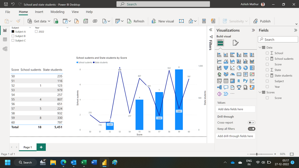
This is a column and line graph, i need the visual to be a column graph only. Where there is an overlap with schools and state, the "column" will be displayed a different colour. I've attached an image in my post for reference.
- Mark as New
- Bookmark
- Subscribe
- Mute
- Subscribe to RSS Feed
- Permalink
- Report Inappropriate Content
You are welcome. You can convert it to any visual you want. If you convert it to a Column chart then the School portion of the column will not even be visible because of the magnitude of difference with the State numbers.
Regards,
Ashish Mathur
http://www.ashishmathur.com
https://www.linkedin.com/in/excelenthusiasts/
Helpful resources

New to Fabric Survey
If you have recently started exploring Fabric, we'd love to hear how it's going. Your feedback can help with product improvements.

Power BI DataViz World Championships - June 2026
A new Power BI DataViz World Championship is coming this June! Don't miss out on submitting your entry.

| User | Count |
|---|---|
| 46 | |
| 43 | |
| 39 | |
| 19 | |
| 15 |
| User | Count |
|---|---|
| 68 | |
| 68 | |
| 31 | |
| 27 | |
| 24 |


