FabCon is coming to Atlanta
Join us at FabCon Atlanta from March 16 - 20, 2026, for the ultimate Fabric, Power BI, AI and SQL community-led event. Save $200 with code FABCOMM.
Register now!- Power BI forums
- Get Help with Power BI
- Desktop
- Service
- Report Server
- Power Query
- Mobile Apps
- Developer
- DAX Commands and Tips
- Custom Visuals Development Discussion
- Health and Life Sciences
- Power BI Spanish forums
- Translated Spanish Desktop
- Training and Consulting
- Instructor Led Training
- Dashboard in a Day for Women, by Women
- Galleries
- Data Stories Gallery
- Themes Gallery
- Contests Gallery
- QuickViz Gallery
- Quick Measures Gallery
- Visual Calculations Gallery
- Notebook Gallery
- Translytical Task Flow Gallery
- TMDL Gallery
- R Script Showcase
- Webinars and Video Gallery
- Ideas
- Custom Visuals Ideas (read-only)
- Issues
- Issues
- Events
- Upcoming Events
The Power BI Data Visualization World Championships is back! Get ahead of the game and start preparing now! Learn more
- Power BI forums
- Forums
- Get Help with Power BI
- Desktop
- Re: Conditional or custom formatting of values
- Subscribe to RSS Feed
- Mark Topic as New
- Mark Topic as Read
- Float this Topic for Current User
- Bookmark
- Subscribe
- Printer Friendly Page
- Mark as New
- Bookmark
- Subscribe
- Mute
- Subscribe to RSS Feed
- Permalink
- Report Inappropriate Content
Conditional or custom formatting of values
Hi,
is it possible to conditional or custom format numeric values in Power BI like you can do in Excel?
For example in one of my presentations I have a card for the last month change of an important value like in the pictures below;
As you can see it's not bad when it's decreasing, because you can at least see a minus sign there, but when it's increasing there's absolutely nothing that suggests that. Is it possible to show green/red arrows pointing up/down or at least putting + sign in front of positive values?
I tried concatenating with + sign if it's > 0 in a new measure, but concatenating converts the values to texts and I can no longer calculate with them causing the cards to show wrong numbers.
Thank you!
Solved! Go to Solution.
- Mark as New
- Bookmark
- Subscribe
- Mute
- Subscribe to RSS Feed
- Permalink
- Report Inappropriate Content
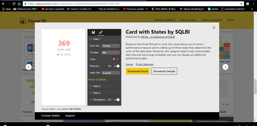
Download this visual from visuals gallery to see the expected results. It can be configured.
Bhavesh
Love the Self Service BI.
Please use the 'Mark as answer' link to mark a post that answers your question. If you find a reply helpful, please remember to give Kudos.
- Mark as New
- Bookmark
- Subscribe
- Mute
- Subscribe to RSS Feed
- Permalink
- Report Inappropriate Content
Does this also work for column totals? Fore example, Is there a way to acc the conditional formatting I have in the grid cells to also include the totals?
- Mark as New
- Bookmark
- Subscribe
- Mute
- Subscribe to RSS Feed
- Permalink
- Report Inappropriate Content
Helpful resources

Power BI Dataviz World Championships
The Power BI Data Visualization World Championships is back! Get ahead of the game and start preparing now!

| User | Count |
|---|---|
| 38 | |
| 38 | |
| 36 | |
| 28 | |
| 28 |
| User | Count |
|---|---|
| 124 | |
| 88 | |
| 74 | |
| 66 | |
| 65 |


