Join us at FabCon Vienna from September 15-18, 2025
The ultimate Fabric, Power BI, SQL, and AI community-led learning event. Save €200 with code FABCOMM.
Get registered- Power BI forums
- Get Help with Power BI
- Desktop
- Service
- Report Server
- Power Query
- Mobile Apps
- Developer
- DAX Commands and Tips
- Custom Visuals Development Discussion
- Health and Life Sciences
- Power BI Spanish forums
- Translated Spanish Desktop
- Training and Consulting
- Instructor Led Training
- Dashboard in a Day for Women, by Women
- Galleries
- Data Stories Gallery
- Themes Gallery
- Contests Gallery
- Quick Measures Gallery
- Notebook Gallery
- Translytical Task Flow Gallery
- TMDL Gallery
- R Script Showcase
- Webinars and Video Gallery
- Ideas
- Custom Visuals Ideas (read-only)
- Issues
- Issues
- Events
- Upcoming Events
Compete to become Power BI Data Viz World Champion! First round ends August 18th. Get started.
- Power BI forums
- Forums
- Get Help with Power BI
- Desktop
- Conditional formatting stacked column chart with m...
- Subscribe to RSS Feed
- Mark Topic as New
- Mark Topic as Read
- Float this Topic for Current User
- Bookmark
- Subscribe
- Printer Friendly Page
- Mark as New
- Bookmark
- Subscribe
- Mute
- Subscribe to RSS Feed
- Permalink
- Report Inappropriate Content
Conditional formatting stacked column chart with multiple vlues
Hi,
Is there a way to put conditional foramting on stacked bar chart with multiple values.
I want to highlight 1 or 2 specific columns in the chart so that they stand out somwhow. Problem is when I add 2 values I no longer have the posibility to add conditional formating. Any other way of highlighting or making them stand out is fine.
- Mark as New
- Bookmark
- Subscribe
- Mute
- Subscribe to RSS Feed
- Permalink
- Report Inappropriate Content
Hi @Krcmajster ,
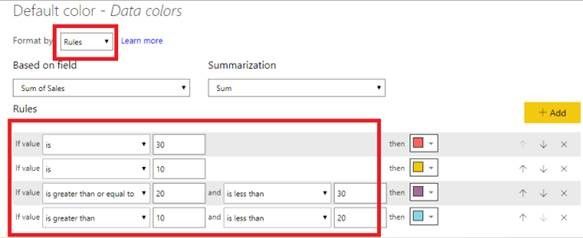
I’m a little confused for what values to be added while conditional formatting? If you have more than one values in values fields, there is no option of conditional formatting directly. But it will display all the columns ,then you can change the colors. And if you want to add values in conditional formatting, you can choose Format by Rules. If I understand incorrectly, please post your expected result. We can help you as soon as possible.
- Many values in values fields. You can change the colors directly.
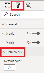
- Add values in conditional formatting . you can choose to format by rules and add multiple values . Click Format -- >Data colors -- > Conditional Formatting
In this way, you can reference this document to learn more.
In addition, You can turn on Show all, then all the values will be displayed.
Best Regards,
Xue Ding
If this post helps, then please consider Accept it as the solution to help the other members find it more quickly.
Xue Ding
If this post helps, then please consider Accept it as the solution to help the other members find it more quickly.
- Mark as New
- Bookmark
- Subscribe
- Mute
- Subscribe to RSS Feed
- Permalink
- Report Inappropriate Content
@v-xuding-msft Thanks. The first chart that you used I want to conditionally format but, as I tought and you have mentioned, it is not possible to conditionally format.
Here is the problem:
You are comparing your company to few other based on classes of workers (HR, Finance, Sales etc.)
And you would use the first visual you have added, with many values in values field. But you want your company to stick out, so when you are comaparing your company to let's say 20 others your eye can instantly catch it insted of reading every X axis lable. Any workaround would be great as well.


