FabCon is coming to Atlanta
Join us at FabCon Atlanta from March 16 - 20, 2026, for the ultimate Fabric, Power BI, AI and SQL community-led event. Save $200 with code FABCOMM.
Register now!- Power BI forums
- Get Help with Power BI
- Desktop
- Service
- Report Server
- Power Query
- Mobile Apps
- Developer
- DAX Commands and Tips
- Custom Visuals Development Discussion
- Health and Life Sciences
- Power BI Spanish forums
- Translated Spanish Desktop
- Training and Consulting
- Instructor Led Training
- Dashboard in a Day for Women, by Women
- Galleries
- Data Stories Gallery
- Themes Gallery
- Contests Gallery
- QuickViz Gallery
- Quick Measures Gallery
- Visual Calculations Gallery
- Notebook Gallery
- Translytical Task Flow Gallery
- TMDL Gallery
- R Script Showcase
- Webinars and Video Gallery
- Ideas
- Custom Visuals Ideas (read-only)
- Issues
- Issues
- Events
- Upcoming Events
The Power BI Data Visualization World Championships is back! Get ahead of the game and start preparing now! Learn more
- Power BI forums
- Forums
- Get Help with Power BI
- Desktop
- Re: Conditional formatting of bar chart colors usi...
- Subscribe to RSS Feed
- Mark Topic as New
- Mark Topic as Read
- Float this Topic for Current User
- Bookmark
- Subscribe
- Printer Friendly Page
- Mark as New
- Bookmark
- Subscribe
- Mute
- Subscribe to RSS Feed
- Permalink
- Report Inappropriate Content
Conditional formatting of bar chart colors using a gradient that is a % variance from target
Hello,
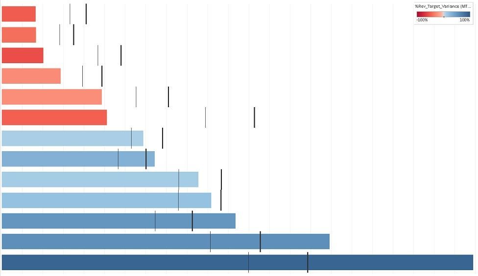
The screenshot below is from Tableau. How do I build this using Power BI?
Let's say:
a) the bars are Revenue for various categories.
b) The grey vertical line is the Month-to-Date Target.
c) The thick, black vertical line is the Monthly Target. I want this reference line to be displayed as well.
d) The colour of the bars is a gradient. The darker the colour (either dark red or dark blue), the greater the % variance from the MTD target. White is the colour for the centre at 0% variance.
If I only display one target, I was able to find a workaround in PBI by using the line and clustered column chart. I changed the line, which is the Target, to have 0px, then used a marker of a line to act as the reference line. The colour of the columns would be a gradient based on a calculation of % variance. (With this workaround though, I do not know how to add a colour legend or change the orientation to a bar chart rather than a column chart.)
But most crucially, how do I show 2 target lines, including the Monthly Target one? Is there a viz or custom viz bullet chart that I should use instead? (Not sure my company will pay for it if it's premium.) Has anyone tried this? Thanks
- Mark as New
- Bookmark
- Subscribe
- Mute
- Subscribe to RSS Feed
- Permalink
- Report Inappropriate Content
Hi @YVR , in Power BI, you can use either Charticulator or Deneb to create bullet chart, I worked on a smilar project same with yours, I am not sure whether you can share your data with me, even you can make up the data for demo purpose, so I can create bullet chart for you using Deneb or Charticulator, hope this will help.
Cheers
- Mark as New
- Bookmark
- Subscribe
- Mute
- Subscribe to RSS Feed
- Permalink
- Report Inappropriate Content
Hi @wangbt89 Sorry for the delay. I didn't have access to publish the sample workbook to the web (public) and my permissions are turned off to share a link on OneDrive with anyone unless I have their email address. So here's some dummy data. Even with the line and clustered column chart workaround that I had mentioned in the original post, I still have some issues:
a) I am unable to change the orientation so that the bars are horizontal instead of vertical, so if your Category names are long, or you just need to have a landscape orientation to fit with the overall layout of your report, you're stuck.
b) I don't know how to add a colour gradient legend here (I can do a workaround for this by creating my own legend with shapes and textboxes, I guess.)
c) Most importantly, I am unable to display another reference line to indicate the Monthly Target as well.
Ideally, I'm looking for a solution that doesn't involve downloading a custom viz that's not PBI Certified or has a premium cost as my company may not allow us to import those.
Thanks for your help!
- Mark as New
- Bookmark
- Subscribe
- Mute
- Subscribe to RSS Feed
- Permalink
- Report Inappropriate Content
@YVR , as I said before, all your requests can be done using Charticulator or Deneb in Power BI, they are all free and certified by Microsoft, you have to do some research, good luck!!
Helpful resources

Power BI Dataviz World Championships
The Power BI Data Visualization World Championships is back! Get ahead of the game and start preparing now!

| User | Count |
|---|---|
| 61 | |
| 46 | |
| 40 | |
| 38 | |
| 22 |
| User | Count |
|---|---|
| 178 | |
| 127 | |
| 117 | |
| 77 | |
| 56 |


