FabCon is coming to Atlanta
Join us at FabCon Atlanta from March 16 - 20, 2026, for the ultimate Fabric, Power BI, AI and SQL community-led event. Save $200 with code FABCOMM.
Register now!- Power BI forums
- Get Help with Power BI
- Desktop
- Service
- Report Server
- Power Query
- Mobile Apps
- Developer
- DAX Commands and Tips
- Custom Visuals Development Discussion
- Health and Life Sciences
- Power BI Spanish forums
- Translated Spanish Desktop
- Training and Consulting
- Instructor Led Training
- Dashboard in a Day for Women, by Women
- Galleries
- Data Stories Gallery
- Themes Gallery
- Contests Gallery
- Quick Measures Gallery
- Visual Calculations Gallery
- Notebook Gallery
- Translytical Task Flow Gallery
- TMDL Gallery
- R Script Showcase
- Webinars and Video Gallery
- Ideas
- Custom Visuals Ideas (read-only)
- Issues
- Issues
- Events
- Upcoming Events
Calling all Data Engineers! Fabric Data Engineer (Exam DP-700) live sessions are back! Starting October 16th. Sign up.
- Power BI forums
- Forums
- Get Help with Power BI
- Desktop
- Re: Conditional formatting of X-axis values
- Subscribe to RSS Feed
- Mark Topic as New
- Mark Topic as Read
- Float this Topic for Current User
- Bookmark
- Subscribe
- Printer Friendly Page
- Mark as New
- Bookmark
- Subscribe
- Mute
- Subscribe to RSS Feed
- Permalink
- Report Inappropriate Content
Conditional formatting of X-axis values
Hi all,
I am struggling with applying conditional formatting to x-axis values:
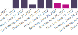
I need to mark the weekend bars as well as their x-axis values with a different color.
I have managed to apply the conditional formatting to the bars themselves by creating a columns with the DayofWeekNumber and setting the rule as "if Sum of DayofWeekNumber is >5 then pink"
But for some reason this approach does not work with the x-axis labels (the actual words that say Saturday, June 25 etc.)
Does anyone have an idea how to implement this? Is it at all possible to implement conditional formatting for individual values of the x-axis or does it only work for the whole axis?
Solved! Go to Solution.
- Mark as New
- Bookmark
- Subscribe
- Mute
- Subscribe to RSS Feed
- Permalink
- Report Inappropriate Content
Hi @itskool ,
According to my knowledge, your requirement could not be realized currently. An idea similar with what you expect has been submitted in Microsoft Idea (powerbi.com)
You may vote the idea and comment to improve this feature. It is a place for customers provide feedback about Microsoft Office products . What’s more, if a feedback is high voted there by other customers, it will be promising that Microsoft Product Team will take it into consideration when designing the next version in the future.
Best Regards,
Jianbo Li
If this post helps, then please consider Accept it as the solution to help the other members find it more quickly.
- Mark as New
- Bookmark
- Subscribe
- Mute
- Subscribe to RSS Feed
- Permalink
- Report Inappropriate Content
I realise this is an old thread, but this still seems to be the case.
- Mark as New
- Bookmark
- Subscribe
- Mute
- Subscribe to RSS Feed
- Permalink
- Report Inappropriate Content
Hi @itskool ,
According to my knowledge, your requirement could not be realized currently. An idea similar with what you expect has been submitted in Microsoft Idea (powerbi.com)
You may vote the idea and comment to improve this feature. It is a place for customers provide feedback about Microsoft Office products . What’s more, if a feedback is high voted there by other customers, it will be promising that Microsoft Product Team will take it into consideration when designing the next version in the future.
Best Regards,
Jianbo Li
If this post helps, then please consider Accept it as the solution to help the other members find it more quickly.
- Mark as New
- Bookmark
- Subscribe
- Mute
- Subscribe to RSS Feed
- Permalink
- Report Inappropriate Content
@itskool , Create a color measure and use it in conditional formatting with the field value option
if( weekday(max('Date'[Date],2) >=6, "Pink", "Blue")
How to do conditional formatting by measure and apply it on pie?
https://www.youtube.com/watch?v=RqBb5eBf_I4&list=PLPaNVDMhUXGYo50Ajmr4SgSV9HIQLxc8L
https://community.powerbi.com/t5/Community-Blog/Power-BI-Conditional-formatting-the-Pie-Visual/ba-p/...
- Mark as New
- Bookmark
- Subscribe
- Mute
- Subscribe to RSS Feed
- Permalink
- Report Inappropriate Content
Thanks for your reply.
Unfortunately, it still formats the whole axis, not just the weekend values.
Helpful resources

FabCon Global Hackathon
Join the Fabric FabCon Global Hackathon—running virtually through Nov 3. Open to all skill levels. $10,000 in prizes!

Power BI Monthly Update - October 2025
Check out the October 2025 Power BI update to learn about new features.


