FabCon is coming to Atlanta
Join us at FabCon Atlanta from March 16 - 20, 2026, for the ultimate Fabric, Power BI, AI and SQL community-led event. Save $200 with code FABCOMM.
Register now!- Power BI forums
- Get Help with Power BI
- Desktop
- Service
- Report Server
- Power Query
- Mobile Apps
- Developer
- DAX Commands and Tips
- Custom Visuals Development Discussion
- Health and Life Sciences
- Power BI Spanish forums
- Translated Spanish Desktop
- Training and Consulting
- Instructor Led Training
- Dashboard in a Day for Women, by Women
- Galleries
- Data Stories Gallery
- Themes Gallery
- Contests Gallery
- QuickViz Gallery
- Quick Measures Gallery
- Visual Calculations Gallery
- Notebook Gallery
- Translytical Task Flow Gallery
- TMDL Gallery
- R Script Showcase
- Webinars and Video Gallery
- Ideas
- Custom Visuals Ideas (read-only)
- Issues
- Issues
- Events
- Upcoming Events
View all the Fabric Data Days sessions on demand. View schedule
- Power BI forums
- Forums
- Get Help with Power BI
- Desktop
- Re: Conditional formatting based on rank or value ...
- Subscribe to RSS Feed
- Mark Topic as New
- Mark Topic as Read
- Float this Topic for Current User
- Bookmark
- Subscribe
- Printer Friendly Page
- Mark as New
- Bookmark
- Subscribe
- Mute
- Subscribe to RSS Feed
- Permalink
- Report Inappropriate Content
Conditional formatting based on rank or value for 2 related charts
Hi All,
I want to set defaul color for team (left chart - number of vacancies per team) and accounts related to that team (right chart - list of accounts with number of vacancies per account) based on rank (e.g. using rankx based on amount of vacancies) or based on some value (e.g. create manual table with index for for each team).
I've managed to create rankx and use it in conditional formatting but it works only for left chart and fails on right and I'm not sure if this is correct variant.
How I can change my measure or maybe there is another way to do this formatting? For rank I used RANKX(ALL('dwh DimAccount'[Team]), [# of Vacancies], ,DESC)
Solved! Go to Solution.
- Mark as New
- Bookmark
- Subscribe
- Mute
- Subscribe to RSS Feed
- Permalink
- Report Inappropriate Content
Hi @bsas ,
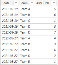
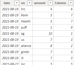
I created some data:
Table1:
Table2:
Here are the steps you can follow:
1. Create calculated table.
Slice = DISTINCT('Table1'[date])2. Create measure.
sortby_un =
var _select=SELECTEDVALUE('Slice'[date])
return
RANKX(FILTER(ALLSELECTED('Table2'),'Table2'[date]=_select),CALCULATE(SUM('Table2'[amount])),,DESC)
sortby_amount =
var _select=SELECTEDVALUE('Slice'[date])
return
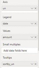
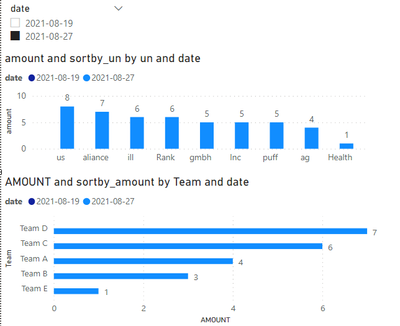
RANKX(FILTER(ALLSELECTED('Table1'),'Table1'[date]=_select),CALCULATE(SUM('Table1'[AMOUNT])),,DESC)3. Change [Team]--Axis, [date]—Legend, [AMOUNT]—Values,[ sortby_amount]—Tooltips in Table 1, and [un]--Axis, [date]—Legend, [amount ]—Values, [sortby_un]—Tooltips
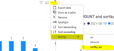
4. In the two visual objects, select the ellipsis and set Sort by-[sortby_amount] and Sort by-[sortby_un]
5. Result:
Both visual objects are automatically sorted according to measure
If it does not meet your expected results, can you share sample data and sample output in table format? Or a sample pbix after removing sensitive data.
Best Regards,
Liu Yang
If this post helps, then please consider Accept it as the solution to help the other members find it more quickly
- Mark as New
- Bookmark
- Subscribe
- Mute
- Subscribe to RSS Feed
- Permalink
- Report Inappropriate Content
Thanks @Anonymous , great solution!
Helpful resources

Power BI Monthly Update - November 2025
Check out the November 2025 Power BI update to learn about new features.

Fabric Data Days
Advance your Data & AI career with 50 days of live learning, contests, hands-on challenges, study groups & certifications and more!


