FabCon is coming to Atlanta
Join us at FabCon Atlanta from March 16 - 20, 2026, for the ultimate Fabric, Power BI, AI and SQL community-led event. Save $200 with code FABCOMM.
Register now!- Power BI forums
- Get Help with Power BI
- Desktop
- Service
- Report Server
- Power Query
- Mobile Apps
- Developer
- DAX Commands and Tips
- Custom Visuals Development Discussion
- Health and Life Sciences
- Power BI Spanish forums
- Translated Spanish Desktop
- Training and Consulting
- Instructor Led Training
- Dashboard in a Day for Women, by Women
- Galleries
- Data Stories Gallery
- Themes Gallery
- Contests Gallery
- QuickViz Gallery
- Quick Measures Gallery
- Visual Calculations Gallery
- Notebook Gallery
- Translytical Task Flow Gallery
- TMDL Gallery
- R Script Showcase
- Webinars and Video Gallery
- Ideas
- Custom Visuals Ideas (read-only)
- Issues
- Issues
- Events
- Upcoming Events
The Power BI Data Visualization World Championships is back! Get ahead of the game and start preparing now! Learn more
- Power BI forums
- Forums
- Get Help with Power BI
- Desktop
- Conditional formatting based on different column d...
- Subscribe to RSS Feed
- Mark Topic as New
- Mark Topic as Read
- Float this Topic for Current User
- Bookmark
- Subscribe
- Printer Friendly Page
- Mark as New
- Bookmark
- Subscribe
- Mute
- Subscribe to RSS Feed
- Permalink
- Report Inappropriate Content
Conditional formatting based on different column data
Hi,
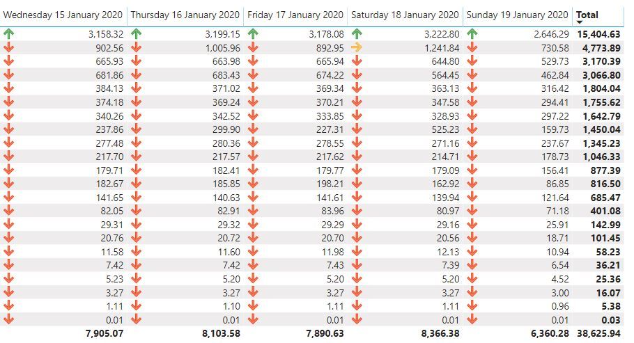
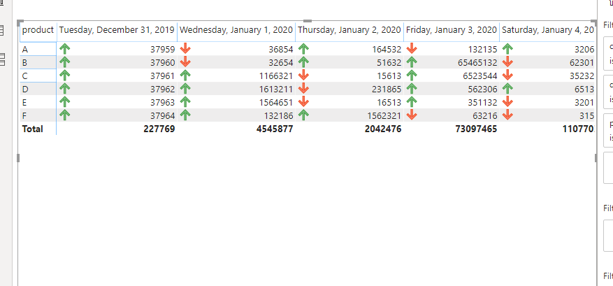
I am trying to create conditional formatting for the data below such that when a value for a row is compared to the previous column (same row) and if it is less than the previous the icon is red and if it is higher it is green
I am not seeing a way to do that with the conditional formatting options of thematrix table:
Solved! Go to Solution.
- Mark as New
- Bookmark
- Subscribe
- Mute
- Subscribe to RSS Feed
- Permalink
- Report Inappropriate Content
What do you mean by previous column? You want to have Day or day change measure.
Create date dimension. Create a day lag measure, create a diff measure and use that for color formatting.
Sales = CALCULATE(SUM(Sales[Sales Amount]))
Daybehind Sales = CALCULATE(SUM(Sales[Sales Amount]),dateadd('Date'[Date],-1,Day))

Diff =[Daybehind Sales] -[Sales]
Appreciate your Kudos. In case, this is the solution you are looking for, mark it as the Solution. In case it does not help, please provide additional information and mark me with @
Thanks. My Recent Blog -
Winner-Topper-on-Map-How-to-Color-States-on-a-Map-with-Winners , HR-Analytics-Active-Employee-Hire-and-Termination-trend
Power-BI-Working-with-Non-Standard-Time-Periods And Comparing-Data-Across-Date-Ranges
Connect on Linkedin
- Mark as New
- Bookmark
- Subscribe
- Mute
- Subscribe to RSS Feed
- Permalink
- Report Inappropriate Content
VAR current_day =
MAX ( Sheet5[cost] )
VAR last_day =
CALCULATE (
MAX ( Sheet5[cost] ),
DATEADD ( Sheet5[date], -1, DAY ),
ALLEXCEPT ( Sheet5, Sheet5[product] )
)
RETURN
IF (
current_day - last_day > 0,
1,
IF (
current_day - last_day = 0,
0,
IF ( current_day - last_day < 0, BLANK () )
)
)
Liang
If this post helps, then please consider Accept it as the solution to help the other members find it more quickly.
- Mark as New
- Bookmark
- Subscribe
- Mute
- Subscribe to RSS Feed
- Permalink
- Report Inappropriate Content
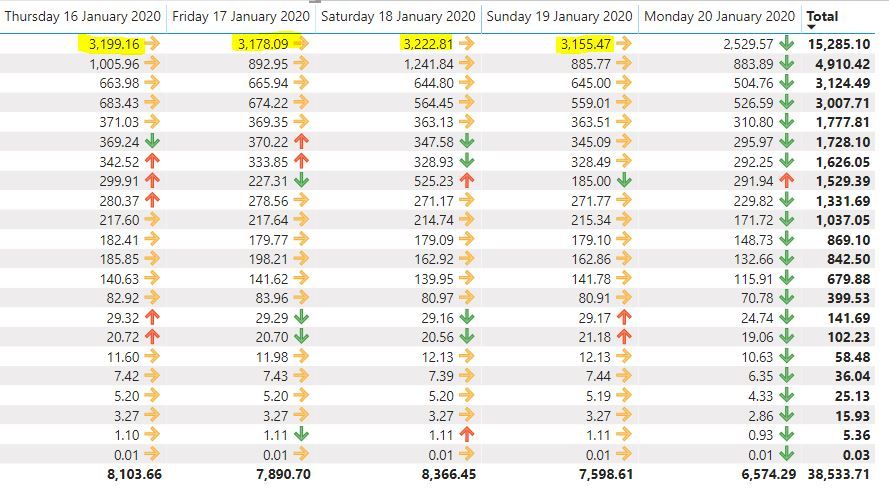
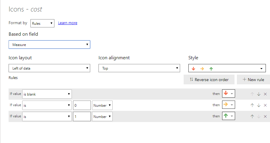
Thanks for that, I almost have it working using the measure above, however it seems like it is not always displaying the correct icon when it comes to the orange one (when the value did change from one to day to the next)
My measure:
Measure =
var current_day = MAX(Query1[Cost])
var last_day = CALCULATE(MAX(Query1[Cost]),
                   DATEADD(Query1[Date],-1,DAY))
return IF(current_day-last_day>0,1,IF(current_day-last_day=0,0,IF(current_day-last_day<0,BLANK())))
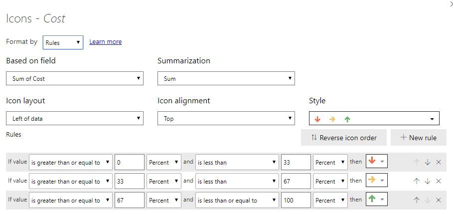
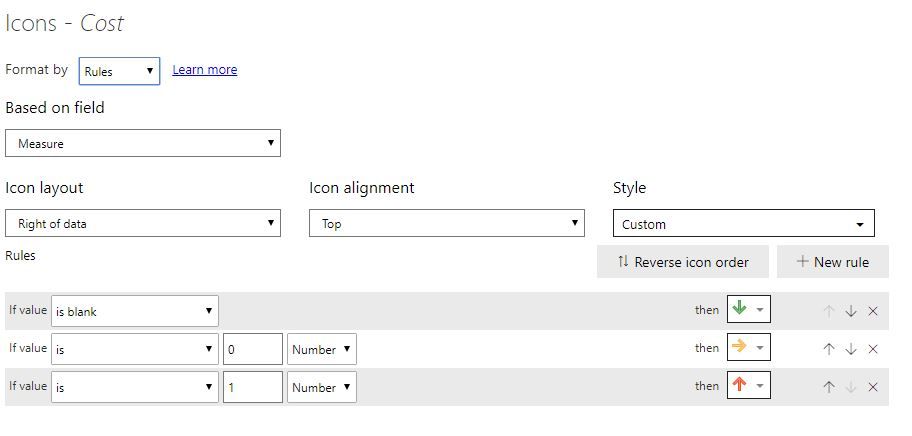
The cond formatting:
Do you see anything wrong there?
It might be also due to the fact that I have multiple cost entries for thesame rows and they need to be added up, for example I can have 20 rows with the same date/product but different cost entries and they need to be added together?
- Mark as New
- Bookmark
- Subscribe
- Mute
- Subscribe to RSS Feed
- Permalink
- Report Inappropriate Content
What do you mean by previous column? You want to have Day or day change measure.
Create date dimension. Create a day lag measure, create a diff measure and use that for color formatting.
Sales = CALCULATE(SUM(Sales[Sales Amount]))
Daybehind Sales = CALCULATE(SUM(Sales[Sales Amount]),dateadd('Date'[Date],-1,Day))

Diff =[Daybehind Sales] -[Sales]
Appreciate your Kudos. In case, this is the solution you are looking for, mark it as the Solution. In case it does not help, please provide additional information and mark me with @
Thanks. My Recent Blog -
Winner-Topper-on-Map-How-to-Color-States-on-a-Map-with-Winners , HR-Analytics-Active-Employee-Hire-and-Termination-trend
Power-BI-Working-with-Non-Standard-Time-Periods And Comparing-Data-Across-Date-Ranges
Connect on Linkedin
Helpful resources

Power BI Dataviz World Championships
The Power BI Data Visualization World Championships is back! Get ahead of the game and start preparing now!

| User | Count |
|---|---|
| 40 | |
| 35 | |
| 34 | |
| 31 | |
| 27 |
| User | Count |
|---|---|
| 135 | |
| 102 | |
| 67 | |
| 65 | |
| 56 |
