Get Fabric certified for FREE!
Don't miss your chance to take the Fabric Data Engineer (DP-700) exam on us!
Learn more- Power BI forums
- Get Help with Power BI
- Desktop
- Service
- Report Server
- Power Query
- Mobile Apps
- Developer
- DAX Commands and Tips
- Custom Visuals Development Discussion
- Health and Life Sciences
- Power BI Spanish forums
- Translated Spanish Desktop
- Training and Consulting
- Instructor Led Training
- Dashboard in a Day for Women, by Women
- Galleries
- Data Stories Gallery
- Themes Gallery
- Contests Gallery
- QuickViz Gallery
- Quick Measures Gallery
- Visual Calculations Gallery
- Notebook Gallery
- Translytical Task Flow Gallery
- TMDL Gallery
- R Script Showcase
- Webinars and Video Gallery
- Ideas
- Custom Visuals Ideas (read-only)
- Issues
- Issues
- Events
- Upcoming Events
We've captured the moments from FabCon & SQLCon that everyone is talking about, and we are bringing them to the community, live and on-demand. Starts on April 14th. Register now
- Power BI forums
- Forums
- Get Help with Power BI
- Desktop
- Re: Conditional formatting Line Chart
- Subscribe to RSS Feed
- Mark Topic as New
- Mark Topic as Read
- Float this Topic for Current User
- Bookmark
- Subscribe
- Printer Friendly Page
- Mark as New
- Bookmark
- Subscribe
- Mute
- Subscribe to RSS Feed
- Permalink
- Report Inappropriate Content
Conditional formatting Line Chart
Hi,
Wondering if I can condition format a Line chart in power bi or alternatively if there is any custom visual to use.
Appreciate your help.
kind Regards,
Chiru
- Mark as New
- Bookmark
- Subscribe
- Mute
- Subscribe to RSS Feed
- Permalink
- Report Inappropriate Content
Your post has been changed because invalid HTML was found in Hello there,
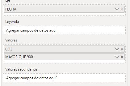
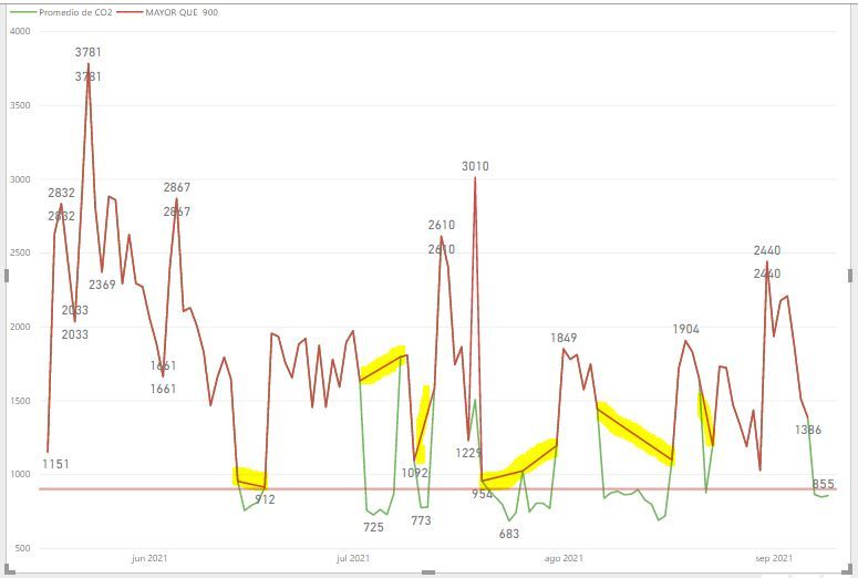
I am following your option to solve the graph, but there are some parts that do not conform to reality, I indicate it in the screenshot.
 I would appreciate your telling me what I may be doing wrong. Thank you.


- Mark as New
- Bookmark
- Subscribe
- Mute
- Subscribe to RSS Feed
- Permalink
- Report Inappropriate Content
Hi @chiru5262 ,
We create a sample and you can refer it.
1. Create a line chart using value. And configure an alert line.
2. Then we can create a measure using IF function.
greater than 20 = IF(CALCULATE(SUM('Table'[value]))>20,CALCULATE(SUM('Table'[value])),BLANK())
Put the measure to line chart and change its color, the result like this,
If it doesn't meet your requirement, Could you please show the exact expected result based on the tables that we have shared?
BTW, pbix as attached.
Best regards,
Community Support Team _ zhenbw
If this post helps, then please consider Accept it as the solution to help the other members find it more quickly.
- Mark as New
- Bookmark
- Subscribe
- Mute
- Subscribe to RSS Feed
- Permalink
- Report Inappropriate Content
How can I achieve if the data before the current one is lower, the color is black, and if the data is less than the current one, the color is red.
- Mark as New
- Bookmark
- Subscribe
- Mute
- Subscribe to RSS Feed
- Permalink
- Report Inappropriate Content
Follow on LinkedIn
@ me in replies or I'll lose your thread!!!
Instead of a Kudo, please vote for this idea
Become an expert!: Enterprise DNA
External Tools: MSHGQM
YouTube Channel!: Microsoft Hates Greg
Latest book!: DAX For Humans
DAX is easy, CALCULATE makes DAX hard...
Helpful resources

New to Fabric Survey
If you have recently started exploring Fabric, we'd love to hear how it's going. Your feedback can help with product improvements.

Power BI DataViz World Championships - June 2026
A new Power BI DataViz World Championship is coming this June! Don't miss out on submitting your entry.

Join our Fabric User Panel
Share feedback directly with Fabric product managers, participate in targeted research studies and influence the Fabric roadmap.

| User | Count |
|---|---|
| 53 | |
| 36 | |
| 33 | |
| 19 | |
| 17 |
| User | Count |
|---|---|
| 72 | |
| 72 | |
| 38 | |
| 35 | |
| 26 |


