A new Data Days event is coming soon!
This time we’re going bigger than ever. Fabric, Power BI, SQL, AI and more. We're covering it all. You won't want to miss it.
Learn more- Power BI forums
- Get Help with Power BI
- Desktop
- Service
- Report Server
- Power Query
- Mobile Apps
- Developer
- DAX Commands and Tips
- Custom Visuals Development Discussion
- Health and Life Sciences
- Power BI Spanish forums
- Translated Spanish Desktop
- Training and Consulting
- Instructor Led Training
- Dashboard in a Day for Women, by Women
- Galleries
- Data Stories Gallery
- Themes Gallery
- Contests Gallery
- QuickViz Gallery
- Quick Measures Gallery
- Visual Calculations Gallery
- Notebook Gallery
- Translytical Task Flow Gallery
- TMDL Gallery
- R Script Showcase
- Webinars and Video Gallery
- Ideas
- Custom Visuals Ideas (read-only)
- Issues
- Issues
- Events
- Upcoming Events
Level up your Power BI skills this month - build one visual each week and tell better stories with data! Get started
- Power BI forums
- Forums
- Get Help with Power BI
- Desktop
- Re: Conditional Formatting
- Subscribe to RSS Feed
- Mark Topic as New
- Mark Topic as Read
- Float this Topic for Current User
- Bookmark
- Subscribe
- Printer Friendly Page
- Mark as New
- Bookmark
- Subscribe
- Mute
- Subscribe to RSS Feed
- Permalink
- Report Inappropriate Content
Conditional Formatting
Hi,
I created a measure in my sheet and I used that data to bar chart with year. I want to add a conditional formating using colour scale. But i couldn't add it. Ho can I do that? I want to do as follow,
Solved! Go to Solution.
- Mark as New
- Bookmark
- Subscribe
- Mute
- Subscribe to RSS Feed
- Permalink
- Report Inappropriate Content
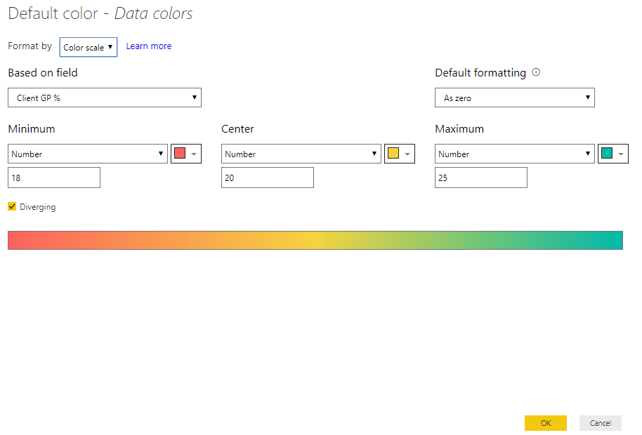
I haven't see your data, but I try it in my report,it worked.
In the "clustered bar chart", my axis is "period", my value is "Amount A.P" which is same with the "based on field"
- Mark as New
- Bookmark
- Subscribe
- Mute
- Subscribe to RSS Feed
- Permalink
- Report Inappropriate Content
Hi @cham ,
I think what you want is this:
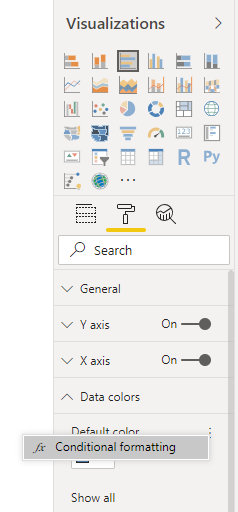
Next to the Default color in the Data colors card, you can find the "dot dot dot" button, click it,
then you can use the Conditional formatting.
Thanks.
Aiolos Zhao
- Mark as New
- Bookmark
- Subscribe
- Mute
- Subscribe to RSS Feed
- Permalink
- Report Inappropriate Content
Hi,
I'm not seeing these options: the default colour or the 3 dots. Is there a reason for this (Options? I'm on Version: 2.70.5494.761 (juni 2019)).
Thanks in advance,
Maurice.
- Mark as New
- Bookmark
- Subscribe
- Mute
- Subscribe to RSS Feed
- Permalink
- Report Inappropriate Content
Hi @MZandvliet
If you are using two values you cammoy do the conditional formating. You can use one value in the "Value" filed in order to do the conditional formating.
- Mark as New
- Bookmark
- Subscribe
- Mute
- Subscribe to RSS Feed
- Permalink
- Report Inappropriate Content
Hi Cham,
Yes, when I select one value I have the three dots for conditional formatting ![]() . It would even be better if you can select it with two values (bars) as well. But the answer from you is clear, THANKS!
. It would even be better if you can select it with two values (bars) as well. But the answer from you is clear, THANKS!
- Mark as New
- Bookmark
- Subscribe
- Mute
- Subscribe to RSS Feed
- Permalink
- Report Inappropriate Content
- Mark as New
- Bookmark
- Subscribe
- Mute
- Subscribe to RSS Feed
- Permalink
- Report Inappropriate Content
Yes I know that. I did it but its not working. All the values get red when I did this. I want to know why is this happening. Cant we add conditional formatting for measure values?
- Mark as New
- Bookmark
- Subscribe
- Mute
- Subscribe to RSS Feed
- Permalink
- Report Inappropriate Content
Hi @cham ,
If you want to customized the value for the color, you can create a measure like:
Measure = IF(Your Measure > 0.5,"#FFFFFF","#000000")
Then after you open the "conditional formatting", you can choose "Field Value" in the "format by" checkbox.
Then choose the measure you created.
I think that will work.
Please try.
Aiolos Zhao
- Mark as New
- Bookmark
- Subscribe
- Mute
- Subscribe to RSS Feed
- Permalink
- Report Inappropriate Content
Is this giving me the specific colour to that value. Because I want to show a colour scale like "shading". I dont want to use specific colour faor the range I select.
Using this can I add a colour scale?
- Mark as New
- Bookmark
- Subscribe
- Mute
- Subscribe to RSS Feed
- Permalink
- Report Inappropriate Content
I haven't see your data, but I try it in my report,it worked.
In the "clustered bar chart", my axis is "period", my value is "Amount A.P" which is same with the "based on field"
Helpful resources

Power BI Monthly Update - April 2026
Check out the April 2026 Power BI update to learn about new features.

Data Days 2026 coming soon!
Sign up to receive a private message when registration opens and key events begin.

New to Fabric Survey
If you have recently started exploring Fabric, we'd love to hear how it's going. Your feedback can help with product improvements.

| User | Count |
|---|---|
| 35 | |
| 32 | |
| 25 | |
| 22 | |
| 18 |
| User | Count |
|---|---|
| 65 | |
| 35 | |
| 32 | |
| 25 | |
| 23 |


