Get Fabric certified for FREE!
Don't miss your chance to take the Fabric Data Engineer (DP-600) exam for FREE! Find out how by watching the DP-600 session on-demand now through April 28th.
Learn more- Power BI forums
- Get Help with Power BI
- Desktop
- Service
- Report Server
- Power Query
- Mobile Apps
- Developer
- DAX Commands and Tips
- Custom Visuals Development Discussion
- Health and Life Sciences
- Power BI Spanish forums
- Translated Spanish Desktop
- Training and Consulting
- Instructor Led Training
- Dashboard in a Day for Women, by Women
- Galleries
- Data Stories Gallery
- Themes Gallery
- Contests Gallery
- QuickViz Gallery
- Quick Measures Gallery
- Visual Calculations Gallery
- Notebook Gallery
- Translytical Task Flow Gallery
- TMDL Gallery
- R Script Showcase
- Webinars and Video Gallery
- Ideas
- Custom Visuals Ideas (read-only)
- Issues
- Issues
- Events
- Upcoming Events
Join the FabCon + SQLCon recap series. Up next: Power BI, Real-Time Intelligence, IQ and AI, and Data Factory take center stage. All sessions are available on-demand after the live show. Register now
- Power BI forums
- Forums
- Get Help with Power BI
- Desktop
- Conditional Formatting with Field Parameter
- Subscribe to RSS Feed
- Mark Topic as New
- Mark Topic as Read
- Float this Topic for Current User
- Bookmark
- Subscribe
- Printer Friendly Page
- Mark as New
- Bookmark
- Subscribe
- Mute
- Subscribe to RSS Feed
- Permalink
- Report Inappropriate Content
Conditional Formatting with Field Parameter
Hi,
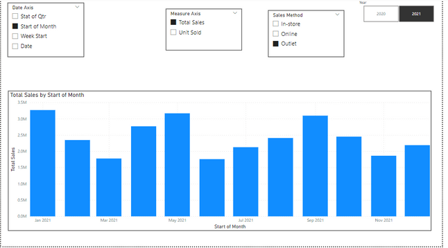
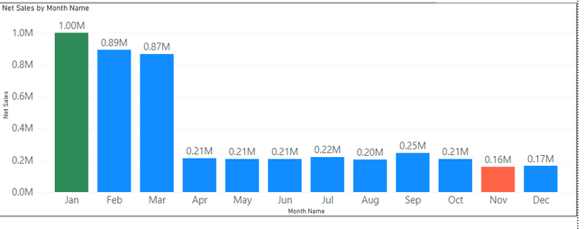
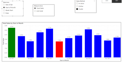
I want to get Dynamic color Green for Maximum value and Red for Minimum value in my column chart with field parameter.
Please advise how can it be done?
As per below example
Solved! Go to Solution.
- Mark as New
- Bookmark
- Subscribe
- Mute
- Subscribe to RSS Feed
- Permalink
- Report Inappropriate Content
Well, this got really ugly really fast...
bar color =
VAR da =
    MAX( 'Date Axis'[Date Axis] )
VAR ma =
    MAX( 'Measure Axis'[Measure Axis] )
VAR ts =
    SWITCH( ma, "Total Sales", [Total Sales], "Unit Sold", [Unit Sold] )
VAR mv0 =
    CALCULATETABLE(
        SUMMARIZE(
            'Date',
            [Stat of Qtr],
            "v", SWITCH( ma, "Total Sales", [Total Sales], "Unit Sold", [Unit Sold] )
        ),
        ALLSELECTED()
    )
VAR mv1 =
    CALCULATETABLE(
        SUMMARIZE(
            'Date',
            [Start of Month],
            "v", SWITCH( ma, "Total Sales", [Total Sales], "Unit Sold", [Unit Sold] )
        ),
        ALLSELECTED()
    )
VAR mv2 =
    CALCULATETABLE(
        SUMMARIZE(
            'Date',
            [Week Start],
            "v", SWITCH( ma, "Total Sales", [Total Sales], "Unit Sold", [Unit Sold] )
        ),
        ALLSELECTED()
    )
VAR mv3 =
    CALCULATETABLE(
        SUMMARIZE(
            'Date',
            [Date],
            "v", SWITCH( ma, "Total Sales", [Total Sales], "Unit Sold", [Unit Sold] )
        ),
        ALLSELECTED()
    )
RETURN
    SWITCH(
        da,
        "Stat of Qtr",
            SWITCH(
                TRUE(),
                ts = MAXX( mv0, [v] ), "green",
                ts = MINX( mv0, [v] ), "red",
                "blue"
            ),
        "Start of Month",
            SWITCH(
                TRUE(),
                ts = MAXX( mv1, [v] ), "green",
                ts = MINX( mv1, [v] ), "red",
                "blue"
            ),
        "Week Start",
            SWITCH(
                TRUE(),
                ts = MAXX( mv2, [v] ), "green",
                ts = MINX( mv2, [v] ), "red",
                "blue"
            ),
        "Date",
            SWITCH(
                TRUE(),
                ts = MAXX( mv3, [v] ), "green",
                ts = MINX( mv3, [v] ), "red",
                "blue"
            )
    )
see attached
- Mark as New
- Bookmark
- Subscribe
- Mute
- Subscribe to RSS Feed
- Permalink
- Report Inappropriate Content
Please provide sample data (with sensitive information removed) that covers your issue or question completely, in a usable format (not as a screenshot).
https://community.fabric.microsoft.com/t5/Community-Blog/How-to-provide-sample-data-in-the-Power-BI-...
- Mark as New
- Bookmark
- Subscribe
- Mute
- Subscribe to RSS Feed
- Permalink
- Report Inappropriate Content
Thank you for your response.
Please refer the attached file as per your requirement.
- Mark as New
- Bookmark
- Subscribe
- Mute
- Subscribe to RSS Feed
- Permalink
- Report Inappropriate Content
Well, this got really ugly really fast...
bar color =
VAR da =
    MAX( 'Date Axis'[Date Axis] )
VAR ma =
    MAX( 'Measure Axis'[Measure Axis] )
VAR ts =
    SWITCH( ma, "Total Sales", [Total Sales], "Unit Sold", [Unit Sold] )
VAR mv0 =
    CALCULATETABLE(
        SUMMARIZE(
            'Date',
            [Stat of Qtr],
            "v", SWITCH( ma, "Total Sales", [Total Sales], "Unit Sold", [Unit Sold] )
        ),
        ALLSELECTED()
    )
VAR mv1 =
    CALCULATETABLE(
        SUMMARIZE(
            'Date',
            [Start of Month],
            "v", SWITCH( ma, "Total Sales", [Total Sales], "Unit Sold", [Unit Sold] )
        ),
        ALLSELECTED()
    )
VAR mv2 =
    CALCULATETABLE(
        SUMMARIZE(
            'Date',
            [Week Start],
            "v", SWITCH( ma, "Total Sales", [Total Sales], "Unit Sold", [Unit Sold] )
        ),
        ALLSELECTED()
    )
VAR mv3 =
    CALCULATETABLE(
        SUMMARIZE(
            'Date',
            [Date],
            "v", SWITCH( ma, "Total Sales", [Total Sales], "Unit Sold", [Unit Sold] )
        ),
        ALLSELECTED()
    )
RETURN
    SWITCH(
        da,
        "Stat of Qtr",
            SWITCH(
                TRUE(),
                ts = MAXX( mv0, [v] ), "green",
                ts = MINX( mv0, [v] ), "red",
                "blue"
            ),
        "Start of Month",
            SWITCH(
                TRUE(),
                ts = MAXX( mv1, [v] ), "green",
                ts = MINX( mv1, [v] ), "red",
                "blue"
            ),
        "Week Start",
            SWITCH(
                TRUE(),
                ts = MAXX( mv2, [v] ), "green",
                ts = MINX( mv2, [v] ), "red",
                "blue"
            ),
        "Date",
            SWITCH(
                TRUE(),
                ts = MAXX( mv3, [v] ), "green",
                ts = MINX( mv3, [v] ), "red",
                "blue"
            )
    )
see attached
- Mark as New
- Bookmark
- Subscribe
- Mute
- Subscribe to RSS Feed
- Permalink
- Report Inappropriate Content
- Mark as New
- Bookmark
- Subscribe
- Mute
- Subscribe to RSS Feed
- Permalink
- Report Inappropriate Content
Helpful resources

Power BI Monthly Update - April 2026
Check out the April 2026 Power BI update to learn about new features.

New to Fabric Survey
If you have recently started exploring Fabric, we'd love to hear how it's going. Your feedback can help with product improvements.

Power BI DataViz World Championships - June 2026
A new Power BI DataViz World Championship is coming this June! Don't miss out on submitting your entry.

| User | Count |
|---|---|
| 43 | |
| 38 | |
| 35 | |
| 21 | |
| 15 |
| User | Count |
|---|---|
| 63 | |
| 58 | |
| 28 | |
| 27 | |
| 25 |


