FabCon is coming to Atlanta
Join us at FabCon Atlanta from March 16 - 20, 2026, for the ultimate Fabric, Power BI, AI and SQL community-led event. Save $200 with code FABCOMM.
Register now!- Power BI forums
- Get Help with Power BI
- Desktop
- Service
- Report Server
- Power Query
- Mobile Apps
- Developer
- DAX Commands and Tips
- Custom Visuals Development Discussion
- Health and Life Sciences
- Power BI Spanish forums
- Translated Spanish Desktop
- Training and Consulting
- Instructor Led Training
- Dashboard in a Day for Women, by Women
- Galleries
- Data Stories Gallery
- Themes Gallery
- Contests Gallery
- QuickViz Gallery
- Quick Measures Gallery
- Visual Calculations Gallery
- Notebook Gallery
- Translytical Task Flow Gallery
- TMDL Gallery
- R Script Showcase
- Webinars and Video Gallery
- Ideas
- Custom Visuals Ideas (read-only)
- Issues
- Issues
- Events
- Upcoming Events
The Power BI Data Visualization World Championships is back! Get ahead of the game and start preparing now! Learn more
- Power BI forums
- Forums
- Get Help with Power BI
- Desktop
- Re: Conditional Formatting of Bar Chart
- Subscribe to RSS Feed
- Mark Topic as New
- Mark Topic as Read
- Float this Topic for Current User
- Bookmark
- Subscribe
- Printer Friendly Page
- Mark as New
- Bookmark
- Subscribe
- Mute
- Subscribe to RSS Feed
- Permalink
- Report Inappropriate Content
Conditional Formatting of Bar Chart
Hi,
Does anyonw knows how to add conditional formating to bar chart? There are no options on the Format-> Colour or at the collum like on tables.
Thanks!
Soraia
- Mark as New
- Bookmark
- Subscribe
- Mute
- Subscribe to RSS Feed
- Permalink
- Report Inappropriate Content
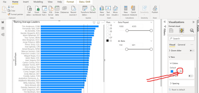
In the Visualizations - Bar - Color select fx button to define a function for conditional formatting.
- Mark as New
- Bookmark
- Subscribe
- Mute
- Subscribe to RSS Feed
- Permalink
- Report Inappropriate Content
Hi, I'll give it try! Thank you.
- Mark as New
- Bookmark
- Subscribe
- Mute
- Subscribe to RSS Feed
- Permalink
- Report Inappropriate Content
Hi @SoraiaT ,
Apologies for the necro, but I was trying to solve the same problem and came across this thread.
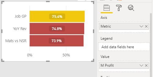
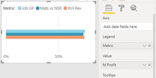
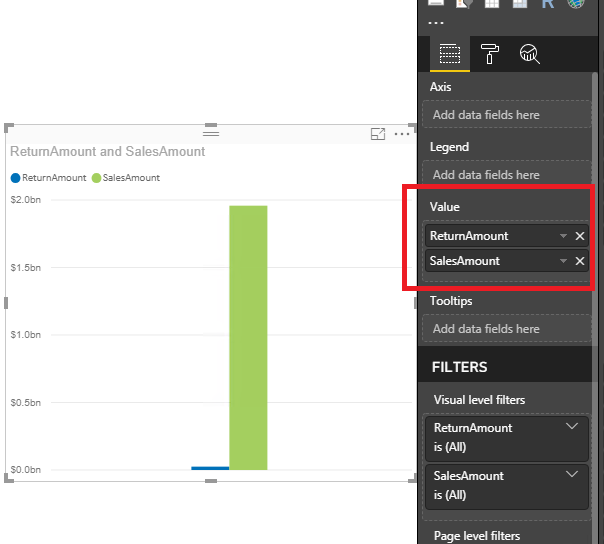
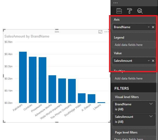
I solved this by moving the chart dimension from Legend into Axis. It appears that you can't conditionally format (nor sort sometimes) charts that use a legend.
I've attached examples of the difference in visual display just by moving the dimension. The chart using Axis is conditionally formatted based on rules.
Hope this helps you and/or anyone else that may stumble across this thread looking for answers.
Pete
Now accepting Kudos! If my post helped you, why not give it a thumbs-up?
Proud to be a Datanaut!
- Mark as New
- Bookmark
- Subscribe
- Mute
- Subscribe to RSS Feed
- Permalink
- Report Inappropriate Content
@SoraiaT,
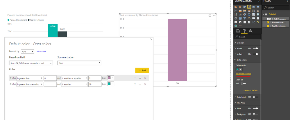
Under Format ->Data colors of the bar chart , you can see "Advanced controls", open it and you will see conditional formatting windows.
Reference:
https://powerbi.microsoft.com/en-us/blog/power-bi-desktop-november-2018-feature-summary/
Regards,
Lydia
- Mark as New
- Bookmark
- Subscribe
- Mute
- Subscribe to RSS Feed
- Permalink
- Report Inappropriate Content
My question is that this won't work on a stacked bar chart.
Your solution only works for single values in the column fields. How to format the colors individually on these?
- Mark as New
- Bookmark
- Subscribe
- Mute
- Subscribe to RSS Feed
- Permalink
- Report Inappropriate Content
Hi @Anonymous Lidia,
I have the latest verson. Download again and that option keeps not showing:
Do you have any idea why?
Thanks again 🙂
- Mark as New
- Bookmark
- Subscribe
- Mute
- Subscribe to RSS Feed
- Permalink
- Report Inappropriate Content
Exactly, Even I have the same question
- Mark as New
- Bookmark
- Subscribe
- Mute
- Subscribe to RSS Feed
- Permalink
- Report Inappropriate Content
Hi @Anonymous ,
This is a very old thread and the capabilities of Power BI have moved on dramatically since this was posted.
If you're having trouble getting PBI to conditionally format how you want it to, I would strongly recommend you open a new topic in the Desktop forum and someone there will be able to help you very quickly.
Pete
Now accepting Kudos! If my post helped you, why not give it a thumbs-up?
Proud to be a Datanaut!
- Mark as New
- Bookmark
- Subscribe
- Mute
- Subscribe to RSS Feed
- Permalink
- Report Inappropriate Content
@SoraiaT,
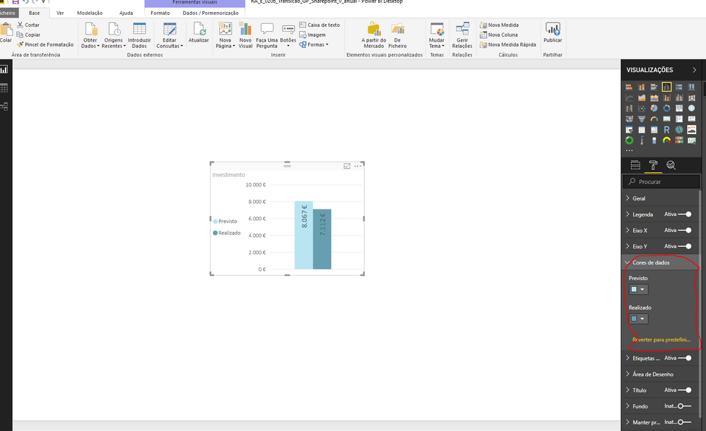
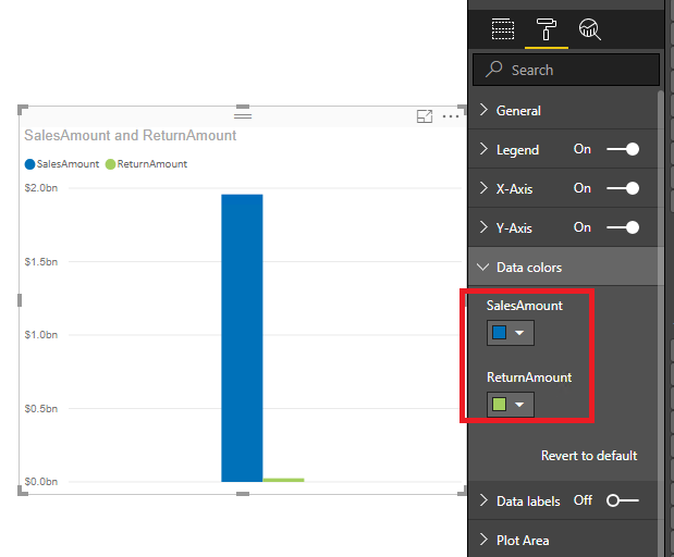
When you directly drag two fields to Values section of the column chart, please manually change color for each field.
If you drag field to Axis and Values to column chart as below, you will have the advanced control option.
Regards,
Lydia
- Mark as New
- Bookmark
- Subscribe
- Mute
- Subscribe to RSS Feed
- Permalink
- Report Inappropriate Content
- Mark as New
- Bookmark
- Subscribe
- Mute
- Subscribe to RSS Feed
- Permalink
- Report Inappropriate Content
@SoraiaT,
As my previous post, if you drag two columns, it is only possible to manually set the colors for each column. If you want to set colors for each column based on the condition as you describe, you can use table visual and configure conditional formatting.
Regards,
Lydia
- Mark as New
- Bookmark
- Subscribe
- Mute
- Subscribe to RSS Feed
- Permalink
- Report Inappropriate Content
- Mark as New
- Bookmark
- Subscribe
- Mute
- Subscribe to RSS Feed
- Permalink
- Report Inappropriate Content
@SoraiaT,
In your second chart, please click Advanced controls to configure conditional formatting as below.
Regards,
Lydia
- Mark as New
- Bookmark
- Subscribe
- Mute
- Subscribe to RSS Feed
- Permalink
- Report Inappropriate Content
- Mark as New
- Bookmark
- Subscribe
- Mute
- Subscribe to RSS Feed
- Permalink
- Report Inappropriate Content
When you put all the values into chart which like the first chart, it is not possible to use Advanced controls option, you would need to manually set color for them.
Regards,
Lydia
- Mark as New
- Bookmark
- Subscribe
- Mute
- Subscribe to RSS Feed
- Permalink
- Report Inappropriate Content
Hi Soraia,
Refer the following link, if that is not your requirement please elaborate your requirement.
https://community.powerbi.com/t5/Desktop/Conditional-Formatting-of-Bar-Chart/td-p/118370
Helpful resources

Power BI Dataviz World Championships
The Power BI Data Visualization World Championships is back! Get ahead of the game and start preparing now!

| User | Count |
|---|---|
| 41 | |
| 38 | |
| 36 | |
| 31 | |
| 28 |
| User | Count |
|---|---|
| 128 | |
| 88 | |
| 79 | |
| 68 | |
| 63 |
