FabCon is coming to Atlanta
Join us at FabCon Atlanta from March 16 - 20, 2026, for the ultimate Fabric, Power BI, AI and SQL community-led event. Save $200 with code FABCOMM.
Register now!- Power BI forums
- Get Help with Power BI
- Desktop
- Service
- Report Server
- Power Query
- Mobile Apps
- Developer
- DAX Commands and Tips
- Custom Visuals Development Discussion
- Health and Life Sciences
- Power BI Spanish forums
- Translated Spanish Desktop
- Training and Consulting
- Instructor Led Training
- Dashboard in a Day for Women, by Women
- Galleries
- Data Stories Gallery
- Themes Gallery
- Contests Gallery
- QuickViz Gallery
- Quick Measures Gallery
- Visual Calculations Gallery
- Notebook Gallery
- Translytical Task Flow Gallery
- TMDL Gallery
- R Script Showcase
- Webinars and Video Gallery
- Ideas
- Custom Visuals Ideas (read-only)
- Issues
- Issues
- Events
- Upcoming Events
The Power BI Data Visualization World Championships is back! Get ahead of the game and start preparing now! Learn more
- Power BI forums
- Forums
- Get Help with Power BI
- Desktop
- Conditional Formatting Stacked Column Chart not wo...
- Subscribe to RSS Feed
- Mark Topic as New
- Mark Topic as Read
- Float this Topic for Current User
- Bookmark
- Subscribe
- Printer Friendly Page
- Mark as New
- Bookmark
- Subscribe
- Mute
- Subscribe to RSS Feed
- Permalink
- Report Inappropriate Content
Conditional Formatting Stacked Column Chart not working with Text values
Hello Community,
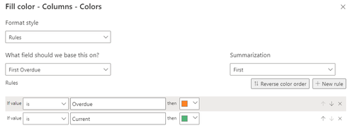
I'm trying to figure out how to do CF with Text values for a stacked col chart. Nothing is working. Maybe it can't do it, but I would think so? Two graphs feed off of the data, and there are only two values, Current and Overdue. I'd like the column visuals to match the pie chart in color based off of condition. I suppose I'd also want the default color for the columns (when both Current and Overdue are selected in the Pie chart to be another color. Doesn't matter what color right now.
Here's the visual I currently have, and then my CF entry:
Both selected:
Overdue selected:
Current selected:
NOTE: In Visualizations | Visual | Columns, I have Show All off, however the colors for each individual are that of the medium Orange color, same as for the Overdue in the Pie Chart. I have that turned off though. If I change that, the colors are all over the place:
This is nothing like excel 😞
Any help would be great, and thank you in advance if you would.
Solved! Go to Solution.
- Mark as New
- Bookmark
- Subscribe
- Mute
- Subscribe to RSS Feed
- Permalink
- Report Inappropriate Content
I used the Legend for Status, X axis for Status, and Y for Count of Status. Then I can change the colors manually. Conditional Formatting needs to work in these situations, or not be an option when a graph is selected for editing.
- Mark as New
- Bookmark
- Subscribe
- Mute
- Subscribe to RSS Feed
- Permalink
- Report Inappropriate Content
@NotMyJob , Conditional formatting is not supported in a chart with legend or multiple measures
You have workaround for pie, not for line
How to do conditional formatting by measure and apply it on pie?
https://www.youtube.com/watch?v=RqBb5eBf_I4&list=PLPaNVDMhUXGYo50Ajmr4SgSV9HIQLxc8L
https://community.powerbi.com/t5/Community-Blog/Power-BI-Conditional-formatting-the-Pie-Visual/ba-p/...
https://amitchandak.medium.com/power-bi-where-is-the-conditional-formatting-option-in-new-format-pan...
- Mark as New
- Bookmark
- Subscribe
- Mute
- Subscribe to RSS Feed
- Permalink
- Report Inappropriate Content
I used the Legend for Status, X axis for Status, and Y for Count of Status. Then I can change the colors manually. Conditional Formatting needs to work in these situations, or not be an option when a graph is selected for editing.
Helpful resources

Power BI Dataviz World Championships
The Power BI Data Visualization World Championships is back! Get ahead of the game and start preparing now!

| User | Count |
|---|---|
| 39 | |
| 37 | |
| 33 | |
| 33 | |
| 29 |
| User | Count |
|---|---|
| 134 | |
| 96 | |
| 78 | |
| 67 | |
| 65 |


