Get Fabric certified for FREE!
Don't miss your chance to take the Fabric Data Engineer (DP-700) exam on us!
Learn more- Power BI forums
- Get Help with Power BI
- Desktop
- Service
- Report Server
- Power Query
- Mobile Apps
- Developer
- DAX Commands and Tips
- Custom Visuals Development Discussion
- Health and Life Sciences
- Power BI Spanish forums
- Translated Spanish Desktop
- Training and Consulting
- Instructor Led Training
- Dashboard in a Day for Women, by Women
- Galleries
- Data Stories Gallery
- Themes Gallery
- Contests Gallery
- QuickViz Gallery
- Quick Measures Gallery
- Visual Calculations Gallery
- Notebook Gallery
- Translytical Task Flow Gallery
- TMDL Gallery
- R Script Showcase
- Webinars and Video Gallery
- Ideas
- Custom Visuals Ideas (read-only)
- Issues
- Issues
- Events
- Upcoming Events
We've captured the moments from FabCon & SQLCon that everyone is talking about, and we are bringing them to the community, live and on-demand. Starts on April 14th. Register now
- Power BI forums
- Forums
- Get Help with Power BI
- Desktop
- Re: Conditional Formatting: Number to Text
- Subscribe to RSS Feed
- Mark Topic as New
- Mark Topic as Read
- Float this Topic for Current User
- Bookmark
- Subscribe
- Printer Friendly Page
- Mark as New
- Bookmark
- Subscribe
- Mute
- Subscribe to RSS Feed
- Permalink
- Report Inappropriate Content
Conditional Formatting: Number to Text
I have a column called "Projected Hour Variance" that shows a percentage. I have this on a card visual, but instead of the percentage appearing, I want to show text OR show a red/yellow/green dot.
For example:
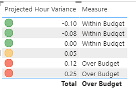
If the value is between -10% and 0%, I want text to appear as "Within Budget" OR have a green dot.
If the value is more than 10%, I want text to appear as "Over Budget" OR have a red dot.
How do I do this?
Solved! Go to Solution.
- Mark as New
- Bookmark
- Subscribe
- Mute
- Subscribe to RSS Feed
- Permalink
- Report Inappropriate Content
Hi @Anonymous ,
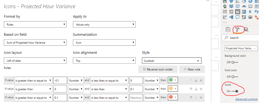
Please try this:
Or create a measure:
Measure =
var pro = MAX('Table'[Projected Hour Variance])
return
IF( pro <=0 && pro >= -0.1,"Within Budget",IF(pro>=0.1,"Over Budget",""))
Xue Ding
If this post helps, then please consider Accept it as the solution to help the other members find it more quickly.
- Mark as New
- Bookmark
- Subscribe
- Mute
- Subscribe to RSS Feed
- Permalink
- Report Inappropriate Content
@Anonymous ,
Try a below DAX measure:

Please take a quick glance at newly created dashboards : Restaurant Management Dashboard , HR Analytics Report , Hotel Management Report, Sales Analysis Report , Fortune 500 Companies Analysis , Revenue Tracking Dashboard
- Mark as New
- Bookmark
- Subscribe
- Mute
- Subscribe to RSS Feed
- Permalink
- Report Inappropriate Content
@Anonymous , You can create a color measure and use UNICHAR to display
example
Color Year = if(FIRSTNONBLANK('Table'[Year],2014) <=2016,"lightgreen",if(FIRSTNONBLANK('Table'[Year],2014)>2018,"red","yellow"))
refer these two
https://community.powerbi.com/t5/Desktop/FORMAT-icon-set-for-use-in-a-data-card/td-p/811692
https://exceleratorbi.com.au/conditional-formatting-using-icons-in-power-bi/
- Mark as New
- Bookmark
- Subscribe
- Mute
- Subscribe to RSS Feed
- Permalink
- Report Inappropriate Content
How or where do I add these formulas?
Helpful resources

New to Fabric Survey
If you have recently started exploring Fabric, we'd love to hear how it's going. Your feedback can help with product improvements.

Power BI DataViz World Championships - June 2026
A new Power BI DataViz World Championship is coming this June! Don't miss out on submitting your entry.

Join our Fabric User Panel
Share feedback directly with Fabric product managers, participate in targeted research studies and influence the Fabric roadmap.

| User | Count |
|---|---|
| 55 | |
| 40 | |
| 35 | |
| 19 | |
| 18 |
| User | Count |
|---|---|
| 71 | |
| 70 | |
| 38 | |
| 35 | |
| 23 |


