Join the Fabric User Panel to shape the future of Fabric.
Share feedback directly with Fabric product managers, participate in targeted research studies and influence the Fabric roadmap.
Sign up now- Power BI forums
- Get Help with Power BI
- Desktop
- Service
- Report Server
- Power Query
- Mobile Apps
- Developer
- DAX Commands and Tips
- Custom Visuals Development Discussion
- Health and Life Sciences
- Power BI Spanish forums
- Translated Spanish Desktop
- Training and Consulting
- Instructor Led Training
- Dashboard in a Day for Women, by Women
- Galleries
- Data Stories Gallery
- Themes Gallery
- Contests Gallery
- QuickViz Gallery
- Quick Measures Gallery
- Visual Calculations Gallery
- Notebook Gallery
- Translytical Task Flow Gallery
- TMDL Gallery
- R Script Showcase
- Webinars and Video Gallery
- Ideas
- Custom Visuals Ideas (read-only)
- Issues
- Issues
- Events
- Upcoming Events
Get Fabric certified for FREE! Don't miss your chance! Learn more
- Power BI forums
- Forums
- Get Help with Power BI
- Desktop
- Comparision/Benchmark chart
- Subscribe to RSS Feed
- Mark Topic as New
- Mark Topic as Read
- Float this Topic for Current User
- Bookmark
- Subscribe
- Printer Friendly Page
- Mark as New
- Bookmark
- Subscribe
- Mute
- Subscribe to RSS Feed
- Permalink
- Report Inappropriate Content
Comparision/Benchmark chart
Hello,
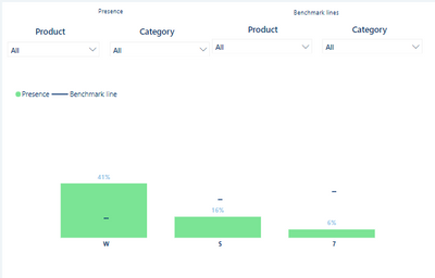
I would like to prepare a comparision/benchmark chart like one down below, where "Presence" bar is filtered by "Presence" filters and it doesn't change "Benchmark line" values and vice versa - "Benchmark lines" filters changes % on "Benchmark line" but doesnt change "Presence" bar. The measure used in both will be the same, but business will compare for instance Presence of Category = "Audio" with Benchmark line of Category = "TV". Hope it clarifies a bit. I'd also mention that Product and Category are from different tables if that counts
Thank you in advance for your help
- Mark as New
- Bookmark
- Subscribe
- Mute
- Subscribe to RSS Feed
- Permalink
- Report Inappropriate Content
@Pbiuserr , Refer if this can help
Compare Categorical Data Using Slicers - Compare two Brands: https://youtu.be/exN4nTewgbc
- Mark as New
- Bookmark
- Subscribe
- Mute
- Subscribe to RSS Feed
- Permalink
- Report Inappropriate Content
Thanks. What if instead of Brand I have like 5 columns which I want to compare? How to create such measure
I understand and can recreate this on single slicer but I'd need few of them
Helpful resources

Join our Fabric User Panel
Share feedback directly with Fabric product managers, participate in targeted research studies and influence the Fabric roadmap.

| User | Count |
|---|---|
| 68 | |
| 59 | |
| 44 | |
| 20 | |
| 15 |

