FabCon is coming to Atlanta
Join us at FabCon Atlanta from March 16 - 20, 2026, for the ultimate Fabric, Power BI, AI and SQL community-led event. Save $200 with code FABCOMM.
Register now!- Power BI forums
- Get Help with Power BI
- Desktop
- Service
- Report Server
- Power Query
- Mobile Apps
- Developer
- DAX Commands and Tips
- Custom Visuals Development Discussion
- Health and Life Sciences
- Power BI Spanish forums
- Translated Spanish Desktop
- Training and Consulting
- Instructor Led Training
- Dashboard in a Day for Women, by Women
- Galleries
- Data Stories Gallery
- Themes Gallery
- Contests Gallery
- QuickViz Gallery
- Quick Measures Gallery
- Visual Calculations Gallery
- Notebook Gallery
- Translytical Task Flow Gallery
- TMDL Gallery
- R Script Showcase
- Webinars and Video Gallery
- Ideas
- Custom Visuals Ideas (read-only)
- Issues
- Issues
- Events
- Upcoming Events
The Power BI Data Visualization World Championships is back! Get ahead of the game and start preparing now! Learn more
- Power BI forums
- Forums
- Get Help with Power BI
- Desktop
- Comparing district sales to total sales in a clust...
- Subscribe to RSS Feed
- Mark Topic as New
- Mark Topic as Read
- Float this Topic for Current User
- Bookmark
- Subscribe
- Printer Friendly Page
- Mark as New
- Bookmark
- Subscribe
- Mute
- Subscribe to RSS Feed
- Permalink
- Report Inappropriate Content
Comparing district sales to total sales in a clustered column chart....problems
I am not entirely sure this is possible but here is what I am trying to do...
I want to create a column chart that shows 2 columns, district sales compared to total sales. The axis is a series of products and the values is a 13 week sales average calculation. Ideally I can create a slicer that someone can then select through each district to see the comparison of average sales to total average sales (to see if the district is below or above the sales average for all districts).
I feel like there is a simpler way to do this but I am overthinking it. Or not thinking about it enough. I do not think a slicer can work on part of a graph (because I want the slicer to pass through districts to one column on the graph but not the total sales, that should stay static throughout the graph).
I have been messing with the Analytics tab to no avail. I am open to any solution. Any help is appreciated!
Solved! Go to Solution.
- Mark as New
- Bookmark
- Subscribe
- Mute
- Subscribe to RSS Feed
- Permalink
- Report Inappropriate Content
Hey @tylerfutures
Thanks for the info, it helped replicate your situtation. I think I got it... hopefully I modeled your data correctly. Try this:
Measure =
VAR CurrentSic = FIRSTNONBLANK(SIC[SIC_Code], 1)
RETURN
CALCULATE(
    AVERAGE(District[SalesAmount]),
    FILTER(ALL(District), RELATED(SIC[SIC_Code]) = CurrentSic)
)
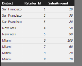
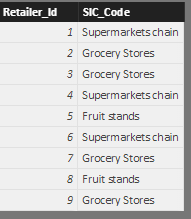
I created 2 tables that look like this (District on the left, SIC on the right):
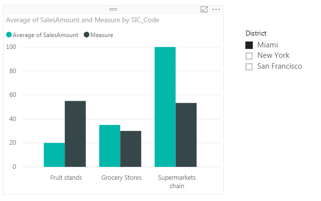
With the measure above, you end up with a visualization that looks like:
Hopefully I didn't over-simplify your data model and this still holds up for you.
Let me know if it works!
Parker
- Mark as New
- Bookmark
- Subscribe
- Mute
- Subscribe to RSS Feed
- Permalink
- Report Inappropriate Content
Hey @tylerfutures
Maybe try to create a measure with the following formula:
TotalAverage =
CALCULATE(
    AVERAGE(Test[Sales]),
    ALL(Test)
)
The ALL clause will remove the filters and use all of your data in your calculation. Give that a try and let me know how that works for you.
Thanks,
Parker
- Mark as New
- Bookmark
- Subscribe
- Mute
- Subscribe to RSS Feed
- Permalink
- Report Inappropriate Content
Thank you for the quick reply! I sense this is so close to the final solution. I am going to tinker with it.
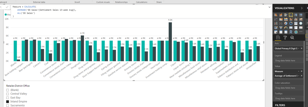
I have a quick question for you, is there a way the measure can follow the axis as well? I've attached a photo:
One thing I'll mention is the SIC code data on the axis is contained in a different data source...should I merge the two? Then I can possibly use the measure you created to segment by SIC?
Thank you again for the help, this is amazing!
- Mark as New
- Bookmark
- Subscribe
- Mute
- Subscribe to RSS Feed
- Permalink
- Report Inappropriate Content
Hey @tylerfutures
I'm having some trouble figuring out how your data is set up. I bet you're good to keep your table set up the same as you have it, but could you post some pictures of your table set up? Maybe show the two tables in the data tab.
Thanks,
Parker
- Mark as New
- Bookmark
- Subscribe
- Mute
- Subscribe to RSS Feed
- Permalink
- Report Inappropriate Content
Yeah no problem. And I truly appreciate the help Parker, I would not have even come close to stumbling upon your measure!
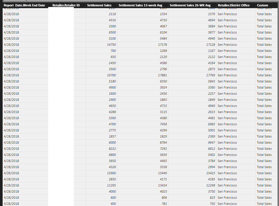
The main data I am grabbing is below. I ommitted some of the sensitive information, I do not think it is harmful to reveal it but just to be sure! You can see that I am getting the 13 week average and district office from this data set.
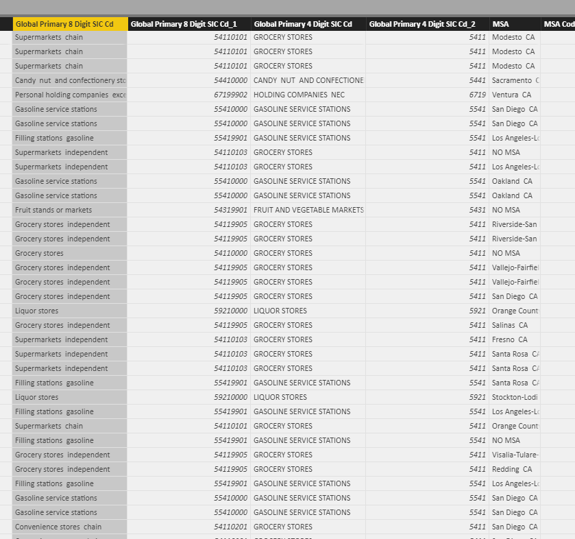
The second data set has a multitude of columns that are not relevant for this, only the SIC code. Each retailer has a SIC code. The data is joined by Retailer ID in both data sets, a one to one relationship.
The report I'm trying to build is showing the average of all retailers in a particular SIC code and averaging their 13 week sales average. When applying a slicer someone can drill down to a particular district office.
The second column in the report will show a total of all retailers (no district distinction) and their 13 week sales averages by SIC code. From the main report screenshot I sent, I can tell that your measure is grabbing the average of everything, however it is not passing along the SIC codes on the axis to it. I am guessing this is something to do within the measure...some kind of tweak that allows the measure to bypass the slicer but still calculate an average of all retailers within that particular SIC code?
Either way your help has been tremendous. I feel like the measure is incredibly close. Any input would be fantastic!
- Mark as New
- Bookmark
- Subscribe
- Mute
- Subscribe to RSS Feed
- Permalink
- Report Inappropriate Content
Hey @tylerfutures
Thanks for the info, it helped replicate your situtation. I think I got it... hopefully I modeled your data correctly. Try this:
Measure =
VAR CurrentSic = FIRSTNONBLANK(SIC[SIC_Code], 1)
RETURN
CALCULATE(
    AVERAGE(District[SalesAmount]),
    FILTER(ALL(District), RELATED(SIC[SIC_Code]) = CurrentSic)
)
I created 2 tables that look like this (District on the left, SIC on the right):
With the measure above, you end up with a visualization that looks like:
Hopefully I didn't over-simplify your data model and this still holds up for you.
Let me know if it works!
Parker
- Mark as New
- Bookmark
- Subscribe
- Mute
- Subscribe to RSS Feed
- Permalink
- Report Inappropriate Content
This looks like a winner! That is brilliant work Parker! Thank you so much!!!
- Mark as New
- Bookmark
- Subscribe
- Mute
- Subscribe to RSS Feed
- Permalink
- Report Inappropriate Content
Awesome @tylerfutures!
Glad this worked out! Could you make sure to mark the last response as the solution for anyone who finds this thread in the future?
Thanks,
Parker
Helpful resources

Power BI Dataviz World Championships
The Power BI Data Visualization World Championships is back! Get ahead of the game and start preparing now!

| User | Count |
|---|---|
| 38 | |
| 38 | |
| 36 | |
| 28 | |
| 28 |
| User | Count |
|---|---|
| 124 | |
| 89 | |
| 73 | |
| 66 | |
| 65 |
