FabCon is coming to Atlanta
Join us at FabCon Atlanta from March 16 - 20, 2026, for the ultimate Fabric, Power BI, AI and SQL community-led event. Save $200 with code FABCOMM.
Register now!- Power BI forums
- Get Help with Power BI
- Desktop
- Service
- Report Server
- Power Query
- Mobile Apps
- Developer
- DAX Commands and Tips
- Custom Visuals Development Discussion
- Health and Life Sciences
- Power BI Spanish forums
- Translated Spanish Desktop
- Training and Consulting
- Instructor Led Training
- Dashboard in a Day for Women, by Women
- Galleries
- Data Stories Gallery
- Themes Gallery
- Contests Gallery
- QuickViz Gallery
- Quick Measures Gallery
- Visual Calculations Gallery
- Notebook Gallery
- Translytical Task Flow Gallery
- TMDL Gallery
- R Script Showcase
- Webinars and Video Gallery
- Ideas
- Custom Visuals Ideas (read-only)
- Issues
- Issues
- Events
- Upcoming Events
Learn from the best! Meet the four finalists headed to the FINALS of the Power BI Dataviz World Championships! Register now
- Power BI forums
- Forums
- Get Help with Power BI
- Desktop
- Re: Compact Histogram
- Subscribe to RSS Feed
- Mark Topic as New
- Mark Topic as Read
- Float this Topic for Current User
- Bookmark
- Subscribe
- Printer Friendly Page
- Mark as New
- Bookmark
- Subscribe
- Mute
- Subscribe to RSS Feed
- Permalink
- Report Inappropriate Content
Compact Histogram
Hello everyone,
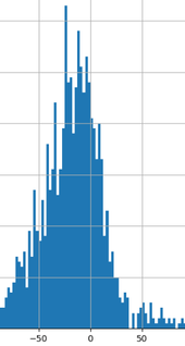
Maybe someone can give me an idea how to create a compact histogram in Power BI like following:
I have a lot of consumption values which i assign to different categories like
and so on...
-5.0 to -2.5 Percent
-2.5 to 0 Percent
0 to 2.5 Percent
2.5 to 5.0 Percent
and so on...
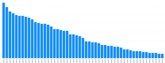
When I use this categories for the x-axis i get something like that:
Two difficulties:
- Sorting because the categories are in type text
- It is not compact and i have to scroll because there are to many categories
The sorting problem i could maybe solve by creating a new column with numbers and assign to the categories. But how can i represent the categories without scrolling at the end? I dont see a possibility to move the columns together. Maybe there are appropriate visuals to do things like that?
Many thanks for ideas.
- Mark as New
- Bookmark
- Subscribe
- Mute
- Subscribe to RSS Feed
- Permalink
- Report Inappropriate Content
Hi @Anonymous
many thanks for your response. I was thinking about python. Are there some suitable / helpful sides with python codes for histograms? Otherwise i will search.
- Mark as New
- Bookmark
- Subscribe
- Mute
- Subscribe to RSS Feed
- Permalink
- Report Inappropriate Content
Hi @Pikachu-Power ,
Here:
Create Power BI visuals using Python in Power BI Desktop - Power BI | Microsoft Learn
Using Python Visuals in Power BI - AbsentData
Histograms — Matplotlib 3.8.2 documentation
Best Regards,
Gao
Community Support Team
If there is any post helps, then please consider Accept it as the solution to help the other members find it more quickly.
If I misunderstand your needs or you still have problems on it, please feel free to let us know. Thanks a lot!
How to get your questions answered quickly -- How to provide sample data in the Power BI Forum -- China Power BI User Group
- Mark as New
- Bookmark
- Subscribe
- Mute
- Subscribe to RSS Feed
- Permalink
- Report Inappropriate Content
I have 222,000 rows in my dataset. Does the limitation of 150,000 rows are also valid for histogram??
When i try bar plot my calculation exceeds five minutes and run into time out. But for histogram it seems to work and i get no message. So i dont know if there is a mistake in my results.
- Mark as New
- Bookmark
- Subscribe
- Mute
- Subscribe to RSS Feed
- Permalink
- Report Inappropriate Content
Hi @Pikachu-Power ,
I've done some testing and can't seem to get rid of the column chart gaps.
Consider use some custom visuals:
Business Apps – Microsoft AppSource
Templates | Deneb (deneb-viz.github.io)
Example Gallery | Vega-Lite
Histogram Example | Vega
Best Regards,
Gao
Community Support Team
If there is any post helps, then please consider Accept it as the solution to help the other members find it more quickly.
If I misunderstand your needs or you still have problems on it, please feel free to let us know. Thanks a lot!
How to get your questions answered quickly -- How to provide sample data in the Power BI Forum -- China Power BI User Group
- Mark as New
- Bookmark
- Subscribe
- Mute
- Subscribe to RSS Feed
- Permalink
- Report Inappropriate Content
Try to use small multiples - https://learn.microsoft.com/en-us/power-bi/visuals/power-bi-visualization-small-multiples
Helpful resources

Join our Fabric User Panel
Share feedback directly with Fabric product managers, participate in targeted research studies and influence the Fabric roadmap.

Power BI Monthly Update - February 2026
Check out the February 2026 Power BI update to learn about new features.

| User | Count |
|---|---|
| 53 | |
| 51 | |
| 39 | |
| 15 | |
| 14 |
| User | Count |
|---|---|
| 94 | |
| 81 | |
| 34 | |
| 29 | |
| 25 |


