Party with Power BI’s own Guy in a Cube
Power BI is turning 10! Tune in for a special live episode on July 24 with behind-the-scenes stories, product evolution highlights, and a sneak peek at what’s in store for the future.
Save the date- Power BI forums
- Get Help with Power BI
- Desktop
- Service
- Report Server
- Power Query
- Mobile Apps
- Developer
- DAX Commands and Tips
- Custom Visuals Development Discussion
- Health and Life Sciences
- Power BI Spanish forums
- Translated Spanish Desktop
- Training and Consulting
- Instructor Led Training
- Dashboard in a Day for Women, by Women
- Galleries
- Data Stories Gallery
- Themes Gallery
- Contests Gallery
- Quick Measures Gallery
- Notebook Gallery
- Translytical Task Flow Gallery
- TMDL Gallery
- R Script Showcase
- Webinars and Video Gallery
- Ideas
- Custom Visuals Ideas (read-only)
- Issues
- Issues
- Events
- Upcoming Events
Enhance your career with this limited time 50% discount on Fabric and Power BI exams. Ends August 31st. Request your voucher.
- Power BI forums
- Forums
- Get Help with Power BI
- Desktop
- Re: Combo chart with multiple column series
- Subscribe to RSS Feed
- Mark Topic as New
- Mark Topic as Read
- Float this Topic for Current User
- Bookmark
- Subscribe
- Printer Friendly Page
- Mark as New
- Bookmark
- Subscribe
- Mute
- Subscribe to RSS Feed
- Permalink
- Report Inappropriate Content
Combo chart with multiple column series
Dear fellow Power BI users,
I have been trying to reproduce the following excel chart in Power BI:
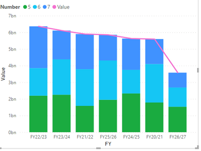
But only can do this:
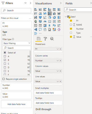
When trying to create a combo chart in Power BI with the same data, I run upon two problems:
- I cannot choose two variables for the column series so as to have both NAME and Number (see that NAME is also collapsed for 2021 in the pivot table/chart)
- I cannot choose independently for different values in the chart if I want a line chart or a stacked column like I would do in excel.
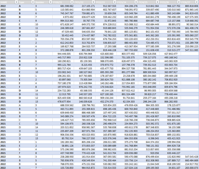
The data I'm using is the following:
Where I have unpivotted the columns to have:
Any help in the matter would be much appreciated
- Mark as New
- Bookmark
- Subscribe
- Mute
- Subscribe to RSS Feed
- Permalink
- Report Inappropriate Content
@far , You can use two legends or two measures with legend on stacked visual
REFER these
https://github.com/microsoft/charticulator/issues/219
https://appsource.microsoft.com/en-us/product/power-bi-visuals/wa200001934?tab=overview
- Mark as New
- Bookmark
- Subscribe
- Mute
- Subscribe to RSS Feed
- Permalink
- Report Inappropriate Content
Hi @amitchandak , would you have any advice on how to create a mixed chart in Charticulator so as to have both a line and a bar chart on the same graph?
- Mark as New
- Bookmark
- Subscribe
- Mute
- Subscribe to RSS Feed
- Permalink
- Report Inappropriate Content
Hi @amitchandak ,
I cannot find a tuto on how to produce a line chart over a stacked colument chart like the one I showcased with charticulator.
Could you point me on how to do it?
Thanks!


