A new Data Days event is coming soon!
This time we’re going bigger than ever. Fabric, Power BI, SQL, AI and more. We're covering it all. You won't want to miss it.
Learn more- Power BI forums
- Get Help with Power BI
- Desktop
- Service
- Report Server
- Power Query
- Mobile Apps
- Developer
- DAX Commands and Tips
- Custom Visuals Development Discussion
- Health and Life Sciences
- Power BI Spanish forums
- Translated Spanish Desktop
- Training and Consulting
- Instructor Led Training
- Dashboard in a Day for Women, by Women
- Galleries
- Data Stories Gallery
- Themes Gallery
- Contests Gallery
- QuickViz Gallery
- Quick Measures Gallery
- Visual Calculations Gallery
- Notebook Gallery
- Translytical Task Flow Gallery
- TMDL Gallery
- R Script Showcase
- Webinars and Video Gallery
- Ideas
- Custom Visuals Ideas (read-only)
- Issues
- Issues
- Events
- Upcoming Events
Level up your Power BI skills this month - build one visual each week and tell better stories with data! Get started
- Power BI forums
- Forums
- Get Help with Power BI
- Desktop
- Combo Graph & Date Alignment
- Subscribe to RSS Feed
- Mark Topic as New
- Mark Topic as Read
- Float this Topic for Current User
- Bookmark
- Subscribe
- Printer Friendly Page
- Mark as New
- Bookmark
- Subscribe
- Mute
- Subscribe to RSS Feed
- Permalink
- Report Inappropriate Content
Combo Graph & Date Alignment
Hi,
I am new here and new to Power Bi, so apologies if this post is in the wrong section. I was just wondering if it is possible to create a report similar to the image below. It needs to fulfill two criteria:
1) For each graph the x/date axis needs to match up with the one above/below,
2) I am able to have two vertical axes (combo graphs), such as EC and pH (top graph) and Rainfall and Water Level (middle)
If this is possible, any help or direction to how this can be done would be greatly appreciated. I have been struggling to figure out how to do these. In Excel I can do the combo graphs but not the x-axis alignment (in a straight forward way at least)
Kind regards,
Luke
Solved! Go to Solution.
- Mark as New
- Bookmark
- Subscribe
- Mute
- Subscribe to RSS Feed
- Permalink
- Report Inappropriate Content
Hi @lukhe81 ,
There's no visual you mentioned.
As a workaround,
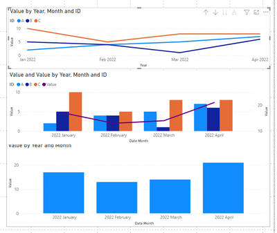
you could create a clustered column chart, a line chart and a line and clustered column chart. And then group three visuals. This way you can get a whole object.
For date alignment, you may need to change the visual size to keep the date aligned.
Reference: Use grouping in Power BI Desktop - Power BI | Microsoft Docs
Best Regards,
Stephen Tao
If this post helps, then please consider Accept it as the solution to help the other members find it more quickly.
- Mark as New
- Bookmark
- Subscribe
- Mute
- Subscribe to RSS Feed
- Permalink
- Report Inappropriate Content
Thanks. I'll have a play around with it some more, and post back when I have something I am happy with.
Cheers,
Luke
- Mark as New
- Bookmark
- Subscribe
- Mute
- Subscribe to RSS Feed
- Permalink
- Report Inappropriate Content
Hi @lukhe81 ,
There's no visual you mentioned.
As a workaround,
you could create a clustered column chart, a line chart and a line and clustered column chart. And then group three visuals. This way you can get a whole object.
For date alignment, you may need to change the visual size to keep the date aligned.
Reference: Use grouping in Power BI Desktop - Power BI | Microsoft Docs
Best Regards,
Stephen Tao
If this post helps, then please consider Accept it as the solution to help the other members find it more quickly.
- Mark as New
- Bookmark
- Subscribe
- Mute
- Subscribe to RSS Feed
- Permalink
- Report Inappropriate Content
@lukhe81 , small multiples or small multiples with Calculation groups
Calculation Groups - Use Measure with small multiple : https://www.youtube.com/watch?v=LEn6ZnScMZc
Helpful resources

Power BI Monthly Update - April 2026
Check out the April 2026 Power BI update to learn about new features.

Data Days 2026 coming soon!
Sign up to receive a private message when registration opens and key events begin.

New to Fabric Survey
If you have recently started exploring Fabric, we'd love to hear how it's going. Your feedback can help with product improvements.

| User | Count |
|---|---|
| 34 | |
| 26 | |
| 25 | |
| 22 | |
| 18 |
| User | Count |
|---|---|
| 65 | |
| 35 | |
| 32 | |
| 25 | |
| 23 |


