FabCon is coming to Atlanta
Join us at FabCon Atlanta from March 16 - 20, 2026, for the ultimate Fabric, Power BI, AI and SQL community-led event. Save $200 with code FABCOMM.
Register now!- Power BI forums
- Get Help with Power BI
- Desktop
- Service
- Report Server
- Power Query
- Mobile Apps
- Developer
- DAX Commands and Tips
- Custom Visuals Development Discussion
- Health and Life Sciences
- Power BI Spanish forums
- Translated Spanish Desktop
- Training and Consulting
- Instructor Led Training
- Dashboard in a Day for Women, by Women
- Galleries
- Data Stories Gallery
- Themes Gallery
- Contests Gallery
- QuickViz Gallery
- Quick Measures Gallery
- Visual Calculations Gallery
- Notebook Gallery
- Translytical Task Flow Gallery
- TMDL Gallery
- R Script Showcase
- Webinars and Video Gallery
- Ideas
- Custom Visuals Ideas (read-only)
- Issues
- Issues
- Events
- Upcoming Events
The Power BI Data Visualization World Championships is back! Get ahead of the game and start preparing now! Learn more
- Power BI forums
- Forums
- Get Help with Power BI
- Desktop
- Re: Combo Chart: Line values only shows when colum...
- Subscribe to RSS Feed
- Mark Topic as New
- Mark Topic as Read
- Float this Topic for Current User
- Bookmark
- Subscribe
- Printer Friendly Page
- Mark as New
- Bookmark
- Subscribe
- Mute
- Subscribe to RSS Feed
- Permalink
- Report Inappropriate Content
Combo Chart: Line values only shows when column values are not blank
Hi everyone!
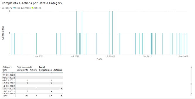
I have a situation here with the combo chart: I want to related two measures, but the line values only shows when the columns values are not blank.
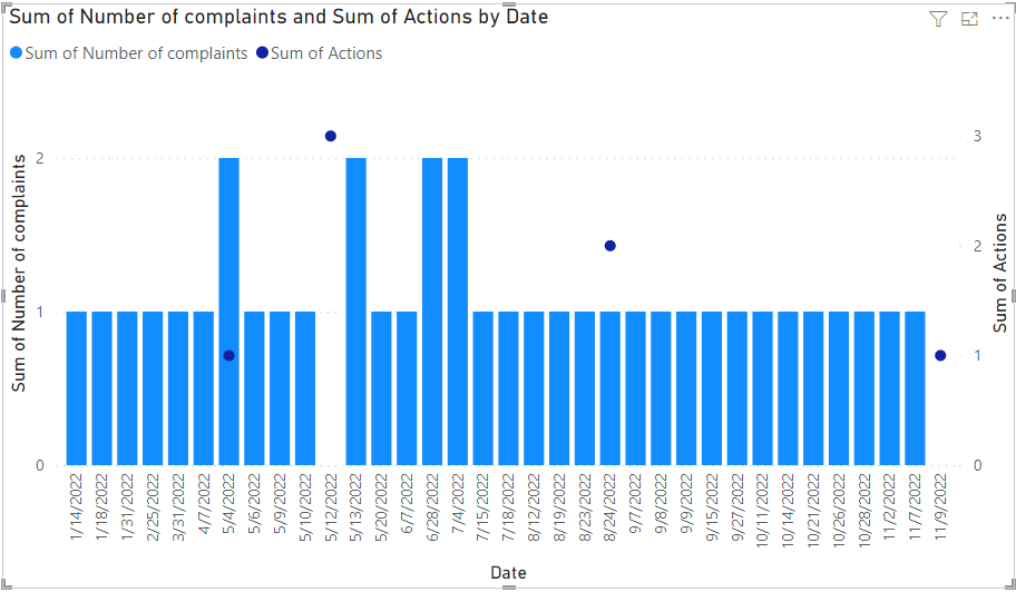
In the image the table shows that at 12-05 I have 3 actions, but as I don't have any complaints, it doesn't shows the line values.
If I choose to show itens with no data for the date in x axis, I have this:
Do you know if I have another option here? "Show itens with no data" is not something I want, because I need to add some filters to the graph, otherwise would be too much info that don't need to be there. And the dots get connected.
If I change the x axis to "week", I have what would be the perfect scenario, but per week and not for the exactly date. The perfect scenario includes the dots not being connected, just the dots.
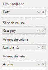
To clarify possible doubts: the two measures are in separated tables, but both have a data table connecting their date column.
I didn't upload a sample of the file because looks to me that is more as something possible or not possible to do.. But if you think it helps, I can make one and post it here 🙂
Thank you in advance!!
Solved! Go to Solution.
- Mark as New
- Bookmark
- Subscribe
- Mute
- Subscribe to RSS Feed
- Permalink
- Report Inappropriate Content
Hi, @Lucas_Phil
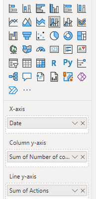
You can try the following methods. Use Line and stacked column chart views.
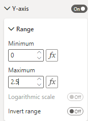
Modify the range of 2 Y-axes.
Result:
Is this the result you expect?
Best Regards,
Community Support Team _Charlotte
If this post helps, then please consider Accept it as the solution to help the other members find it more quickly.
- Mark as New
- Bookmark
- Subscribe
- Mute
- Subscribe to RSS Feed
- Permalink
- Report Inappropriate Content
Hi, @Lucas_Phil
Listening to your description should be achievable. Can you provide easy data for testing? The output you expect can also be shown in pictures or excel.
Best Regards,
Community Support Team _Charlotte
If this post helps, then please consider Accept it as the solution to help the other members find it more quickly.
- Mark as New
- Bookmark
- Subscribe
- Mute
- Subscribe to RSS Feed
- Permalink
- Report Inappropriate Content
Hi @v-zhangti !!
Sorry to bother you, but did you have time to take a look on this?
I tried some importaded visuals, but none until now satisfied with the exact same result I'm expecting.
Thank you!
- Mark as New
- Bookmark
- Subscribe
- Mute
- Subscribe to RSS Feed
- Permalink
- Report Inappropriate Content
Hi, @v-zhangti !
Thanks for your reply.
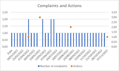
The expected output should be something like this.
The data sample:
https://docs.google.com/spreadsheets/d/1remOWfAXZ6UrX64EZlOxQdxkcjc1YUoY/edit?usp=sharing&ouid=10939...
Thank you again!
- Mark as New
- Bookmark
- Subscribe
- Mute
- Subscribe to RSS Feed
- Permalink
- Report Inappropriate Content
Hi, @Lucas_Phil
You can try the following methods. Use Line and stacked column chart views.
Modify the range of 2 Y-axes.
Result:
Is this the result you expect?
Best Regards,
Community Support Team _Charlotte
If this post helps, then please consider Accept it as the solution to help the other members find it more quickly.
Helpful resources

Power BI Monthly Update - November 2025
Check out the November 2025 Power BI update to learn about new features.

Fabric Data Days
Advance your Data & AI career with 50 days of live learning, contests, hands-on challenges, study groups & certifications and more!

| User | Count |
|---|---|
| 57 | |
| 43 | |
| 41 | |
| 22 | |
| 17 |
| User | Count |
|---|---|
| 183 | |
| 114 | |
| 93 | |
| 62 | |
| 45 |
