Become a Certified Power BI Data Analyst!
Join us for an expert-led overview of the tools and concepts you'll need to pass exam PL-300. The first session starts on June 11th. See you there!
Get registered- Power BI forums
- Get Help with Power BI
- Desktop
- Service
- Report Server
- Power Query
- Mobile Apps
- Developer
- DAX Commands and Tips
- Custom Visuals Development Discussion
- Health and Life Sciences
- Power BI Spanish forums
- Translated Spanish Desktop
- Training and Consulting
- Instructor Led Training
- Dashboard in a Day for Women, by Women
- Galleries
- Webinars and Video Gallery
- Data Stories Gallery
- Themes Gallery
- Contests Gallery
- Quick Measures Gallery
- Notebook Gallery
- Translytical Task Flow Gallery
- R Script Showcase
- Ideas
- Custom Visuals Ideas (read-only)
- Issues
- Issues
- Events
- Upcoming Events
Power BI is turning 10! Let’s celebrate together with dataviz contests, interactive sessions, and giveaways. Register now.
- Power BI forums
- Forums
- Get Help with Power BI
- Desktop
- Combination chart with separate x-axis at differen...
- Subscribe to RSS Feed
- Mark Topic as New
- Mark Topic as Read
- Float this Topic for Current User
- Bookmark
- Subscribe
- Printer Friendly Page
- Mark as New
- Bookmark
- Subscribe
- Mute
- Subscribe to RSS Feed
- Permalink
- Report Inappropriate Content
Combination chart with separate x-axis at different periods
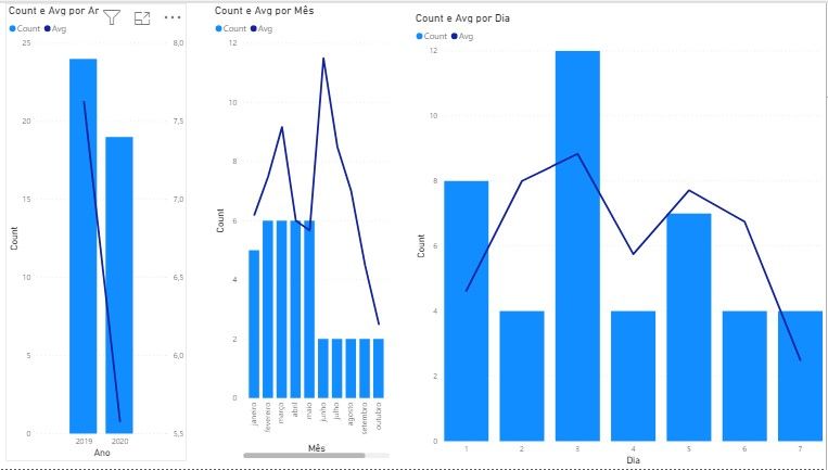
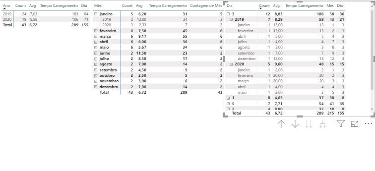
I need to set up a combination chart but on its x axis it is necessary that I have the separation of 3 periods (year, month and day) as shown in the example below. Sample.pbix
Assumptions:
Bar and line calculations use different measures.
Year Period: Display the columns and rows grouped by year for the period selected in the slice
Period Month: Display the columns and rows grouped by month for the period selected in the slice. The values here would be a break from the previous value, considering only the biggest year of the slice.
Day Period: Display the columns and rows grouped by day for the period selected in the slice. The values here would be a break from the value of the month period, considering only the largest month selected in the slice.
- Mark as New
- Bookmark
- Subscribe
- Mute
- Subscribe to RSS Feed
- Permalink
- Report Inappropriate Content
@Anonymous , This not possible using the seeded visual. Check for custom visuals
https://appsource.microsoft.com/en-us/marketplace/apps?page=1&product=power-bi-visuals
Another way is that you create a table and merge all three type of data and display
Union(
summarize( Year data),
summarize( Month data),
summarize( Day data)
)
- Mark as New
- Bookmark
- Subscribe
- Mute
- Subscribe to RSS Feed
- Permalink
- Report Inappropriate Content
@amitchandak , about the merge of periods, is there a way to make it dynamic?
I remember that as informed the periods have premises for counting lines according to each period, following a single slice
Helpful resources
| User | Count |
|---|---|
| 84 | |
| 76 | |
| 75 | |
| 43 | |
| 36 |
| User | Count |
|---|---|
| 109 | |
| 56 | |
| 52 | |
| 48 | |
| 43 |


