Become a Certified Power BI Data Analyst!
Join us for an expert-led overview of the tools and concepts you'll need to pass exam PL-300. The first session starts on June 11th. See you there!
Get registered- Power BI forums
- Get Help with Power BI
- Desktop
- Service
- Report Server
- Power Query
- Mobile Apps
- Developer
- DAX Commands and Tips
- Custom Visuals Development Discussion
- Health and Life Sciences
- Power BI Spanish forums
- Translated Spanish Desktop
- Training and Consulting
- Instructor Led Training
- Dashboard in a Day for Women, by Women
- Galleries
- Webinars and Video Gallery
- Data Stories Gallery
- Themes Gallery
- Contests Gallery
- Quick Measures Gallery
- Notebook Gallery
- Translytical Task Flow Gallery
- R Script Showcase
- Ideas
- Custom Visuals Ideas (read-only)
- Issues
- Issues
- Events
- Upcoming Events
Power BI is turning 10! Let’s celebrate together with dataviz contests, interactive sessions, and giveaways. Register now.
- Power BI forums
- Forums
- Get Help with Power BI
- Desktop
- Re: Combination chart with separate x-axis at diff...
- Subscribe to RSS Feed
- Mark Topic as New
- Mark Topic as Read
- Float this Topic for Current User
- Bookmark
- Subscribe
- Printer Friendly Page
- Mark as New
- Bookmark
- Subscribe
- Mute
- Subscribe to RSS Feed
- Permalink
- Report Inappropriate Content
Combination chart with separate x-axis at different periods
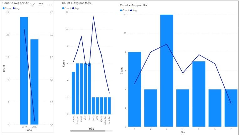
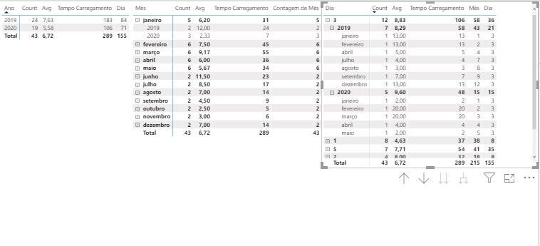
I need to set up a combination chart but on its x axis it is necessary that I have the separation of 3 periods (year, month and day) as shown in the example below. Sample.pbix
Assumptions:
Bar and line calculations use different measures.
Year Period: Display the columns and rows grouped by year for the period selected in the slice
Period Month: Display the columns and rows grouped by month for the period selected in the slice. The values here would be a break from the previous value, considering only the biggest year of the slice.
Day Period: Display the columns and rows grouped by day for the period selected in the slice. The values here would be a break from the value of the month period, considering only the largest month selected in the slice.
- Mark as New
- Bookmark
- Subscribe
- Mute
- Subscribe to RSS Feed
- Permalink
- Report Inappropriate Content
@Anonymous , This not possible using the seeded visual. Check for custom visuals
https://appsource.microsoft.com/en-us/marketplace/apps?page=1&product=power-bi-visuals
Another way is that you create a table and merge all three type of data and display
Union(
summarize( Year data),
summarize( Month data),
summarize( Day data)
)
- Mark as New
- Bookmark
- Subscribe
- Mute
- Subscribe to RSS Feed
- Permalink
- Report Inappropriate Content
@amitchandak , about the merge of periods, is there a way to make it dynamic?
I remember that as informed the periods have premises for counting lines according to each period, following a single slice
Helpful resources

Join our Fabric User Panel
This is your chance to engage directly with the engineering team behind Fabric and Power BI. Share your experiences and shape the future.

Power BI Monthly Update - June 2025
Check out the June 2025 Power BI update to learn about new features.

| User | Count |
|---|---|
| 84 | |
| 76 | |
| 73 | |
| 42 | |
| 36 |
| User | Count |
|---|---|
| 109 | |
| 56 | |
| 52 | |
| 48 | |
| 43 |


