FabCon is coming to Atlanta
Join us at FabCon Atlanta from March 16 - 20, 2026, for the ultimate Fabric, Power BI, AI and SQL community-led event. Save $200 with code FABCOMM.
Register now!- Power BI forums
- Get Help with Power BI
- Desktop
- Service
- Report Server
- Power Query
- Mobile Apps
- Developer
- DAX Commands and Tips
- Custom Visuals Development Discussion
- Health and Life Sciences
- Power BI Spanish forums
- Translated Spanish Desktop
- Training and Consulting
- Instructor Led Training
- Dashboard in a Day for Women, by Women
- Galleries
- Data Stories Gallery
- Themes Gallery
- Contests Gallery
- Quick Measures Gallery
- Notebook Gallery
- Translytical Task Flow Gallery
- TMDL Gallery
- R Script Showcase
- Webinars and Video Gallery
- Ideas
- Custom Visuals Ideas (read-only)
- Issues
- Issues
- Events
- Upcoming Events
To celebrate FabCon Vienna, we are offering 50% off select exams. Ends October 3rd. Request your discount now.
- Power BI forums
- Forums
- Get Help with Power BI
- Desktop
- Re: Columned chart not showing data from all the m...
- Subscribe to RSS Feed
- Mark Topic as New
- Mark Topic as Read
- Float this Topic for Current User
- Bookmark
- Subscribe
- Printer Friendly Page
- Mark as New
- Bookmark
- Subscribe
- Mute
- Subscribe to RSS Feed
- Permalink
- Report Inappropriate Content
Columned chart not showing data from all the months.
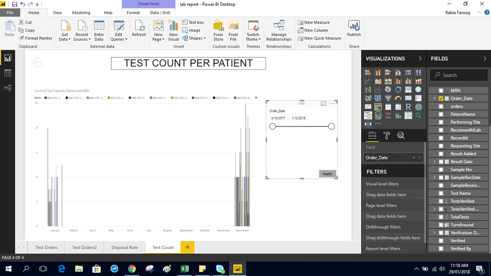
Hi. So i am kinda new to power bi and i am working on the statistics of hospital's data. What i want is i want to visualize how many tests are against each patient per day.
For that i am using line and clustered columned chart. Now the problem is the chart is showing the data for all the months of the year i.e march 2017-jan2018. But if i change the date and exclude the months of dec2017 and jan2018, it shows the correctly. .
- Mark as New
- Bookmark
- Subscribe
- Mute
- Subscribe to RSS Feed
- Permalink
- Report Inappropriate Content
Hi @rabiafarooq,
In your line and clustered columned chart, what field did you use in y-axis column? In your first screenshot, it shows all values from 2017/3/19 to 2017/12/7. In the second screenshot, why it only display Jan and December data, it is caused by the category values in [MRN], could you please share more details pr .pbix file for for further analysis?
Best Regards,
Angelia


