Get Fabric certified for FREE!
Don't miss your chance to take the Fabric Data Engineer (DP-600) exam for FREE! Find out how by watching the DP-600 session on-demand now through April 28th.
Learn more- Power BI forums
- Get Help with Power BI
- Desktop
- Service
- Report Server
- Power Query
- Mobile Apps
- Developer
- DAX Commands and Tips
- Custom Visuals Development Discussion
- Health and Life Sciences
- Power BI Spanish forums
- Translated Spanish Desktop
- Training and Consulting
- Instructor Led Training
- Dashboard in a Day for Women, by Women
- Galleries
- Data Stories Gallery
- Themes Gallery
- Contests Gallery
- QuickViz Gallery
- Quick Measures Gallery
- Visual Calculations Gallery
- Notebook Gallery
- Translytical Task Flow Gallery
- TMDL Gallery
- R Script Showcase
- Webinars and Video Gallery
- Ideas
- Custom Visuals Ideas (read-only)
- Issues
- Issues
- Events
- Upcoming Events
Join the FabCon + SQLCon recap series. Up next: Power BI, Real-Time Intelligence, IQ and AI, and Data Factory take center stage. All sessions are available on-demand after the live show. Register now
- Power BI forums
- Forums
- Get Help with Power BI
- Desktop
- Re: Column chart: space between columns when using...
- Subscribe to RSS Feed
- Mark Topic as New
- Mark Topic as Read
- Float this Topic for Current User
- Bookmark
- Subscribe
- Printer Friendly Page
- Mark as New
- Bookmark
- Subscribe
- Mute
- Subscribe to RSS Feed
- Permalink
- Report Inappropriate Content
Column chart: space between columns when using measures

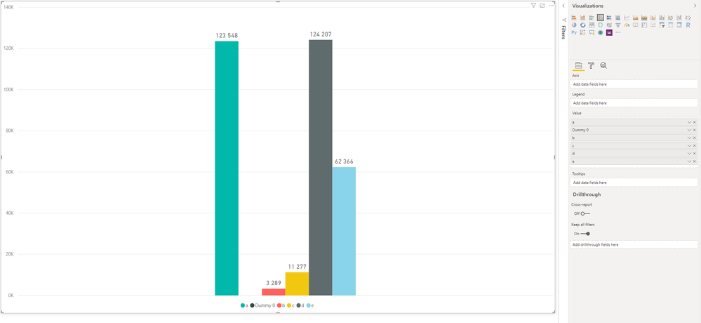
I was wondering if anyone knows how to add space between the columns in the 'Clustered column chart' when using only calculated measures?
It seems like unless a value is applied to the Axis value all the values gets grouped together with no spacing. In my case the values cannot get categorized using a column in the Axis and counting number of rows as a a row can be of more than one category.
I have seen some creative solutions such as adding a measure with blank and removing the measure name. But it seems like Power BI no longer allows you to have a measure without a name (https://community.powerbi.com/t5/Desktop/Spacing-in-column-chart/m-p/423550#M194799).
Does anyone know how I can add spacing to 'Clustered column charts'? Is there another visual that would solve this?
Best regards
Arefoss
- Mark as New
- Bookmark
- Subscribe
- Mute
- Subscribe to RSS Feed
- Permalink
- Report Inappropriate Content
Hi @Anonymous ,
You can refer to the following steps to grouping your measures and use them in the clustered column chart.
Steps:
1. Create a table with all types of measures.
Table= SELECTCOLUMNS({"a","b","c","d","e"},"Category",[Value])2. Write a measure with switch function to use above table category to return correspond measure value.
Measure =
SWITCH (
    SELECTEDVALUE ( 'Table'[Category] ),
    "a", [Measure a],
    "b", [Measure b],
    "c", [Measure c],
    "d", [Measure d],
    "e", [Measure e]
)
3. Create a clustered column chart with the above category column as axis and legend, measure as value.
Regards,
Xiaoxin Sheng
- Mark as New
- Bookmark
- Subscribe
- Mute
- Subscribe to RSS Feed
- Permalink
- Report Inappropriate Content
Hi!
Thanks a lot for your answer!
Your solution does solve my issue on my test set. But I am having trouble when applying it to a SSAS connection. When I try to create a Calculated table in SSDT I recieve an error message: "Could not complete the operation because the changes could not be committed to the VertiPaq engine."
Do you know of work around or how I could solve this.
- Mark as New
- Bookmark
- Subscribe
- Mute
- Subscribe to RSS Feed
- Permalink
- Report Inappropriate Content
Hi @Anonymous ,
Current I haven't found any methods to create a table on live connection mode. Maybe you can create a table on your database side to stored all category, then you can use its axis and category on your visual.
Regards,
Xiaoxin Sheng
Helpful resources

Power BI Monthly Update - April 2026
Check out the April 2026 Power BI update to learn about new features.

New to Fabric Survey
If you have recently started exploring Fabric, we'd love to hear how it's going. Your feedback can help with product improvements.

Power BI DataViz World Championships - June 2026
A new Power BI DataViz World Championship is coming this June! Don't miss out on submitting your entry.

| User | Count |
|---|---|
| 42 | |
| 35 | |
| 35 | |
| 21 | |
| 15 |
| User | Count |
|---|---|
| 65 | |
| 58 | |
| 28 | |
| 27 | |
| 25 |

