Party with Power BI’s own Guy in a Cube
Power BI is turning 10! Tune in for a special live episode on July 24 with behind-the-scenes stories, product evolution highlights, and a sneak peek at what’s in store for the future.
Save the date- Power BI forums
- Get Help with Power BI
- Desktop
- Service
- Report Server
- Power Query
- Mobile Apps
- Developer
- DAX Commands and Tips
- Custom Visuals Development Discussion
- Health and Life Sciences
- Power BI Spanish forums
- Translated Spanish Desktop
- Training and Consulting
- Instructor Led Training
- Dashboard in a Day for Women, by Women
- Galleries
- Webinars and Video Gallery
- Data Stories Gallery
- Themes Gallery
- Contests Gallery
- Quick Measures Gallery
- Notebook Gallery
- Translytical Task Flow Gallery
- R Script Showcase
- Ideas
- Custom Visuals Ideas (read-only)
- Issues
- Issues
- Events
- Upcoming Events
Enhance your career with this limited time 50% discount on Fabric and Power BI exams. Ends August 31st. Request your voucher.
- Power BI forums
- Forums
- Get Help with Power BI
- Desktop
- Column and Line Chart with multiple lines from one...
- Subscribe to RSS Feed
- Mark Topic as New
- Mark Topic as Read
- Float this Topic for Current User
- Bookmark
- Subscribe
- Printer Friendly Page
- Mark as New
- Bookmark
- Subscribe
- Mute
- Subscribe to RSS Feed
- Permalink
- Report Inappropriate Content
Column and Line Chart with multiple lines from one column
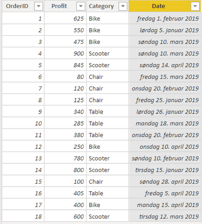
Here's a template dataset:
(PBI file: categorysales.pbix)
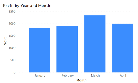
Next, I put it into a column chart to see total sales per month:
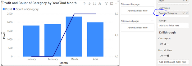
If I want to see how well each of the categories are performing for each month, a column and line chart by default does not work:
What is possible is creating measures per category and adding it to the Line Values:
Bikemeasure =
    CALCULATE(SUM(Table1[Profit]), Table1[Category] = "Bike")
I can add one for each category, and add them to the chart and get the results I want:

This gets the job done, but in a real-life dataset, I will end up with quite a few measures (X columns * Y types).
Is there a better way than this? Can variables be used within the measure, so that I end up with only one measure per column?
- Mark as New
- Bookmark
- Subscribe
- Mute
- Subscribe to RSS Feed
- Permalink
- Report Inappropriate Content
hi, @Anonymous
To my knowledge, the "lenged" column only affects the columns in a combo chart in power bi for now.
So for your requirement, there are two workaround for you refer to:
1. As you said, create different measure for each category and then drag them in Line values.
2. Exchange Line values and Column values, and then drag category into column series.
Regards,
Lin
If this post helps, then please consider Accept it as the solution to help the other members find it more quickly.
Helpful resources

Power BI Monthly Update - July 2025
Check out the July 2025 Power BI update to learn about new features.

Join our Fabric User Panel
This is your chance to engage directly with the engineering team behind Fabric and Power BI. Share your experiences and shape the future.

| User | Count |
|---|---|
| 72 | |
| 67 | |
| 51 | |
| 38 | |
| 26 |
| User | Count |
|---|---|
| 89 | |
| 52 | |
| 45 | |
| 39 | |
| 38 |


