Join us at FabCon Vienna from September 15-18, 2025
The ultimate Fabric, Power BI, SQL, and AI community-led learning event. Save €200 with code FABCOMM.
Get registered- Power BI forums
- Get Help with Power BI
- Desktop
- Service
- Report Server
- Power Query
- Mobile Apps
- Developer
- DAX Commands and Tips
- Custom Visuals Development Discussion
- Health and Life Sciences
- Power BI Spanish forums
- Translated Spanish Desktop
- Training and Consulting
- Instructor Led Training
- Dashboard in a Day for Women, by Women
- Galleries
- Data Stories Gallery
- Themes Gallery
- Contests Gallery
- Quick Measures Gallery
- Notebook Gallery
- Translytical Task Flow Gallery
- TMDL Gallery
- R Script Showcase
- Webinars and Video Gallery
- Ideas
- Custom Visuals Ideas (read-only)
- Issues
- Issues
- Events
- Upcoming Events
Enhance your career with this limited time 50% discount on Fabric and Power BI exams. Ends September 15. Request your voucher.
- Power BI forums
- Forums
- Get Help with Power BI
- Desktop
- Re: Column Chart with headers - similar to Tableau
- Subscribe to RSS Feed
- Mark Topic as New
- Mark Topic as Read
- Float this Topic for Current User
- Bookmark
- Subscribe
- Printer Friendly Page
- Mark as New
- Bookmark
- Subscribe
- Mute
- Subscribe to RSS Feed
- Permalink
- Report Inappropriate Content
Column Chart with headers - similar to Tableau
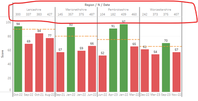
Below is the chart from Tableau. Automatic bar chart with muliple headers . What is the PBI equivalent for this?
- Mark as New
- Bookmark
- Subscribe
- Mute
- Subscribe to RSS Feed
- Permalink
- Report Inappropriate Content
Can you please suggest an alternative approach in PowerBI to achieve a similar visualization? I have disabled the concatenate feature, but whenever I change the parameters, the X-axis automatically collapses. I have to manually drill down to the last level every time.
Please provide guidance, that will save my day. thank you.
- Mark as New
- Bookmark
- Subscribe
- Mute
- Subscribe to RSS Feed
- Permalink
- Report Inappropriate Content
@jack555 ,You can not get same, You can have similar one
Refer to my two videos on this topic. Two columns on axis-> expand -> Sort on axis columns -> Concatenate label off
Bar/Clustered Bar: https://youtu.be/2P5BBRN853c
Concatenate Label off : https://youtu.be/QgI0vIGIOOk
- Mark as New
- Bookmark
- Subscribe
- Mute
- Subscribe to RSS Feed
- Permalink
- Report Inappropriate Content
Thank you. I am ok with this closest solution. However how to sort the each items in the X axis.
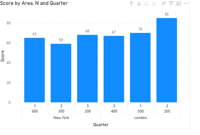
In the below visual,
1,2,3 in the x axis is quarter of sales
next row is volume of orders
labels at the top is profit percentage
I would like to sort by city and quarter not by number of orders. quarter should be always in chronological order.
Helpful resources
| User | Count |
|---|---|
| 68 | |
| 63 | |
| 59 | |
| 54 | |
| 28 |
| User | Count |
|---|---|
| 182 | |
| 81 | |
| 64 | |
| 46 | |
| 41 |


