Join us at the 2025 Microsoft Fabric Community Conference
March 31 - April 2, 2025, in Las Vegas, Nevada. Use code MSCUST for a $150 discount! Early bird discount ends December 31.
Register Now- Power BI forums
- Get Help with Power BI
- Desktop
- Service
- Report Server
- Power Query
- Mobile Apps
- Developer
- DAX Commands and Tips
- Custom Visuals Development Discussion
- Health and Life Sciences
- Power BI Spanish forums
- Translated Spanish Desktop
- Training and Consulting
- Instructor Led Training
- Dashboard in a Day for Women, by Women
- Galleries
- Community Connections & How-To Videos
- COVID-19 Data Stories Gallery
- Themes Gallery
- Data Stories Gallery
- R Script Showcase
- Webinars and Video Gallery
- Quick Measures Gallery
- 2021 MSBizAppsSummit Gallery
- 2020 MSBizAppsSummit Gallery
- 2019 MSBizAppsSummit Gallery
- Events
- Ideas
- Custom Visuals Ideas
- Issues
- Issues
- Events
- Upcoming Events
Be one of the first to start using Fabric Databases. View on-demand sessions with database experts and the Microsoft product team to learn just how easy it is to get started. Watch now
- Power BI forums
- Forums
- Get Help with Power BI
- Desktop
- Re: Column Chart and Showing Percentage of Total o...
- Subscribe to RSS Feed
- Mark Topic as New
- Mark Topic as Read
- Float this Topic for Current User
- Bookmark
- Subscribe
- Printer Friendly Page
- Mark as New
- Bookmark
- Subscribe
- Mute
- Subscribe to RSS Feed
- Permalink
- Report Inappropriate Content
Column Chart and Showing Percentage of Total of Each Item per Year
Let me ask this again on a simpler Clustered Columm Column Chart. I am struggling and missing something.
How do I replace the counts for each years column with a Percentage for that year, so 2018 would be Red 16.1%, Light Blue 9.7%, Orange 16.1%,Grey 25.8%, Green 19.4%, Blue 9.7%, Black 3.2%? Would be great if I could have no decimal.
Day Short is Text Field.
Solved! Go to Solution.
- Mark as New
- Bookmark
- Subscribe
- Mute
- Subscribe to RSS Feed
- Permalink
- Report Inappropriate Content

- Mark as New
- Bookmark
- Subscribe
- Mute
- Subscribe to RSS Feed
- Permalink
- Report Inappropriate Content
How can I can adjust rounding as even with 1 decimal 2020 is over 100%
- Mark as New
- Bookmark
- Subscribe
- Mute
- Subscribe to RSS Feed
- Permalink
- Report Inappropriate Content
Hi @bdehning
You have to write a measure and use it in the Y-axis:
% Share =
VAR __Base =
     COUNT(Table1[ColumnName1])

VAR __Total=
   CALCULATE(
      COUNT(Table1[ColumnName1]),
      ALL(Table2[Column2))
   )

RETURN

DIVIDE(__Base,__Total)
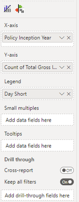
Please replace the vatlues Table and column with your objects. Table1 and Table2 can be the same. Column1 ist the column which you use for counting (Total Gross ...). Column2 is the column which you use for the days (Day Short).
When you defined the measure you can also change the formatting to percentage.
Best regards
Michael
-----------------------------------------------------
If this post helps, then please consider Accept it as the solution to help the other members find it more quickly.
Appreciate your thumbs up!
@ me in replies or I'll lose your thread.
Visit my blog datenhungrig which I recently started with content about business intelligence and Power BI in German and English or follow me on LinkedIn!
- Mark as New
- Bookmark
- Subscribe
- Mute
- Subscribe to RSS Feed
- Permalink
- Report Inappropriate Content
I ended up with this
- Mark as New
- Bookmark
- Subscribe
- Mute
- Subscribe to RSS Feed
- Permalink
- Report Inappropriate Content
Can you please show the measure you built?
Visit my blog datenhungrig which I recently started with content about business intelligence and Power BI in German and English or follow me on LinkedIn!
- Mark as New
- Bookmark
- Subscribe
- Mute
- Subscribe to RSS Feed
- Permalink
- Report Inappropriate Content
- Mark as New
- Bookmark
- Subscribe
- Mute
- Subscribe to RSS Feed
- Permalink
- Report Inappropriate Content
weird.
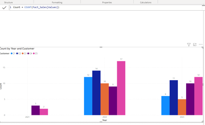
for me it works just fine (see below) -> normal count
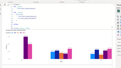
now with the share measure
Are you 100% sure that you used exactly this column as a legend? LossRunToExcel[Day Short])
Can you please share sample data?
Best regards
Michael
-----------------------------------------------------
If this post helps, then please consider Accept it as the solution to help the other members find it more quickly.
Appreciate your thumbs up!
@ me in replies or I'll lose your thread.
Visit my blog datenhungrig which I recently started with content about business intelligence and Power BI in German and English or follow me on LinkedIn!
- Mark as New
- Bookmark
- Subscribe
- Mute
- Subscribe to RSS Feed
- Permalink
- Report Inappropriate Content
Here is Visualization
- Mark as New
- Bookmark
- Subscribe
- Mute
- Subscribe to RSS Feed
- Permalink
- Report Inappropriate Content

- Mark as New
- Bookmark
- Subscribe
- Mute
- Subscribe to RSS Feed
- Permalink
- Report Inappropriate Content
Hi @bdehning
WHere do you get more than 100? In the first bunch its 100
how big is the deviation? is it maybe rounding?
Best regards
Michael
-----------------------------------------------------
If this post helps, then please consider Accept it as the solution to help the other members find it more quickly.
Appreciate your thumbs up!
@ me in replies or I'll lose your thread.
Visit my blog datenhungrig which I recently started with content about business intelligence and Power BI in German and English or follow me on LinkedIn!
- Mark as New
- Bookmark
- Subscribe
- Mute
- Subscribe to RSS Feed
- Permalink
- Report Inappropriate Content
Try 2022. I get 101 for several. I am going to check out one decimal.
- Mark as New
- Bookmark
- Subscribe
- Mute
- Subscribe to RSS Feed
- Permalink
- Report Inappropriate Content
as you see in genereal it works with percentage in my exampe but what might bother you is that now the scalig ist also absed on percentage. But as soon as you have the percentage value it should be possible to add a linechart so that you can use the percentage only for the data label.
Visit my blog datenhungrig which I recently started with content about business intelligence and Power BI in German and English or follow me on LinkedIn!
- Mark as New
- Bookmark
- Subscribe
- Mute
- Subscribe to RSS Feed
- Permalink
- Report Inappropriate Content
I only see one chose in Data Labels. Series for Day of Week?
Helpful resources

Join us at the Microsoft Fabric Community Conference
March 31 - April 2, 2025, in Las Vegas, Nevada. Use code MSCUST for a $150 discount!

We want your feedback!
Your insights matter. That’s why we created a quick survey to learn about your experience finding answers to technical questions.

Microsoft Fabric Community Conference 2025
Arun Ulag shares exciting details about the Microsoft Fabric Conference 2025, which will be held in Las Vegas, NV.

| User | Count |
|---|---|
| 123 | |
| 86 | |
| 73 | |
| 57 | |
| 52 |
| User | Count |
|---|---|
| 197 | |
| 133 | |
| 107 | |
| 69 | |
| 65 |


