A new Data Days event is coming soon!
This time we’re going bigger than ever. Fabric, Power BI, SQL, AI and more. We're covering it all. You won't want to miss it.
Learn more- Power BI forums
- Get Help with Power BI
- Desktop
- Service
- Report Server
- Power Query
- Mobile Apps
- Developer
- DAX Commands and Tips
- Custom Visuals Development Discussion
- Health and Life Sciences
- Power BI Spanish forums
- Translated Spanish Desktop
- Training and Consulting
- Instructor Led Training
- Dashboard in a Day for Women, by Women
- Galleries
- Data Stories Gallery
- Themes Gallery
- Contests Gallery
- QuickViz Gallery
- Quick Measures Gallery
- Visual Calculations Gallery
- Notebook Gallery
- Translytical Task Flow Gallery
- TMDL Gallery
- R Script Showcase
- Webinars and Video Gallery
- Ideas
- Custom Visuals Ideas (read-only)
- Issues
- Issues
- Events
- Upcoming Events
Level up your Power BI skills this month - build one visual each week and tell better stories with data! Get started
- Power BI forums
- Forums
- Get Help with Power BI
- Desktop
- Colour saturation help
- Subscribe to RSS Feed
- Mark Topic as New
- Mark Topic as Read
- Float this Topic for Current User
- Bookmark
- Subscribe
- Printer Friendly Page
- Mark as New
- Bookmark
- Subscribe
- Mute
- Subscribe to RSS Feed
- Permalink
- Report Inappropriate Content
Colour saturation help
Hi everyone,
I am trying to figure out how to get my bar graph to change colour dependant on another columns values.
I have to columns of data which are linked by the date. Each column is the sum of data for that day,eg:
Date Column 1 Column 2
Jan/ 1 / 16 50 55
Jan/ 2 / 16 51 55
Jan/ 3 / 16 55 55
Jan/ 4 / 16 58 55
Jan/ 5 / 16 59 55
The bar graph needs to be Column 1 as bars and column 2 determines the colour saturation. If Column 1 is more than or equal to Column 2 then the colour is green otherwise it is red. No matter what I try I cant seem to get it to work. Hope someone can help.
Thanks,
Giles
Solved! Go to Solution.
- Mark as New
- Bookmark
- Subscribe
- Mute
- Subscribe to RSS Feed
- Permalink
- Report Inappropriate Content
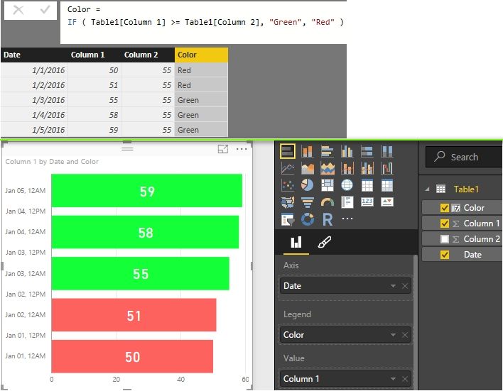
You can also create a column with DAX formula.
Best Regards,
Herbert
- Mark as New
- Bookmark
- Subscribe
- Mute
- Subscribe to RSS Feed
- Permalink
- Report Inappropriate Content
- Mark as New
- Bookmark
- Subscribe
- Mute
- Subscribe to RSS Feed
- Permalink
- Report Inappropriate Content
Hi Herbert,
I´ve been trying with the option of color saturation of some visualization (diverging option), but it does not satisfy my expectations, so when I saw your answer to this matter, decided i need to try it your way.
My report acctually has 5 different fields/tables (Leading, Managing, Onboarding, PAC, Whitebelt) each one for a specific thema.
In each Table i created a measure named KPI. For each KPI i have a specific target. Would like to give them a conditional color using your formula. If target is reach should be green, if -10% below of the target yellow, if its even lower red.
So i figured out i need to create a new table with each KPI name and the target.
KPI's Target Color
Leading 90%
Managing 90%
Onboarding 100%
PAC 90%
Whitebelt 90%
My question is, how I should write your color formula, if each KPI comes from a measure of a different table. Should be something like this? How should I do the part of -10% of target = Yellow, -20% or less of target= red???
Color = IF ( NewTable[KPI´s] >= TableLeading[LeadingKPI]
TableManaging[ManagingKPI]
TableOnboarding[OnboardingKPI]
TablePAC[PACKPI]
TableWhitebelt[WhitebeltKPI],
¨Green¨, ¨Yellow¨, ¨Red¨)
Would appreciate your input on this.
Thanks!
- Mark as New
- Bookmark
- Subscribe
- Mute
- Subscribe to RSS Feed
- Permalink
- Report Inappropriate Content
Hi Giles
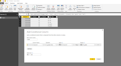
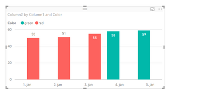
One way to do it is to add a calculated/conditional column and use that as a legend in the chart.
You can then choose too hide the legend in the chart.
br
Erik
Helpful resources

Power BI Monthly Update - April 2026
Check out the April 2026 Power BI update to learn about new features.

Data Days 2026 coming soon!
Sign up to receive a private message when registration opens and key events begin.

New to Fabric Survey
If you have recently started exploring Fabric, we'd love to hear how it's going. Your feedback can help with product improvements.

| User | Count |
|---|---|
| 36 | |
| 33 | |
| 31 | |
| 24 | |
| 18 |
| User | Count |
|---|---|
| 66 | |
| 50 | |
| 33 | |
| 24 | |
| 24 |


