Get certified for free when you join Fabric Data Days 2026 and dive into Fabric, Power BI, SQL, AI, and other essential data skills.
Join nowJuly 7 - July 17 | Round 2 of the Power BI Dataviz World Championships. Don't miss your chance! Learn more
Hi everyone,
I am trying to figure out how to get my bar graph to change colour dependant on another columns values.
I have to columns of data which are linked by the date. Each column is the sum of data for that day,eg:
Date Column 1 Column 2
Jan/ 1 / 16 50 55
Jan/ 2 / 16 51 55
Jan/ 3 / 16 55 55
Jan/ 4 / 16 58 55
Jan/ 5 / 16 59 55
The bar graph needs to be Column 1 as bars and column 2 determines the colour saturation. If Column 1 is more than or equal to Column 2 then the colour is green otherwise it is red. No matter what I try I cant seem to get it to work. Hope someone can help.
Thanks,
Giles
Solved! Go to Solution.
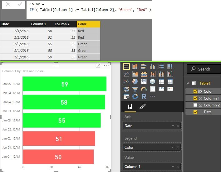
You can also create a column with DAX formula.
Best Regards,
Herbert
Hi Herbert,
I´ve been trying with the option of color saturation of some visualization (diverging option), but it does not satisfy my expectations, so when I saw your answer to this matter, decided i need to try it your way.
My report acctually has 5 different fields/tables (Leading, Managing, Onboarding, PAC, Whitebelt) each one for a specific thema.
In each Table i created a measure named KPI. For each KPI i have a specific target. Would like to give them a conditional color using your formula. If target is reach should be green, if -10% below of the target yellow, if its even lower red.
So i figured out i need to create a new table with each KPI name and the target.
KPI's Target Color
Leading 90%
Managing 90%
Onboarding 100%
PAC 90%
Whitebelt 90%
My question is, how I should write your color formula, if each KPI comes from a measure of a different table. Should be something like this? How should I do the part of -10% of target = Yellow, -20% or less of target= red???
Color = IF ( NewTable[KPI´s] >= TableLeading[LeadingKPI]
TableManaging[ManagingKPI]
TableOnboarding[OnboardingKPI]
TablePAC[PACKPI]
TableWhitebelt[WhitebeltKPI],
¨Green¨, ¨Yellow¨, ¨Red¨)
Would appreciate your input on this.
Thanks!
Hi Giles
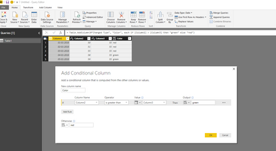
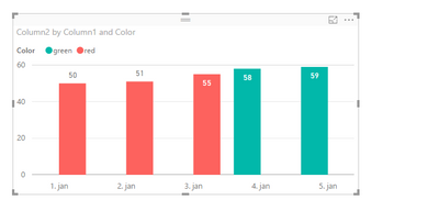
One way to do it is to add a calculated/conditional column and use that as a legend in the chart.
You can then choose too hide the legend in the chart.
br
Erik
Join us in Barcelona for FabCon and SQLCon, the Fabric, Power BI, SQL, and AI community event. Save €200 with code FABCMTY200.
Join Fabric Data Days 2026: 60 days of free live/on-demand sessions, challenges, study groups, and certification opportunities.
| User | Count |
|---|---|
| 22 | |
| 20 | |
| 14 | |
| 13 | |
| 13 |
| User | Count |
|---|---|
| 62 | |
| 40 | |
| 38 | |
| 38 | |
| 38 |