FabCon is coming to Atlanta
Join us at FabCon Atlanta from March 16 - 20, 2026, for the ultimate Fabric, Power BI, AI and SQL community-led event. Save $200 with code FABCOMM.
Register now!- Power BI forums
- Get Help with Power BI
- Desktop
- Service
- Report Server
- Power Query
- Mobile Apps
- Developer
- DAX Commands and Tips
- Custom Visuals Development Discussion
- Health and Life Sciences
- Power BI Spanish forums
- Translated Spanish Desktop
- Training and Consulting
- Instructor Led Training
- Dashboard in a Day for Women, by Women
- Galleries
- Data Stories Gallery
- Themes Gallery
- Contests Gallery
- QuickViz Gallery
- Quick Measures Gallery
- Visual Calculations Gallery
- Notebook Gallery
- Translytical Task Flow Gallery
- TMDL Gallery
- R Script Showcase
- Webinars and Video Gallery
- Ideas
- Custom Visuals Ideas (read-only)
- Issues
- Issues
- Events
- Upcoming Events
The Power BI Data Visualization World Championships is back! Get ahead of the game and start preparing now! Learn more
- Power BI forums
- Forums
- Get Help with Power BI
- Desktop
- Re: Color saturation in clustered column chart
- Subscribe to RSS Feed
- Mark Topic as New
- Mark Topic as Read
- Float this Topic for Current User
- Bookmark
- Subscribe
- Printer Friendly Page
- Mark as New
- Bookmark
- Subscribe
- Mute
- Subscribe to RSS Feed
- Permalink
- Report Inappropriate Content
Color saturation in clustered column chart
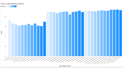
How can I get something like this below (different hues of one color) in a clustered column chart.
The month (x-axis) order would change every month. Next month, 05 will be at the end and 06 in the front.
But the color hue order would not change.
Regardless of the x-axis order, the graph will always look like this.
Here is the data:
| AGE_GROUP | May | Jun | Jul | Aug | Sep | Oct | Nov | Dec | Jan | Feb | Mar | Apr |
| 0-17 | 1.82 | 1.66 | 1.6 | 1.54 | 1.57 | 1.58 | 1.63 | 1.56 | 1.65 | 1.54 | 1.52 | 1.74 |
| 18-64 | 2.24 | 2.25 | 2.22 | 2.18 | 2.23 | 2.25 | 2.26 | 2.11 | 2.24 | 2.26 | 2.3 | 2.23 |
| 65 and Over | 2.3 | 2.31 | 2.28 | 2.26 | 2.3 | 2.32 | 2.3 | 2.3 | 2.35 | 2.35 | 2.36 | 2.33 |
Thank you for your help!
Vadivu
Solved! Go to Solution.
- Mark as New
- Bookmark
- Subscribe
- Mute
- Subscribe to RSS Feed
- Permalink
- Report Inappropriate Content
let
    Source = Table.FromRows(Json.Document(Binary.Decompress(Binary.FromText("ZYw9DoMwDIWvgjxDVNvY+BY9QJQBqV0ZGHr+NnmpRMTiT8/vJ2d6LLzRTJxCGtyBdm0FkLCApVA9aEMSI9tKZc7EsXj9S5IOA6SBA0oHz+Hx0MNT//k67jbtx2t6ft7nxdTei3tP5SpwbUBP//bLFw==", BinaryEncoding.Base64), Compression.Deflate)), let _t = ((type nullable text) meta [Serialized.Text = true]) in type table [AGE_GROUP = _t, #"5/1/2021" = _t, #"6/1/2021" = _t, #"7/1/2021" = _t, #"8/1/2021" = _t, #"9/1/2021" = _t, #"10/1/2021" = _t, #"11/1/2021" = _t, #"12/1/2021" = _t, #"1/1/2022" = _t, #"2/1/2022" = _t, #"3/1/2022" = _t, #"4/1/2022" = _t]),
    #"Unpivoted Other Columns" = Table.UnpivotOtherColumns(Source, {"AGE_GROUP"}, "Month", "Value"),
    #"Changed Type" = Table.TransformColumnTypes(#"Unpivoted Other Columns",{{"Month", type date}, {"Value", type number}})
in
    #"Changed Type"
Measure := DATEDIFF(TODAY(),max('Table'[Month]),MONTH)
- Mark as New
- Bookmark
- Subscribe
- Mute
- Subscribe to RSS Feed
- Permalink
- Report Inappropriate Content
See attached.
Notes
- your source data is not suitable for Power BI. It needs to be unpivoted (and the year needs to be added).
- I added a measure to produce the gradient
- there is a bug in the current Power BI Desktop that ignores the instruction not to concatenate X axis labels. It is caused by the new format pane. Hopefully they can fix that soon.
- Mark as New
- Bookmark
- Subscribe
- Mute
- Subscribe to RSS Feed
- Permalink
- Report Inappropriate Content
Thank you. I am not able to open the attached file. I have Jan 2021 Desktop Power BI version.
- Mark as New
- Bookmark
- Subscribe
- Mute
- Subscribe to RSS Feed
- Permalink
- Report Inappropriate Content
let
    Source = Table.FromRows(Json.Document(Binary.Decompress(Binary.FromText("ZYw9DoMwDIWvgjxDVNvY+BY9QJQBqV0ZGHr+NnmpRMTiT8/vJ2d6LLzRTJxCGtyBdm0FkLCApVA9aEMSI9tKZc7EsXj9S5IOA6SBA0oHz+Hx0MNT//k67jbtx2t6ft7nxdTei3tP5SpwbUBP//bLFw==", BinaryEncoding.Base64), Compression.Deflate)), let _t = ((type nullable text) meta [Serialized.Text = true]) in type table [AGE_GROUP = _t, #"5/1/2021" = _t, #"6/1/2021" = _t, #"7/1/2021" = _t, #"8/1/2021" = _t, #"9/1/2021" = _t, #"10/1/2021" = _t, #"11/1/2021" = _t, #"12/1/2021" = _t, #"1/1/2022" = _t, #"2/1/2022" = _t, #"3/1/2022" = _t, #"4/1/2022" = _t]),
    #"Unpivoted Other Columns" = Table.UnpivotOtherColumns(Source, {"AGE_GROUP"}, "Month", "Value"),
    #"Changed Type" = Table.TransformColumnTypes(#"Unpivoted Other Columns",{{"Month", type date}, {"Value", type number}})
in
    #"Changed Type"
Measure := DATEDIFF(TODAY(),max('Table'[Month]),MONTH)
- Mark as New
- Bookmark
- Subscribe
- Mute
- Subscribe to RSS Feed
- Permalink
- Report Inappropriate Content
Thank you very much for your assist
Helpful resources

Power BI Dataviz World Championships
The Power BI Data Visualization World Championships is back! Get ahead of the game and start preparing now!

| User | Count |
|---|---|
| 38 | |
| 37 | |
| 33 | |
| 32 | |
| 29 |
| User | Count |
|---|---|
| 132 | |
| 88 | |
| 82 | |
| 68 | |
| 64 |


