Join us at the 2025 Microsoft Fabric Community Conference
March 31 - April 2, 2025, in Las Vegas, Nevada. Use code MSCUST for a $150 discount! Early bird discount ends December 31.
Register Now- Power BI forums
- Get Help with Power BI
- Desktop
- Service
- Report Server
- Power Query
- Mobile Apps
- Developer
- DAX Commands and Tips
- Custom Visuals Development Discussion
- Health and Life Sciences
- Power BI Spanish forums
- Translated Spanish Desktop
- Training and Consulting
- Instructor Led Training
- Dashboard in a Day for Women, by Women
- Galleries
- Community Connections & How-To Videos
- COVID-19 Data Stories Gallery
- Themes Gallery
- Data Stories Gallery
- R Script Showcase
- Webinars and Video Gallery
- Quick Measures Gallery
- 2021 MSBizAppsSummit Gallery
- 2020 MSBizAppsSummit Gallery
- 2019 MSBizAppsSummit Gallery
- Events
- Ideas
- Custom Visuals Ideas
- Issues
- Issues
- Events
- Upcoming Events
Be one of the first to start using Fabric Databases. View on-demand sessions with database experts and the Microsoft product team to learn just how easy it is to get started. Watch now
- Power BI forums
- Forums
- Get Help with Power BI
- Desktop
- Color only highest and lowest values
- Subscribe to RSS Feed
- Mark Topic as New
- Mark Topic as Read
- Float this Topic for Current User
- Bookmark
- Subscribe
- Printer Friendly Page
- Mark as New
- Bookmark
- Subscribe
- Mute
- Subscribe to RSS Feed
- Permalink
- Report Inappropriate Content
Color only highest and lowest values
Hi all,
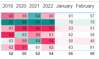
I‘m strugling with column coloring. Every column in this table below is a simple measure, which differs only in date:
AVG_2022-01_Total_amount = CALCULATE(AVERAGE(DB[Month_total_amount]),DATESBETWEEN(DB[Date],"2022-01-01","2022-01-31"))
And now i need to color every column with two colors: only highest value – green, only lowest value – red, everything else - white.
Conditional formating provided by Power BI colors all values and there is no simple build-in solution to color highest and lowest values like in excel.
I have founded different solutions (additional measure for colorig), but can‘t customize them to suit my needs.
If any one can provide some customized solution it will save my day. Write if i need to provide some additonal information about that table and calculation within.
And i didn‘t understand do i will need to create additional coloring measure for each that calculation measure?
Solved! Go to Solution.
- Mark as New
- Bookmark
- Subscribe
- Mute
- Subscribe to RSS Feed
- Permalink
- Report Inappropriate Content
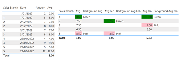
Below is the output you'll get by applying the steps in the PBIX attached:
You need to create the following two measures:
Avg =

VAR _1 = CALCULATE ( AVERAGE ('Table'[Amount] ) , DATESMTD ('Table'[Date] ) )

RETURN

_1
Background Avg =

VAR _1 = MINX ( SUMMARIZE ( ALL ('Table' ) ,'Table'[Sales Branch] , "Avg" , AVERAGE ('Table'[Amount] ) ) , [Avg] )
VAR _2 = MAXX ( SUMMARIZE ( ALL ('Table' ) ,'Table'[Sales Branch] , "Avg" , AVERAGE ('Table'[Amount] ) ) , [Avg] )

RETURN

SWITCH ( TRUE() , [Avg] = _1 , "Green" , 'Table'[Avg Feb] = _2 , "Pink" , "" )
If you want the Avg by Month, as per Jan and Feb in the output snapshot, then you will need to add the following measures:
Avg Feb =

VAR _1 = CALCULATE ( [Avg] , FILTER ('Table' , 'Table'[Date].[MonthNo] = 2 ) )

RETURN

_1
In the above, you can see that the MonthNo 2 is February. If you want it for January, just change the 2 to a 1.
Background Avg Feb =

VAR _1 = MINX ( SUMMARIZE ( ALL ('Table' ) ,'Table'[Sales Branch] , "Avg" , AVERAGE ('Table'[Amount] ) ) , [Avg Feb] )
VAR _2 = MAXX ( SUMMARIZE ( ALL ('Table' ) ,'Table'[Sales Branch] , "Avg" , AVERAGE ('Table'[Amount] ) ) , [Avg Feb] )

RETURN

SWITCH ( TRUE() , [Avg Feb] = _1 , "Green" , 'Table'[Avg Feb] = _2 , "Pink" , "" )
And the above measure, you can adjust to whatever months you want. Just change the [Avg Feb] to [Avg Jan], etc.
The other item to note is that the SWITCH TRUE gives you Green, Pink, and blank. If you want other colours, just write them in. For example, "SWITCH ( TRUE() , [Avg Feb] = _1 , "Black" , 'Table'[Avg Feb] = _2 , "Purple" , "Red" )" will give you Black background for the Avg Feb minimum, Purple for the maximum average, and red for everything else.
Hope this helps mate!
Theo 🙂
If I have posted a response that resolves your question, please accept it as a solution to formally close the post.
Also, if you are as passionate about Power BI, DAX and data as I am, please feel free to reach out if you have any questions, queries, or if you simply want to connect and talk to another data geek!
Want to connect?www.linkedin.com/in/theoconias
- Mark as New
- Bookmark
- Subscribe
- Mute
- Subscribe to RSS Feed
- Permalink
- Report Inappropriate Content
You should be able to achieve the output you are after using a measure and Rules in the Conditional Formatting menu. Here is a link to another post that hopefully assists: https://community.powerbi.com/t5/Desktop/Conditional-formatting-with-dynamic-min-and-max/m-p/599213
Hope this helps.
Theo
If I have posted a response that resolves your question, please accept it as a solution to formally close the post.
Also, if you are as passionate about Power BI, DAX and data as I am, please feel free to reach out if you have any questions, queries, or if you simply want to connect and talk to another data geek!
Want to connect?www.linkedin.com/in/theoconias
- Mark as New
- Bookmark
- Subscribe
- Mute
- Subscribe to RSS Feed
- Permalink
- Report Inappropriate Content
That's the problem - how to achieve correct MIN and MAX values from this measure:
AVG_2022-01_Total_amount = CALCULATE(AVERAGE(DB[Month_total_amount]),DATESBETWEEN(DB[Date],"2022-01-01","2022-01-31"))
when this measure is putted in to a table and average value is calculated for a dynamic count of sales branches, f.e.:
| Sales branch | That measure (avg) | highest value of that measure (1) |
| 1 | 54 | 0 |
| 2 | 34 | 0 |
| 3 | 65 | 1 |
- Mark as New
- Bookmark
- Subscribe
- Mute
- Subscribe to RSS Feed
- Permalink
- Report Inappropriate Content
Below is the output you'll get by applying the steps in the PBIX attached:
You need to create the following two measures:
Avg =

VAR _1 = CALCULATE ( AVERAGE ('Table'[Amount] ) , DATESMTD ('Table'[Date] ) )

RETURN

_1
Background Avg =

VAR _1 = MINX ( SUMMARIZE ( ALL ('Table' ) ,'Table'[Sales Branch] , "Avg" , AVERAGE ('Table'[Amount] ) ) , [Avg] )
VAR _2 = MAXX ( SUMMARIZE ( ALL ('Table' ) ,'Table'[Sales Branch] , "Avg" , AVERAGE ('Table'[Amount] ) ) , [Avg] )

RETURN

SWITCH ( TRUE() , [Avg] = _1 , "Green" , 'Table'[Avg Feb] = _2 , "Pink" , "" )
If you want the Avg by Month, as per Jan and Feb in the output snapshot, then you will need to add the following measures:
Avg Feb =

VAR _1 = CALCULATE ( [Avg] , FILTER ('Table' , 'Table'[Date].[MonthNo] = 2 ) )

RETURN

_1
In the above, you can see that the MonthNo 2 is February. If you want it for January, just change the 2 to a 1.
Background Avg Feb =

VAR _1 = MINX ( SUMMARIZE ( ALL ('Table' ) ,'Table'[Sales Branch] , "Avg" , AVERAGE ('Table'[Amount] ) ) , [Avg Feb] )
VAR _2 = MAXX ( SUMMARIZE ( ALL ('Table' ) ,'Table'[Sales Branch] , "Avg" , AVERAGE ('Table'[Amount] ) ) , [Avg Feb] )

RETURN

SWITCH ( TRUE() , [Avg Feb] = _1 , "Green" , 'Table'[Avg Feb] = _2 , "Pink" , "" )
And the above measure, you can adjust to whatever months you want. Just change the [Avg Feb] to [Avg Jan], etc.
The other item to note is that the SWITCH TRUE gives you Green, Pink, and blank. If you want other colours, just write them in. For example, "SWITCH ( TRUE() , [Avg Feb] = _1 , "Black" , 'Table'[Avg Feb] = _2 , "Purple" , "Red" )" will give you Black background for the Avg Feb minimum, Purple for the maximum average, and red for everything else.
Hope this helps mate!
Theo 🙂
If I have posted a response that resolves your question, please accept it as a solution to formally close the post.
Also, if you are as passionate about Power BI, DAX and data as I am, please feel free to reach out if you have any questions, queries, or if you simply want to connect and talk to another data geek!
Want to connect?www.linkedin.com/in/theoconias
Helpful resources

Join us at the Microsoft Fabric Community Conference
March 31 - April 2, 2025, in Las Vegas, Nevada. Use code MSCUST for a $150 discount!

We want your feedback!
Your insights matter. That’s why we created a quick survey to learn about your experience finding answers to technical questions.

Microsoft Fabric Community Conference 2025
Arun Ulag shares exciting details about the Microsoft Fabric Conference 2025, which will be held in Las Vegas, NV.

| User | Count |
|---|---|
| 124 | |
| 87 | |
| 87 | |
| 70 | |
| 51 |
| User | Count |
|---|---|
| 205 | |
| 153 | |
| 97 | |
| 79 | |
| 69 |


