FabCon is coming to Atlanta
Join us at FabCon Atlanta from March 16 - 20, 2026, for the ultimate Fabric, Power BI, AI and SQL community-led event. Save $200 with code FABCOMM.
Register now!- Power BI forums
- Get Help with Power BI
- Desktop
- Service
- Report Server
- Power Query
- Mobile Apps
- Developer
- DAX Commands and Tips
- Custom Visuals Development Discussion
- Health and Life Sciences
- Power BI Spanish forums
- Translated Spanish Desktop
- Training and Consulting
- Instructor Led Training
- Dashboard in a Day for Women, by Women
- Galleries
- Data Stories Gallery
- Themes Gallery
- Contests Gallery
- QuickViz Gallery
- Quick Measures Gallery
- Visual Calculations Gallery
- Notebook Gallery
- Translytical Task Flow Gallery
- TMDL Gallery
- R Script Showcase
- Webinars and Video Gallery
- Ideas
- Custom Visuals Ideas (read-only)
- Issues
- Issues
- Events
- Upcoming Events
The Power BI Data Visualization World Championships is back! Get ahead of the game and start preparing now! Learn more
- Power BI forums
- Forums
- Get Help with Power BI
- Desktop
- Re: Color of a multiline chart that depends on a t...
- Subscribe to RSS Feed
- Mark Topic as New
- Mark Topic as Read
- Float this Topic for Current User
- Bookmark
- Subscribe
- Printer Friendly Page
- Mark as New
- Bookmark
- Subscribe
- Mute
- Subscribe to RSS Feed
- Permalink
- Report Inappropriate Content
Color of a multiline chart that depends on a table
Hola,
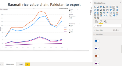
I'm new on powerBI desktop. I have a multiline chart. I would like that the color of each line depends on a filed that come from my postgresql database. Do you know how can I do this ?
Thanks a lot for you help,
Theo
Solved! Go to Solution.
- Mark as New
- Bookmark
- Subscribe
- Mute
- Subscribe to RSS Feed
- Permalink
- Report Inappropriate Content
Hi @Anonymous
You may want to use conditional formatting in Line Charts for multiple lines.
Your demand is a good idea, while it is not supported to implement in Power BI currently.
You can vote up this idea for this function:Cluster column and line chart
Or you can submit a new idea to improve the Power BI.
It is a place for customers provide feedback about Microsoft Office products . What’s more, if a feedback is high voted there by other customers, it will be promising that Microsoft Product Team will take it into consideration when designing the next version in the future.
Best Regards,
Rico Zhou
If this post helps, then please consider Accept it as the solution to help the other members find it more quickly.
- Mark as New
- Bookmark
- Subscribe
- Mute
- Subscribe to RSS Feed
- Permalink
- Report Inappropriate Content
@Anonymous
You can use the legend section of the chart to show the color of each line differently.
If this answer doesn't work, please your sample data and the expected
________________________
If my answer was helpful, please click Accept it as the solution to help other members find it useful
Click on the Thumbs-Up icon if you like this reply 🙂
Website YouTube LinkedIn results.
⭕ Subscribe and learn Power BI from these videos
⚪ Website ⚪ LinkedIn ⚪ PBI User Group
- Mark as New
- Bookmark
- Subscribe
- Mute
- Subscribe to RSS Feed
- Permalink
- Report Inappropriate Content
@Fowmy thanks a lot for your help !
OK but I have to manualy choose the color of each line ! What I would like is that the color is determined by a field of the table. That's a kind of conditonnal format I think, but when I do a line chart, I don't achieve to see the conditionnal format ellipsis (tree dots).
- Mark as New
- Bookmark
- Subscribe
- Mute
- Subscribe to RSS Feed
- Permalink
- Report Inappropriate Content
Hi @Anonymous
Could you tell me if your problem has been solved? If it is, kindly Accept it as the solution. More people will benefit from it. Or you are still confused about it, please provide me with more details about your problem.
Best Regards,
Rico Zhou
- Mark as New
- Bookmark
- Subscribe
- Mute
- Subscribe to RSS Feed
- Permalink
- Report Inappropriate Content
Hi @Anonymous
You may want to use conditional formatting in Line Charts for multiple lines.
Your demand is a good idea, while it is not supported to implement in Power BI currently.
You can vote up this idea for this function:Cluster column and line chart
Or you can submit a new idea to improve the Power BI.
It is a place for customers provide feedback about Microsoft Office products . What’s more, if a feedback is high voted there by other customers, it will be promising that Microsoft Product Team will take it into consideration when designing the next version in the future.
Best Regards,
Rico Zhou
If this post helps, then please consider Accept it as the solution to help the other members find it more quickly.
Helpful resources

Power BI Dataviz World Championships
The Power BI Data Visualization World Championships is back! Get ahead of the game and start preparing now!

Power BI Monthly Update - November 2025
Check out the November 2025 Power BI update to learn about new features.

| User | Count |
|---|---|
| 59 | |
| 43 | |
| 42 | |
| 23 | |
| 17 |
| User | Count |
|---|---|
| 190 | |
| 122 | |
| 96 | |
| 66 | |
| 47 |

