FabCon is coming to Atlanta
Join us at FabCon Atlanta from March 16 - 20, 2026, for the ultimate Fabric, Power BI, AI and SQL community-led event. Save $200 with code FABCOMM.
Register now!- Power BI forums
- Get Help with Power BI
- Desktop
- Service
- Report Server
- Power Query
- Mobile Apps
- Developer
- DAX Commands and Tips
- Custom Visuals Development Discussion
- Health and Life Sciences
- Power BI Spanish forums
- Translated Spanish Desktop
- Training and Consulting
- Instructor Led Training
- Dashboard in a Day for Women, by Women
- Galleries
- Data Stories Gallery
- Themes Gallery
- Contests Gallery
- QuickViz Gallery
- Quick Measures Gallery
- Visual Calculations Gallery
- Notebook Gallery
- Translytical Task Flow Gallery
- TMDL Gallery
- R Script Showcase
- Webinars and Video Gallery
- Ideas
- Custom Visuals Ideas (read-only)
- Issues
- Issues
- Events
- Upcoming Events
Get Fabric Certified for FREE during Fabric Data Days. Don't miss your chance! Request now
- Power BI forums
- Forums
- Get Help with Power BI
- Desktop
- Color in Scatter Chart
- Subscribe to RSS Feed
- Mark Topic as New
- Mark Topic as Read
- Float this Topic for Current User
- Bookmark
- Subscribe
- Printer Friendly Page
- Mark as New
- Bookmark
- Subscribe
- Mute
- Subscribe to RSS Feed
- Permalink
- Report Inappropriate Content
Color in Scatter Chart
Dear all,
I have a problem with my scatter charts.
Within the Chart there are several data points. Each data points has information in further columns.
Now what I am trying to do is the following:
Depending on the filters I set for the report, I would like to color of the scatter to change.
E.g.: All points which "meets" the filter criteria shall have one color, the other ones shall have a different color.
One Example.
1) X = 10, Y = 10, Info_1 = A, Info 2=B
2) X = 20, Y = 10, Info_1 = B, Info 2=B
Now I set filters to Info_1 = A and Info_2 = B.
Then I would like (1) to have red color and (2) to be grey (because (1) meets the filter criteria but (2) does not).
Is that possible? Could you please explain this to me?
Thanks a lot in anticipation
Kai
- Mark as New
- Bookmark
- Subscribe
- Mute
- Subscribe to RSS Feed
- Permalink
- Report Inappropriate Content
I'm not sure if you can control scatter chart colors like that. There is a color by category option but I haven't quite figured that one out yet.
This thread might help: https://community.powerbi.com/t5/Desktop/color-quot-bubbles-quot-by-computed-category/td-p/25220
Basically, I would think to create a measure using a disconnected table that provides your categories and then put that into the Legend essentially.
Follow on LinkedIn
@ me in replies or I'll lose your thread!!!
Instead of a Kudo, please vote for this idea
Become an expert!: Enterprise DNA
External Tools: MSHGQM
YouTube Channel!: Microsoft Hates Greg
Latest book!: DAX For Humans
DAX is easy, CALCULATE makes DAX hard...
- Mark as New
- Bookmark
- Subscribe
- Mute
- Subscribe to RSS Feed
- Permalink
- Report Inappropriate Content
Thanks, that was helpful.
So now I am trying to use the "Legend" to define the color.
Is there a possibility to have a "dynamic" measure?
In my report I would like to set the filters.
Then based on the set filters the measure should for each data point calculate where it is suffering the filter or not.
Then I could colorcode the "not suffering" data points and this would be the solution
- Mark as New
- Bookmark
- Subscribe
- Mute
- Subscribe to RSS Feed
- Permalink
- Report Inappropriate Content
Hi
Yes. You can use the legend for colour.
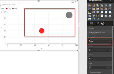
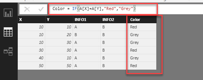
you can write an IF condition and define a new column and use that in legend. In formatting pane, you can set red and grey as a colour.
- Mark as New
- Bookmark
- Subscribe
- Mute
- Subscribe to RSS Feed
- Permalink
- Report Inappropriate Content
Hi,
yes that was my intention. The only problem is, the if condition should be based on data cuts I have in my report.
Is that possible?
- Mark as New
- Bookmark
- Subscribe
- Mute
- Subscribe to RSS Feed
- Permalink
- Report Inappropriate Content
If by data cuts you mean filters or slicers, then you would need a measure and then use the disconnected table trick along with another measure using the HASONEFILTER trick in your Legend.
Follow on LinkedIn
@ me in replies or I'll lose your thread!!!
Instead of a Kudo, please vote for this idea
Become an expert!: Enterprise DNA
External Tools: MSHGQM
YouTube Channel!: Microsoft Hates Greg
Latest book!: DAX For Humans
DAX is easy, CALCULATE makes DAX hard...
- Mark as New
- Bookmark
- Subscribe
- Mute
- Subscribe to RSS Feed
- Permalink
- Report Inappropriate Content
Thanks.
Since I am pretty new to Power Bi could you please explain that a little bit more in detail?
Thanks in anticipation
- Mark as New
- Bookmark
- Subscribe
- Mute
- Subscribe to RSS Feed
- Permalink
- Report Inappropriate Content
Check out this thread:
https://community.powerbi.com/t5/Desktop/Super-Groups-Extended-Question/td-p/140727
Follow on LinkedIn
@ me in replies or I'll lose your thread!!!
Instead of a Kudo, please vote for this idea
Become an expert!: Enterprise DNA
External Tools: MSHGQM
YouTube Channel!: Microsoft Hates Greg
Latest book!: DAX For Humans
DAX is easy, CALCULATE makes DAX hard...
Helpful resources

Power BI Monthly Update - November 2025
Check out the November 2025 Power BI update to learn about new features.

Fabric Data Days
Advance your Data & AI career with 50 days of live learning, contests, hands-on challenges, study groups & certifications and more!


