Get Fabric certified for FREE!
Don't miss your chance to take the Fabric Data Engineer (DP-700) exam on us!
Learn more- Power BI forums
- Get Help with Power BI
- Desktop
- Service
- Report Server
- Power Query
- Mobile Apps
- Developer
- DAX Commands and Tips
- Custom Visuals Development Discussion
- Health and Life Sciences
- Power BI Spanish forums
- Translated Spanish Desktop
- Training and Consulting
- Instructor Led Training
- Dashboard in a Day for Women, by Women
- Galleries
- Data Stories Gallery
- Themes Gallery
- Contests Gallery
- QuickViz Gallery
- Quick Measures Gallery
- Visual Calculations Gallery
- Notebook Gallery
- Translytical Task Flow Gallery
- TMDL Gallery
- R Script Showcase
- Webinars and Video Gallery
- Ideas
- Custom Visuals Ideas (read-only)
- Issues
- Issues
- Events
- Upcoming Events
The FabCon + SQLCon recap series starts April 14th at 8am Pacific. If you’re tracking where AI is going inside Fabric, this first session is a can't miss. Register now
- Power BI forums
- Forums
- Get Help with Power BI
- Desktop
- Re: Color formatting
- Subscribe to RSS Feed
- Mark Topic as New
- Mark Topic as Read
- Float this Topic for Current User
- Bookmark
- Subscribe
- Printer Friendly Page
- Mark as New
- Bookmark
- Subscribe
- Mute
- Subscribe to RSS Feed
- Permalink
- Report Inappropriate Content
Color formatting
Hello everybody,
got a clustered column chart visualization with 5 values, each value is a measure i created, each for a different table.
Want to add a color saturation to give the chart columns a color if it reachs determinated % (over 90% green, under 90% red).
Can´t add any value of any of the 5 table to the color saturation field. What would your recommend, should i create a new column/measure/table to add to this color saturation field??
Solved! Go to Solution.
- Mark as New
- Bookmark
- Subscribe
- Mute
- Subscribe to RSS Feed
- Permalink
- Report Inappropriate Content
Hi @franorio,
>>, how should i charge the table in order to parametrize colors in red, yellow and green according to the scale?
You can download the sample pbix file, it contain the description of how to use the visual.
Color palette of distribution can be changed using property “Colorbrewer” of the formatting panel (available values: YlGn, YlGnBu, GnBu, BuGn, PuBuGn, PuBu, BuPu, RdPu, PuRd, OrRd, YlOrRd, YlOrBr, Purples, Blues, Greens, Oranges, Reds, Greys, PuOr, BrBG, PRGn, PiYG, RdBu, RdGy, RdYlBu, Spectral, RdYlGn, Paired, Pastel1, Set1, Set3).
Regards,
Xiaoxin Sheng
- Mark as New
- Bookmark
- Subscribe
- Mute
- Subscribe to RSS Feed
- Permalink
- Report Inappropriate Content
Hi @franorio
@Anonymous is right, in the chart visualization power bi doesn't allow you to that flexibility but there is a turn around way to achieve that in the Table.
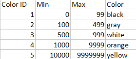
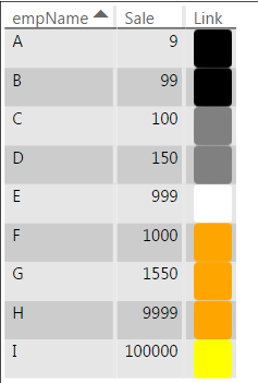
This is the coloring table:-
Power BI Table showing color codes according to the Table above
- Mark as New
- Bookmark
- Subscribe
- Mute
- Subscribe to RSS Feed
- Permalink
- Report Inappropriate Content
thanks @kaushikd for your answer, didn't follow you at all on how should i do to customize the colors on my heatmap. Due there isn't an option in the format menu to customize color, how should i charge the table in order to parametrize colors in red, yellow and green according to the scale?
Thanks & Regards!
- Mark as New
- Bookmark
- Subscribe
- Mute
- Subscribe to RSS Feed
- Permalink
- Report Inappropriate Content
Hi @franorio,
>>, how should i charge the table in order to parametrize colors in red, yellow and green according to the scale?
You can download the sample pbix file, it contain the description of how to use the visual.
Color palette of distribution can be changed using property “Colorbrewer” of the formatting panel (available values: YlGn, YlGnBu, GnBu, BuGn, PuBuGn, PuBu, BuPu, RdPu, PuRd, OrRd, YlOrRd, YlOrBr, Purples, Blues, Greens, Oranges, Reds, Greys, PuOr, BrBG, PRGn, PiYG, RdBu, RdGy, RdYlBu, Spectral, RdYlGn, Paired, Pastel1, Set1, Set3).
Regards,
Xiaoxin Sheng
- Mark as New
- Bookmark
- Subscribe
- Mute
- Subscribe to RSS Feed
- Permalink
- Report Inappropriate Content
Hi @franorio,
Current, power bi not support to detail color formatting.
>>Want to add a color saturation to give the chart columns a color if it reachs determinated % (over 90% green, under 90% red).
I'd like to suggest you vote below ideas or use table heat map visual:
Regards,
Xiaoxin Sheng
Helpful resources

New to Fabric Survey
If you have recently started exploring Fabric, we'd love to hear how it's going. Your feedback can help with product improvements.

Power BI DataViz World Championships - June 2026
A new Power BI DataViz World Championship is coming this June! Don't miss out on submitting your entry.

Join our Fabric User Panel
Share feedback directly with Fabric product managers, participate in targeted research studies and influence the Fabric roadmap.

| User | Count |
|---|---|
| 53 | |
| 40 | |
| 38 | |
| 19 | |
| 18 |
| User | Count |
|---|---|
| 70 | |
| 69 | |
| 34 | |
| 33 | |
| 30 |


