Get Fabric certified for FREE!
Don't miss your chance to take the Fabric Data Engineer (DP-600) exam for FREE! Find out how by watching the DP-600 session on-demand now through April 28th.
Learn more- Power BI forums
- Get Help with Power BI
- Desktop
- Service
- Report Server
- Power Query
- Mobile Apps
- Developer
- DAX Commands and Tips
- Custom Visuals Development Discussion
- Health and Life Sciences
- Power BI Spanish forums
- Translated Spanish Desktop
- Training and Consulting
- Instructor Led Training
- Dashboard in a Day for Women, by Women
- Galleries
- Data Stories Gallery
- Themes Gallery
- Contests Gallery
- QuickViz Gallery
- Quick Measures Gallery
- Visual Calculations Gallery
- Notebook Gallery
- Translytical Task Flow Gallery
- TMDL Gallery
- R Script Showcase
- Webinars and Video Gallery
- Ideas
- Custom Visuals Ideas (read-only)
- Issues
- Issues
- Events
- Upcoming Events
Join the FabCon + SQLCon recap series. Up next: Power BI, Real-Time Intelligence, IQ and AI, and Data Factory take center stage. All sessions are available on-demand after the live show. Register now
- Power BI forums
- Forums
- Get Help with Power BI
- Desktop
- Re: Color coding based on changing baseline and ta...
- Subscribe to RSS Feed
- Mark Topic as New
- Mark Topic as Read
- Float this Topic for Current User
- Bookmark
- Subscribe
- Printer Friendly Page
- Mark as New
- Bookmark
- Subscribe
- Mute
- Subscribe to RSS Feed
- Permalink
- Report Inappropriate Content
Color coding based on changing baseline and target
Hello,
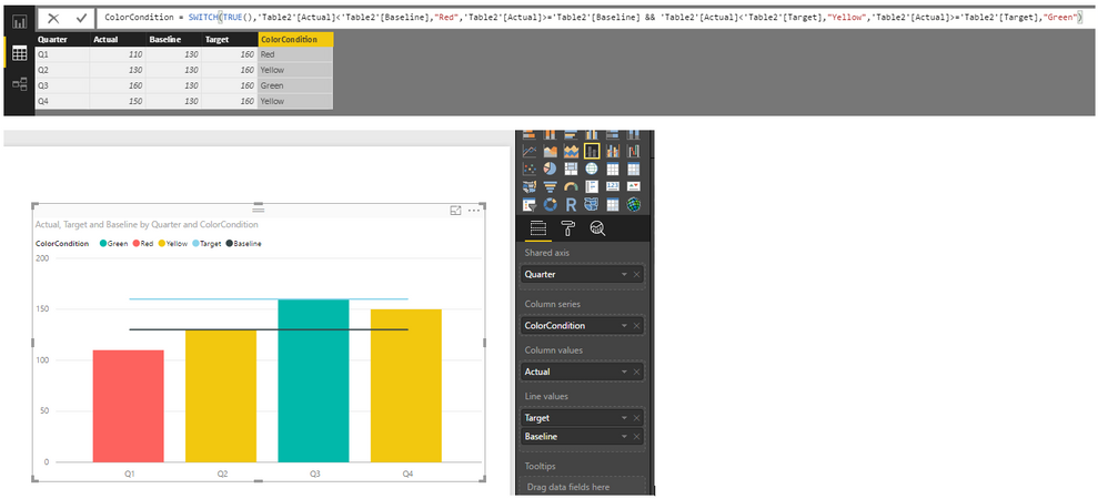
I'm trying to create a line and cluster column chart that changes colour when the baseline and the target are met. One colour below the baseline, one colour above the baseline and one colour above target. Each field that is chosen corresponds with a different baseline and target. It looks like color saturation is not available in this type of visualization and even if it was, it looks like I have to choose a specific value that reflects the baseline and target but each field's target and baseline is different. I'm thinking this is not possible...?
Here's what I have so far. Idealy Q1 should be red, Q2 and Q4 should be yellow, and, pretending Q3 reached the target, it would be green.
Thank you!
- Mark as New
- Bookmark
- Subscribe
- Mute
- Subscribe to RSS Feed
- Permalink
- Report Inappropriate Content
Hi @sdegroot,
You can try to create a calculated column to return result whether the actual value meet the baseline or target. Then use this new column in the Column Series property.
ColorCondition = SWITCH(TRUE(),'Table2'[Actual]<'Table2'[Baseline],"Red",'Table2'[Actual]>='Table2'[Baseline] && 'Table2'[Actual]<'Table2'[Target],"Yellow",'Table2'[Actual]>='Table2'[Target],"Green")
Best Regards,
QQiuyunYu
If this post helps, then please consider Accept it as the solution to help the other members find it more quickly.
- Mark as New
- Bookmark
- Subscribe
- Mute
- Subscribe to RSS Feed
- Permalink
- Report Inappropriate Content
Thank you, that was very useful!
It looks like I cannot use this same method when creating a table. The table should follow the same code as below but, from my understanding of previous posts, conditional formating is not available from a value in a table unless it is an aggregated value. Is this true?
- Mark as New
- Bookmark
- Subscribe
- Mute
- Subscribe to RSS Feed
- Permalink
- Report Inappropriate Content
Hi,
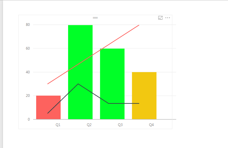
Kind of conditional formatting you are after; I don't think it is available out of the box. But, if you want you could probably add some custom columns and add overlays of charts to get something like below. NB: Works better only when you don’t want visuals to interact with other visuals on the report I don’t think, my idea is a best practice but a work around 🙂
If you wnat I will share my PBIX file, let me know!
HTH!
Prathy
- Mark as New
- Bookmark
- Subscribe
- Mute
- Subscribe to RSS Feed
- Permalink
- Report Inappropriate Content
Hello Prathy,
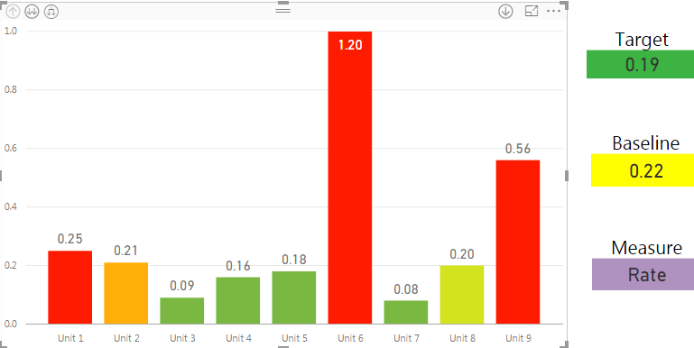
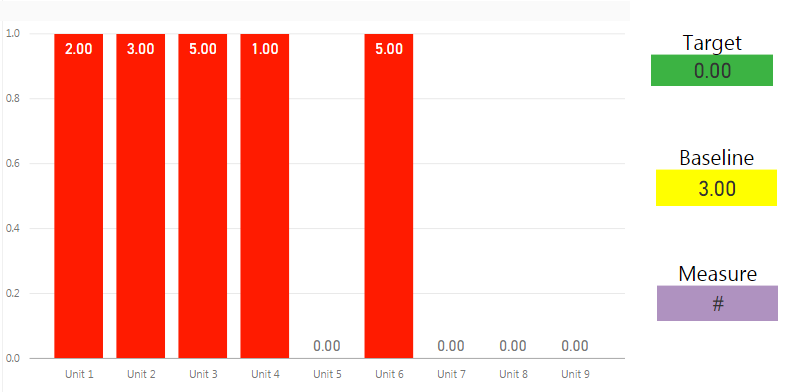
Thanks for you response. I think we're looking for something a little more asthetically appealing so I've used the option of just using a column chart and using Diverging Data Colors. Unfortunately, because I have to state a minimmum and a maximum # it does not work well with the different fields as each field has a different baseline and target :(. Basically, here's what's happening now.
I properly set up one field indicator:
But the next one will look like this since the the color coding is not based on a field:
Helpful resources

Power BI Monthly Update - April 2026
Check out the April 2026 Power BI update to learn about new features.

New to Fabric Survey
If you have recently started exploring Fabric, we'd love to hear how it's going. Your feedback can help with product improvements.

Power BI DataViz World Championships - June 2026
A new Power BI DataViz World Championship is coming this June! Don't miss out on submitting your entry.

| User | Count |
|---|---|
| 43 | |
| 38 | |
| 35 | |
| 21 | |
| 15 |
| User | Count |
|---|---|
| 63 | |
| 58 | |
| 28 | |
| 27 | |
| 25 |


