- Power BI forums
- Get Help with Power BI
- Desktop
- Service
- Report Server
- Power Query
- Mobile Apps
- Developer
- DAX Commands and Tips
- Custom Visuals Development Discussion
- Health and Life Sciences
- Power BI Spanish forums
- Translated Spanish Desktop
- Training and Consulting
- Instructor Led Training
- Dashboard in a Day for Women, by Women
- Galleries
- Data Stories Gallery
- Themes Gallery
- Contests Gallery
- QuickViz Gallery
- Quick Measures Gallery
- Visual Calculations Gallery
- Notebook Gallery
- Translytical Task Flow Gallery
- TMDL Gallery
- R Script Showcase
- Webinars and Video Gallery
- Ideas
- Custom Visuals Ideas (read-only)
- Issues
- Issues
- Events
- Upcoming Events
Learn from the best! Meet the four finalists headed to the FINALS of the Power BI Dataviz World Championships! Register now
- Power BI forums
- Forums
- Get Help with Power BI
- Desktop
- Re: Color based on number value
- Subscribe to RSS Feed
- Mark Topic as New
- Mark Topic as Read
- Float this Topic for Current User
- Bookmark
- Subscribe
- Printer Friendly Page
- Mark as New
- Bookmark
- Subscribe
- Mute
- Subscribe to RSS Feed
- Permalink
- Report Inappropriate Content
Color based on number value
Hi,
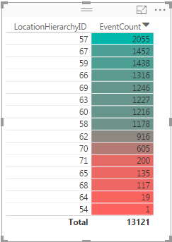
I am trying to create a table like this:
But when I create a table, I can't seem to get the color to show based on the value. Basically I want the same thing which goes from 0-100 and red to green. I couldn't find any thresholds where I can set colors or anything in the table visual.
Does anyone know how to achieve this?
Thanks!
Solved! Go to Solution.
- Mark as New
- Bookmark
- Subscribe
- Mute
- Subscribe to RSS Feed
- Permalink
- Report Inappropriate Content
That screnshot has actually been taken from Power BI, and I figured out how to do it. It's called 'conditional formatting' and can be found in the drop down menu for 'fields'
- Mark as New
- Bookmark
- Subscribe
- Mute
- Subscribe to RSS Feed
- Permalink
- Report Inappropriate Content
I have also look´t on this and what I have seen,
you can not get that in Power BI yet, like you have in Ecxel,
but what I read it will come sone,
I hope:-)
You have a Visiual that can get you a card with color "Card with States by SQLBI"
Best regards
Totte67
- Mark as New
- Bookmark
- Subscribe
- Mute
- Subscribe to RSS Feed
- Permalink
- Report Inappropriate Content
That screnshot has actually been taken from Power BI, and I figured out how to do it. It's called 'conditional formatting' and can be found in the drop down menu for 'fields'
- Mark as New
- Bookmark
- Subscribe
- Mute
- Subscribe to RSS Feed
- Permalink
- Report Inappropriate Content
Thanks, then I also got the solution 🙂
It look´s like Excel but now when I looked at it again I saw it was in Power BI.
Best regards
Totte67
Helpful resources
| User | Count |
|---|---|
| 56 | |
| 42 | |
| 30 | |
| 18 | |
| 16 |
| User | Count |
|---|---|
| 71 | |
| 59 | |
| 39 | |
| 22 | |
| 22 |


