A new Data Days event is coming soon!
This time we’re going bigger than ever. Fabric, Power BI, SQL, AI and more. We're covering it all. You won't want to miss it.
Learn more- Power BI forums
- Get Help with Power BI
- Desktop
- Service
- Report Server
- Power Query
- Mobile Apps
- Developer
- DAX Commands and Tips
- Custom Visuals Development Discussion
- Health and Life Sciences
- Power BI Spanish forums
- Translated Spanish Desktop
- Training and Consulting
- Instructor Led Training
- Dashboard in a Day for Women, by Women
- Galleries
- Data Stories Gallery
- Themes Gallery
- Contests Gallery
- QuickViz Gallery
- Quick Measures Gallery
- Visual Calculations Gallery
- Notebook Gallery
- Translytical Task Flow Gallery
- TMDL Gallery
- R Script Showcase
- Webinars and Video Gallery
- Ideas
- Custom Visuals Ideas (read-only)
- Issues
- Issues
- Events
- Upcoming Events
Did you hear? There's a new SQL AI Developer certification (DP-800). Start preparing now and be one of the first to get certified. Register now
- Power BI forums
- Forums
- Get Help with Power BI
- Desktop
- Color Linking
- Subscribe to RSS Feed
- Mark Topic as New
- Mark Topic as Read
- Float this Topic for Current User
- Bookmark
- Subscribe
- Printer Friendly Page
- Mark as New
- Bookmark
- Subscribe
- Mute
- Subscribe to RSS Feed
- Permalink
- Report Inappropriate Content
Color Linking
Sorry I couldn't think of a better title !
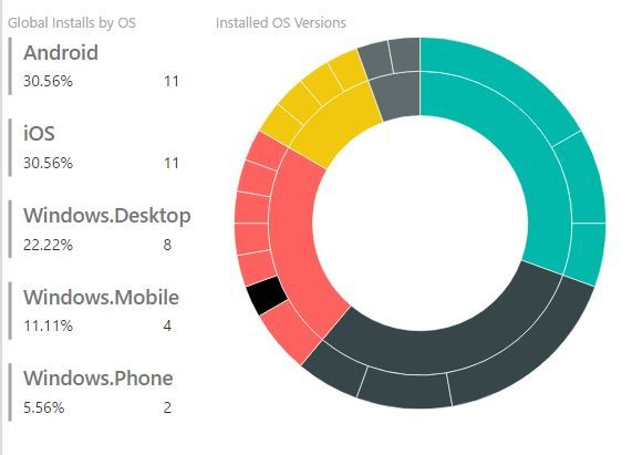
Below is a summary of Installs by OS and Installed OS Versions.
Is there a way that I can assign a color to each OS such that the same color is used through out any other chart that uses OS data ?
- Mark as New
- Bookmark
- Subscribe
- Mute
- Subscribe to RSS Feed
- Permalink
- Report Inappropriate Content
... I haven't used your custom visual, but does this describe the issue you are seeing? Hopefuly it helps..? FOrrest
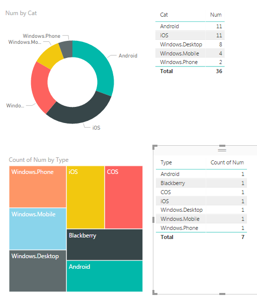
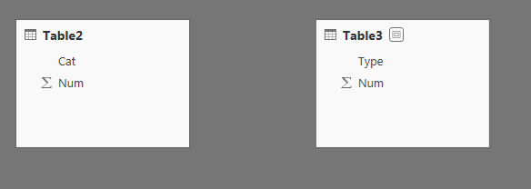
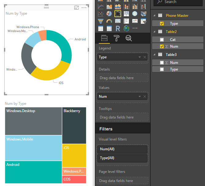
Because my data for each visual comes from different tables (summarized to the right), and each table has multiple rows and not a single 'master category' your multiple visuals on a page have different colors...
As you can see there's no LINK between the two tables.
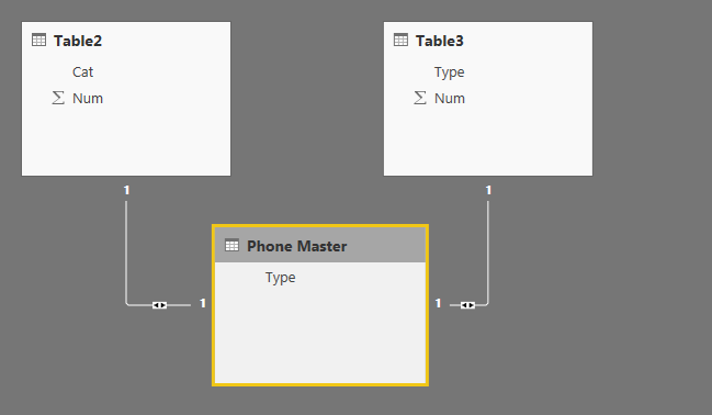
I manually created a LIST of phone Types and then 'Managed Relationship' using the list to create two 1:many relationships between teh two sets of data: (It says 1:1 below, but 1:many if you have lots of rows.)
Now, I change the Legends of both Visuals to use the 'Master List' instead of the individual categories. Now all the colors allign...
Please give Kudos or Mark as a Solution!
https://www.linkedin.com/in/forrest-hill-04480730/
Proud to give back to the community!
Thank You!
- Mark as New
- Bookmark
- Subscribe
- Mute
- Subscribe to RSS Feed
- Permalink
- Report Inappropriate Content
Both of those last visuals use the same data where as your first pair had different tables...
- Mark as New
- Bookmark
- Subscribe
- Mute
- Subscribe to RSS Feed
- Permalink
- Report Inappropriate Content
Hi @maf,
There are two visuals in your screenshot, one is Multi-row chart, another one is Sunburst visual, right? You want the color of same category is same. As I tested, we can not set the category custom color for Sunburst visual as well as Multi-row chart. For power BI visual, we can set categories' color, most of them can not be changed. Thanks for understanding.
Best Regards,
Angelia
Helpful resources

Power BI Monthly Update - April 2026
Check out the April 2026 Power BI update to learn about new features.

Data Days 2026 coming soon!
Sign up to receive a private message when registration opens and key events begin.

New to Fabric Survey
If you have recently started exploring Fabric, we'd love to hear how it's going. Your feedback can help with product improvements.

| User | Count |
|---|---|
| 34 | |
| 31 | |
| 25 | |
| 20 | |
| 16 |
| User | Count |
|---|---|
| 61 | |
| 49 | |
| 28 | |
| 23 | |
| 23 |
