FabCon is coming to Atlanta
Join us at FabCon Atlanta from March 16 - 20, 2026, for the ultimate Fabric, Power BI, AI and SQL community-led event. Save $200 with code FABCOMM.
Register now!- Power BI forums
- Get Help with Power BI
- Desktop
- Service
- Report Server
- Power Query
- Mobile Apps
- Developer
- DAX Commands and Tips
- Custom Visuals Development Discussion
- Health and Life Sciences
- Power BI Spanish forums
- Translated Spanish Desktop
- Training and Consulting
- Instructor Led Training
- Dashboard in a Day for Women, by Women
- Galleries
- Data Stories Gallery
- Themes Gallery
- Contests Gallery
- QuickViz Gallery
- Quick Measures Gallery
- Visual Calculations Gallery
- Notebook Gallery
- Translytical Task Flow Gallery
- TMDL Gallery
- R Script Showcase
- Webinars and Video Gallery
- Ideas
- Custom Visuals Ideas (read-only)
- Issues
- Issues
- Events
- Upcoming Events
The Power BI Data Visualization World Championships is back! Get ahead of the game and start preparing now! Learn more
- Power BI forums
- Forums
- Get Help with Power BI
- Desktop
- Re: Clustered stacked column chart
- Subscribe to RSS Feed
- Mark Topic as New
- Mark Topic as Read
- Float this Topic for Current User
- Bookmark
- Subscribe
- Printer Friendly Page
- Mark as New
- Bookmark
- Subscribe
- Mute
- Subscribe to RSS Feed
- Permalink
- Report Inappropriate Content
Clustered stacked column chart
I'm trying to implement a Clustered stacked column chart. I can't figure out how to do it or find any examples.
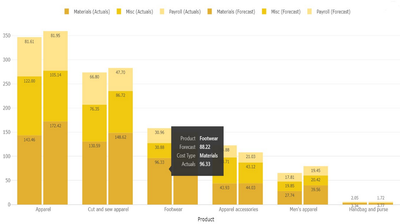
The chart would look similar to the image below. Have you got any idea if this can be acieved in Power BI?
Solved! Go to Solution.
- Mark as New
- Bookmark
- Subscribe
- Mute
- Subscribe to RSS Feed
- Permalink
- Report Inappropriate Content
@trev_likes_PBI
In Power BI Desktop, it’s not possible to create a chart which can combine both Clustered and Stacked column chart together. Because it can’t determine which group of series need to be “clustered”, which group of series need to be “stacked”. And it’s still not supported to add multiple fields into Legend of a chart. The expected result as you posted can’t be achieved. For your requirement, I suggest you add a column to assign type “Forecast” and “Actual”, then build a hierarchy like “Type->Cost”. Put the hierarchy on X-axis, you suppose to drill down the detail level to see those different costs.
Best Regards,
Angelia
- Mark as New
- Bookmark
- Subscribe
- Mute
- Subscribe to RSS Feed
- Permalink
- Report Inappropriate Content
Hi @trev_likes_PBI ,
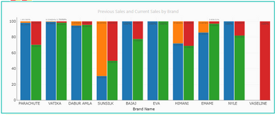
Here, is a 100 % Stacked Clustered Column Chart where you can put two different values (e.g: Current year sales and Previous year sales) and can easily compare between them based on their category.

Download link for the custom visual file on this page,
https://pbivizedit.com/gallery/100stacked-clustered-column-chart
This was made with our Custom Visual creator tool PBIVizEdit.com. With this tool,
- anyone, irrespective of technical skills, can create their visuals
- 15 minutes to create a visual from scratch
- opens up many additional attributes to edit (e.g. labels, tooltips, legends position, etc)
Give this a shot and let us know if you face any problems/errors.
You can use the editor to modify your visual further (some modifications cannot be done in the Power BI window and have to be in the editor).
Thanks,
Team PBIVizEdit
- Mark as New
- Bookmark
- Subscribe
- Mute
- Subscribe to RSS Feed
- Permalink
- Report Inappropriate Content
I'm trying to use this tool and can't figure out how to add the clustering variable. How do you add a clustering variable?
- Mark as New
- Bookmark
- Subscribe
- Mute
- Subscribe to RSS Feed
- Permalink
- Report Inappropriate Content
Hi @Riv
Instead of creating with the editor, now there is a direct download option available.
You can directly download the clustered stacked column chart from Appsource. There is a non-certified and a certified version.
https://appsource.microsoft.com/en-US/product/PowerBIVisuals/yavdaanalyticspvtltd1628223732998.clust...
https://appsource.microsoft.com/en-us/product/power-bi-visuals/yavdaanalyticspvtltd1628223732998.clu...
if you need a modification to the standard one and have to use the editor, then let us know and we can get you help.
Regards,
AsitM
- Mark as New
- Bookmark
- Subscribe
- Mute
- Subscribe to RSS Feed
- Permalink
- Report Inappropriate Content
I've put a solution together in this blog post if it's still interesting after all these years since this thread was posted 🙂
https://www.villezekeviking.com/how-to-combine-a-clustered-and-stacked-chart-in-power-bi/
- Mark as New
- Bookmark
- Subscribe
- Mute
- Subscribe to RSS Feed
- Permalink
- Report Inappropriate Content
This doesn't work for me, I just get identical stacked charts next to each other.
- Mark as New
- Bookmark
- Subscribe
- Mute
- Subscribe to RSS Feed
- Permalink
- Report Inappropriate Content
Hi, for the same, if multiple values are drilled down in x axis, for each of those parameters, how to show it in 2 stacked and one bar in clustered fashion like this, u have made it for single parameter.... any heads up?
- Mark as New
- Bookmark
- Subscribe
- Mute
- Subscribe to RSS Feed
- Permalink
- Report Inappropriate Content
This solution worked wonders for me, thank you! It did turn out the data structure of my source was similar to the one in your solution so it worked like a charm. But for other users out there, keep in mind you may need to tweak your data structure to make this work. Good luck!
- Mark as New
- Bookmark
- Subscribe
- Mute
- Subscribe to RSS Feed
- Permalink
- Report Inappropriate Content
Brilliant solution! I had a tinker with it for a while. my SQL was already extracting the year as a seperate column as a string, not a Date type. I'm not sure what I did but eventually it just worked somehow and I got a Clustered Stacked graph exactly how I wanted! You're the best!! hanks for sharing the pbix file on your blog as well.
- Mark as New
- Bookmark
- Subscribe
- Mute
- Subscribe to RSS Feed
- Permalink
- Report Inappropriate Content
Hi @Anonymous ,
Interesting solution. Thanks for sharing
Cheers
CheenuSing
- Mark as New
- Bookmark
- Subscribe
- Mute
- Subscribe to RSS Feed
- Permalink
- Report Inappropriate Content
Sorry to reply to an old post, but in case more people are looking for a solution - this tutorial shows how to simulate a clustered stacked chart https://youtu.be/AI3eT1kRje4
- Mark as New
- Bookmark
- Subscribe
- Mute
- Subscribe to RSS Feed
- Permalink
- Report Inappropriate Content
Is there any update on this feature we too need this functionality/workaround if any one has done it
- Mark as New
- Bookmark
- Subscribe
- Mute
- Subscribe to RSS Feed
- Permalink
- Report Inappropriate Content
@trev_likes_PBI
In Power BI Desktop, it’s not possible to create a chart which can combine both Clustered and Stacked column chart together. Because it can’t determine which group of series need to be “clustered”, which group of series need to be “stacked”. And it’s still not supported to add multiple fields into Legend of a chart. The expected result as you posted can’t be achieved. For your requirement, I suggest you add a column to assign type “Forecast” and “Actual”, then build a hierarchy like “Type->Cost”. Put the hierarchy on X-axis, you suppose to drill down the detail level to see those different costs.
Best Regards,
Angelia
- Mark as New
- Bookmark
- Subscribe
- Mute
- Subscribe to RSS Feed
- Permalink
- Report Inappropriate Content
This link effectively shows the steps of what you mention regarding the column for types and drilldown:
https://www.villezekeviking.com/how-to-combine-a-clustered-and-stacked-chart-in-power-bi/
- Mark as New
- Bookmark
- Subscribe
- Mute
- Subscribe to RSS Feed
- Permalink
- Report Inappropriate Content
There are paid visuals on appsource now (starting at $7 or so) that can get this done easily
Appsource - Clustered Stacked Column Chart
- Mark as New
- Bookmark
- Subscribe
- Mute
- Subscribe to RSS Feed
- Permalink
- Report Inappropriate Content
You have to structure your data like this example before using it in power BI.
- Mark as New
- Bookmark
- Subscribe
- Mute
- Subscribe to RSS Feed
- Permalink
- Report Inappropriate Content
Hi Guys
I know there is no provision to create a clustered stacked column chart in PowerBI directly. But at times we have no option but to create the same to meet project demand. We have tried to tweak a little and build something which is close to clustered stacked column chart to meet our requirement. I am sharing the screen shot for same. We created it using black columns. In case you want to know more about solution, do ping me @ kamboj.rajan90@gmail.com
Thanks
Rajan Kamboj
- Mark as New
- Bookmark
- Subscribe
- Mute
- Subscribe to RSS Feed
- Permalink
- Report Inappropriate Content
- Mark as New
- Bookmark
- Subscribe
- Mute
- Subscribe to RSS Feed
- Permalink
- Report Inappropriate Content
Unfortunately the solution suggested by @rajankamboj never came with a pbix.
The best offer came from @LN7715 with a video on Youtube showing a possible way forward.
I believe it's still an open request with the Power BI developers to give us an official solution.
- Mark as New
- Bookmark
- Subscribe
- Mute
- Subscribe to RSS Feed
- Permalink
- Report Inappropriate Content
- Mark as New
- Bookmark
- Subscribe
- Mute
- Subscribe to RSS Feed
- Permalink
- Report Inappropriate Content
hi
what was the solution ? i need to implement it as well in a file
Helpful resources

Power BI Dataviz World Championships
The Power BI Data Visualization World Championships is back! Get ahead of the game and start preparing now!

| User | Count |
|---|---|
| 39 | |
| 37 | |
| 33 | |
| 32 | |
| 29 |
| User | Count |
|---|---|
| 133 | |
| 88 | |
| 85 | |
| 68 | |
| 64 |


