FabCon is coming to Atlanta
Join us at FabCon Atlanta from March 16 - 20, 2026, for the ultimate Fabric, Power BI, AI and SQL community-led event. Save $200 with code FABCOMM.
Register now!- Power BI forums
- Get Help with Power BI
- Desktop
- Service
- Report Server
- Power Query
- Mobile Apps
- Developer
- DAX Commands and Tips
- Custom Visuals Development Discussion
- Health and Life Sciences
- Power BI Spanish forums
- Translated Spanish Desktop
- Training and Consulting
- Instructor Led Training
- Dashboard in a Day for Women, by Women
- Galleries
- Data Stories Gallery
- Themes Gallery
- Contests Gallery
- QuickViz Gallery
- Quick Measures Gallery
- Visual Calculations Gallery
- Notebook Gallery
- Translytical Task Flow Gallery
- TMDL Gallery
- R Script Showcase
- Webinars and Video Gallery
- Ideas
- Custom Visuals Ideas (read-only)
- Issues
- Issues
- Events
- Upcoming Events
Learn from the best! Meet the four finalists headed to the FINALS of the Power BI Dataviz World Championships! Register now
- Power BI forums
- Forums
- Get Help with Power BI
- Desktop
- Re: Clustered Column chart with two value fields
- Subscribe to RSS Feed
- Mark Topic as New
- Mark Topic as Read
- Float this Topic for Current User
- Bookmark
- Subscribe
- Printer Friendly Page
- Mark as New
- Bookmark
- Subscribe
- Mute
- Subscribe to RSS Feed
- Permalink
- Report Inappropriate Content
Clustered Column chart with two value fields
Hi!
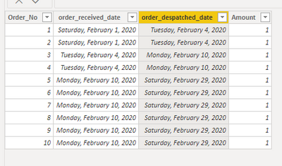
I have a table [orders]. There are two date columns, one is "order_received_date" and the other is "order_despatched_date"
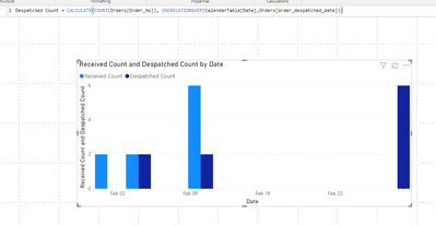
I want to have a Clustered column chart with x-Axis [Date] and y-Axis [Amount of orders].
There should be 2 bars aligned to each other (2 Values). One bar with amount of orders received and one bar with amount of orders despatched.
It seemed like a simple task, but I just don't know how to do it. Do I need a separate date table or something?
Thx for your help!
Solved! Go to Solution.
- Mark as New
- Bookmark
- Subscribe
- Mute
- Subscribe to RSS Feed
- Permalink
- Report Inappropriate Content
This is easily done with the USERELATIONSHIP function.
First, on the relationship modeling tab create a link for both date columns, you'll notice the second one is inactive but we can use the above function to have the measure use that relationship instead.
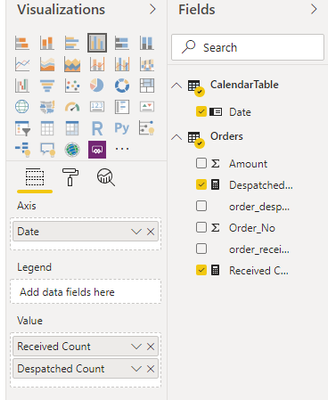
Now create a measure that uses calculate to use that inactive relationship.
Measures:
Despatched Count = CALCULATE(COUNT(Orders[Order_No]),USERELATIONSHIP(CalendarTable[Date],Orders[order_despatched_date]))

Received Count = COUNT(Orders[Order_No])


Helpful resources

Join our Fabric User Panel
Share feedback directly with Fabric product managers, participate in targeted research studies and influence the Fabric roadmap.

Power BI Monthly Update - February 2026
Check out the February 2026 Power BI update to learn about new features.

| User | Count |
|---|---|
| 63 | |
| 55 | |
| 41 | |
| 17 | |
| 14 |
| User | Count |
|---|---|
| 97 | |
| 80 | |
| 35 | |
| 29 | |
| 25 |

