FabCon is coming to Atlanta
Join us at FabCon Atlanta from March 16 - 20, 2026, for the ultimate Fabric, Power BI, AI and SQL community-led event. Save $200 with code FABCOMM.
Register now!- Power BI forums
- Get Help with Power BI
- Desktop
- Service
- Report Server
- Power Query
- Mobile Apps
- Developer
- DAX Commands and Tips
- Custom Visuals Development Discussion
- Health and Life Sciences
- Power BI Spanish forums
- Translated Spanish Desktop
- Training and Consulting
- Instructor Led Training
- Dashboard in a Day for Women, by Women
- Galleries
- Data Stories Gallery
- Themes Gallery
- Contests Gallery
- QuickViz Gallery
- Quick Measures Gallery
- Visual Calculations Gallery
- Notebook Gallery
- Translytical Task Flow Gallery
- TMDL Gallery
- R Script Showcase
- Webinars and Video Gallery
- Ideas
- Custom Visuals Ideas (read-only)
- Issues
- Issues
- Events
- Upcoming Events
The Power BI Data Visualization World Championships is back! Get ahead of the game and start preparing now! Learn more
- Power BI forums
- Forums
- Get Help with Power BI
- Desktop
- Clustered Column chart with Data from two datasets
- Subscribe to RSS Feed
- Mark Topic as New
- Mark Topic as Read
- Float this Topic for Current User
- Bookmark
- Subscribe
- Printer Friendly Page
- Mark as New
- Bookmark
- Subscribe
- Mute
- Subscribe to RSS Feed
- Permalink
- Report Inappropriate Content
Clustered Column chart with Data from two datasets
I feel like I am being dense and what I want to do is possible but I can't figure it out.
I have two separate datasets in my powerbi.
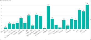
The first is an odata link to an onprem SharePoint list where I am pivoting the quantity of projects in progress by team name. Unique identifier /value in that data set is ID - so its telling me each team has a status of x projects that is "in progress". (image below)
I have another set of data that is a list of the same team names, with their capacity. Its a manual chart added in excel to the powerbi. (image below)
I have the two datasets linked by the team names that match
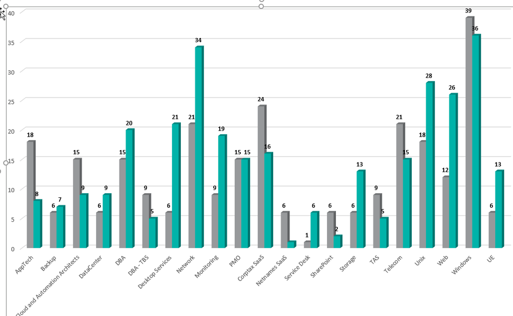
I want to create a clustered column chart where I can show the work in progress by team, next to what their capacity is.
How can I do this? I can't seem to figure out how to get both to line up on teh same chart. I cannot update the sharepoint list - and want to be able to refresh to get a current portrait of work in progress on the chart.
Excel by Team
Sharepoint by Team:
DataSets:
Result in Excel:
Solved! Go to Solution.
- Mark as New
- Bookmark
- Subscribe
- Mute
- Subscribe to RSS Feed
- Permalink
- Report Inappropriate Content
Technically you have 1 dataset (Data model) and 2 tables. You either need to merge the 2 tables into 1, or load a third table that contains a list of all of the unique team names, remove the current join and link both tables to the new table. Put the column from the third table as the axis, and then columns from the other 2 tables as your values
* Matt is an 8 times Microsoft MVP (Power BI) and author of the Power BI Book Supercharge Power BI.
I will not give you bad advice, even if you unknowingly ask for it.
- Mark as New
- Bookmark
- Subscribe
- Mute
- Subscribe to RSS Feed
- Permalink
- Report Inappropriate Content
THANK YOU! It was right in front of my face!
Helpful resources

Power BI Dataviz World Championships
The Power BI Data Visualization World Championships is back! Get ahead of the game and start preparing now!

| User | Count |
|---|---|
| 62 | |
| 47 | |
| 40 | |
| 36 | |
| 23 |
| User | Count |
|---|---|
| 184 | |
| 123 | |
| 106 | |
| 78 | |
| 52 |


