Join us at FabCon Vienna from September 15-18, 2025
The ultimate Fabric, Power BI, SQL, and AI community-led learning event. Save €200 with code FABCOMM.
Get registered- Power BI forums
- Get Help with Power BI
- Desktop
- Service
- Report Server
- Power Query
- Mobile Apps
- Developer
- DAX Commands and Tips
- Custom Visuals Development Discussion
- Health and Life Sciences
- Power BI Spanish forums
- Translated Spanish Desktop
- Training and Consulting
- Instructor Led Training
- Dashboard in a Day for Women, by Women
- Galleries
- Data Stories Gallery
- Themes Gallery
- Contests Gallery
- Quick Measures Gallery
- Notebook Gallery
- Translytical Task Flow Gallery
- TMDL Gallery
- R Script Showcase
- Webinars and Video Gallery
- Ideas
- Custom Visuals Ideas (read-only)
- Issues
- Issues
- Events
- Upcoming Events
Enhance your career with this limited time 50% discount on Fabric and Power BI exams. Ends September 15. Request your voucher.
- Power BI forums
- Forums
- Get Help with Power BI
- Desktop
- Clustered Column Chart Data label
- Subscribe to RSS Feed
- Mark Topic as New
- Mark Topic as Read
- Float this Topic for Current User
- Bookmark
- Subscribe
- Printer Friendly Page
- Mark as New
- Bookmark
- Subscribe
- Mute
- Subscribe to RSS Feed
- Permalink
- Report Inappropriate Content
Clustered Column Chart Data label
Guys,
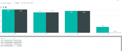
I create a Clustered Column Chart and i use a measure as a value. the problem is that all columns show the right data with the right data label except on column which shows only the text 6.43E-8.see image below.
how can I change this to show the right Display Units (Millions) and remove the E from the Data label?
Thanks a lot.
Solved! Go to Solution.
- Mark as New
- Bookmark
- Subscribe
- Mute
- Subscribe to RSS Feed
- Permalink
- Report Inappropriate Content
Hi Marios,
this happens because you have value with decimal position higher than 4th (as example 0.000000064)
Since you are considering data at Million scale I suggest to round the date at the fourth decimal position.
See the attached screen:
right
wrong
Helpful resources
| User | Count |
|---|---|
| 65 | |
| 60 | |
| 55 | |
| 54 | |
| 31 |
| User | Count |
|---|---|
| 180 | |
| 88 | |
| 70 | |
| 46 | |
| 46 |


