FabCon is coming to Atlanta
Join us at FabCon Atlanta from March 16 - 20, 2026, for the ultimate Fabric, Power BI, AI and SQL community-led event. Save $200 with code FABCOMM.
Register now!- Power BI forums
- Get Help with Power BI
- Desktop
- Service
- Report Server
- Power Query
- Mobile Apps
- Developer
- DAX Commands and Tips
- Custom Visuals Development Discussion
- Health and Life Sciences
- Power BI Spanish forums
- Translated Spanish Desktop
- Training and Consulting
- Instructor Led Training
- Dashboard in a Day for Women, by Women
- Galleries
- Data Stories Gallery
- Themes Gallery
- Contests Gallery
- QuickViz Gallery
- Quick Measures Gallery
- Visual Calculations Gallery
- Notebook Gallery
- Translytical Task Flow Gallery
- TMDL Gallery
- R Script Showcase
- Webinars and Video Gallery
- Ideas
- Custom Visuals Ideas (read-only)
- Issues
- Issues
- Events
- Upcoming Events
Get Fabric Certified for FREE during Fabric Data Days. Don't miss your chance! Request now
- Power BI forums
- Forums
- Get Help with Power BI
- Desktop
- Re: Chart with goal line with different measures
- Subscribe to RSS Feed
- Mark Topic as New
- Mark Topic as Read
- Float this Topic for Current User
- Bookmark
- Subscribe
- Printer Friendly Page
- Mark as New
- Bookmark
- Subscribe
- Mute
- Subscribe to RSS Feed
- Permalink
- Report Inappropriate Content
Chart with goal line with different measures
Hi,
I have two tables that have this structure:
Feedback Table
| Year | Month | Person | Sector | Year-Month-Status |
| 2022 | 1 | Jack | B | 2022-1-Z |
| 2022 | 1 | Ellen | A | 2022-1-T |
| 2022 | 2 | David | D | 2022-2-Z |
| 2022 | 3 | Alice | C | 2022-3-A |
| ... | ... | ... | ... | ... |
Objectives Table
| Year | Month | Sector | Goal | Year-Month-Status |
| 2022 | 1 | A | 15 | 2022-1-A |
| 2022 | 1 | B | 11 | 2022-1-B |
| 2022 | 1 | C | 17 | 2022-1-C |
| 2022 | 1 | D | 20 | 2022-1-D |
| 2022 | 2 | A | 24 | 2022-2-A |
| 2022 | 2 | B | 33 | 2022-2-B |
| 2022 | 2 | C | 45 | 2022-2-C |
| 2022 | 2 | D | 36 | 2022-2-D |
| ... | ... | ... | ... | ... |
I want to create a chart that shows the COUNT of feedbacks for each Sector in each month of the year, with the objective line adapting to the objective of each month and sector of the Objectives table.
I would also like that if the Sector objective for the month was reached, the bar would turn green, if not, the bar would turn red.
I created a column that concatenates Year, Month and Sector in the two tables (Year-Month-Status column), to be able to generate a kind of ID and related the two tables by that ID, but I don't know what else to do. I've already created the chart that shows the count of feedbacks per Sector and per month, but when I enter the Objective value for the goal line (from the Objective table), the line appears straight, indicating "objective count", as in the image below:
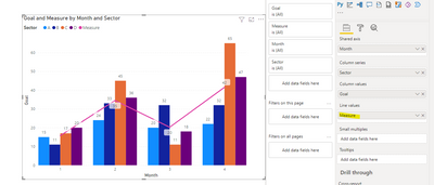
When actually I wanted my chart to look something like this:
Can someone help me?
Solved! Go to Solution.
- Mark as New
- Bookmark
- Subscribe
- Mute
- Subscribe to RSS Feed
- Permalink
- Report Inappropriate Content
Hi @Anonymous ,
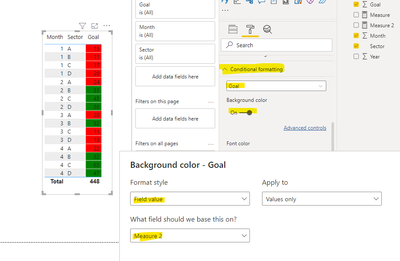
The line and clustered column chart does not support adding a conditional judgment condition based on column. You can try to use table visual, create measure, and use format->conditional formatting function, refer to the following.
Measure 2 = IF(MAX('Table'[Goal ])>=25,"green","red")In addition you can create measures as trend lines (e.g. averages) to be placed in the visual counterpart.
Measure = AVERAGE('Table'[Goal ])
If the problem is still not resolved, please provide detailed error information and let me know immediately. Looking forward to your reply.
Best Regards,
Henry
If this post helps, then please consider Accept it as the solution to help the other members find it more quickly.
- Mark as New
- Bookmark
- Subscribe
- Mute
- Subscribe to RSS Feed
- Permalink
- Report Inappropriate Content
No one? 😞
Helpful resources

Power BI Monthly Update - November 2025
Check out the November 2025 Power BI update to learn about new features.

Fabric Data Days
Advance your Data & AI career with 50 days of live learning, contests, hands-on challenges, study groups & certifications and more!


