Fabric Data Days starts November 4th!
Advance your Data & AI career with 50 days of live learning, dataviz contests, hands-on challenges, study groups & certifications and more!
Get registered- Power BI forums
- Get Help with Power BI
- Desktop
- Service
- Report Server
- Power Query
- Mobile Apps
- Developer
- DAX Commands and Tips
- Custom Visuals Development Discussion
- Health and Life Sciences
- Power BI Spanish forums
- Translated Spanish Desktop
- Training and Consulting
- Instructor Led Training
- Dashboard in a Day for Women, by Women
- Galleries
- Data Stories Gallery
- Themes Gallery
- Contests Gallery
- QuickViz Gallery
- Quick Measures Gallery
- Visual Calculations Gallery
- Notebook Gallery
- Translytical Task Flow Gallery
- TMDL Gallery
- R Script Showcase
- Webinars and Video Gallery
- Ideas
- Custom Visuals Ideas (read-only)
- Issues
- Issues
- Events
- Upcoming Events
Get Fabric Certified for FREE during Fabric Data Days. Don't miss your chance! Request now
- Power BI forums
- Forums
- Get Help with Power BI
- Desktop
- Chart Y-axis formatting with Calculation group
- Subscribe to RSS Feed
- Mark Topic as New
- Mark Topic as Read
- Float this Topic for Current User
- Bookmark
- Subscribe
- Printer Friendly Page
- Mark as New
- Bookmark
- Subscribe
- Mute
- Subscribe to RSS Feed
- Permalink
- Report Inappropriate Content
Chart Y-axis formatting with Calculation group
Hi All
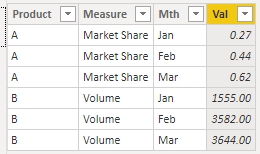
I want to achieve the chart according to the screenshot. There are 2 different product, 1 is for Market Share & another for Volume. When user will select Product-A then chart should show data in percentage, and when user select Product-B, chart should show simple number. I think so, we can achieve the same through caluclation group, however, not able to achieve the same. Please suggest
Kind Regards
Ashwani
- Mark as New
- Bookmark
- Subscribe
- Mute
- Subscribe to RSS Feed
- Permalink
- Report Inappropriate Content
Hi, @Anonymous
Based on your description, I created data to reproduce your scenario. The pbix file is attached in the end.
Table:
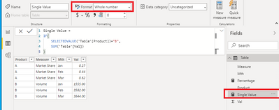
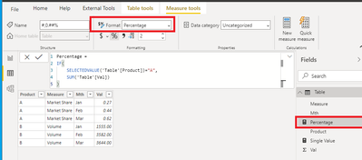
You may create two measures as below.
Single Value =
IF(
    SELECTEDVALUE('Table'[Product])="B",
    SUM('Table'[Val])
)
Percentage =
IF(
    SELECTEDVALUE('Table'[Product])="A",
    SUM('Table'[Val])
)
Then you may format 'Single Value' as 'Whole number' and 'Percentage' as 'Percentage'.
Finally you may use 'Line and clustered column chart' to display the result.
Best Regards
Allan
If this post helps, then please consider Accept it as the solution to help the other members find it more quickly.
- Mark as New
- Bookmark
- Subscribe
- Mute
- Subscribe to RSS Feed
- Permalink
- Report Inappropriate Content
Thanks @v-alq-msft for your response. Actually, I want to achieve the same thing in single chart.
I think so, we can achieve the same with Calcultion Group as Microsoft has shared same example in Aug;20 release. However, not able to find Aug;20 PBIX file on GitHub.
Please suggest, how we can resolve this issue
Kind Regards
Ashwani
- Mark as New
- Bookmark
- Subscribe
- Mute
- Subscribe to RSS Feed
- Permalink
- Report Inappropriate Content
@Anonymous ,I think this case is ideal for bookmark and buttons
https://radacad.com/bookmarks-and-buttons-making-power-bi-charts-even-more-interactive
Another option is measure slicer based on Product1 and Product2 values.
https://radacad.com/change-the-column-or-measure-value-in-a-power-bi-visual-by-selection-of-the-slicer-parameter-table-pattern
https://community.powerbi.com/t5/Desktop/Slicer-MTD-QTD-YTD-to-filter-dates-using-the-slicer/td-p/500115
- Mark as New
- Bookmark
- Subscribe
- Mute
- Subscribe to RSS Feed
- Permalink
- Report Inappropriate Content
Hi Amit
Thanks for your response. I have multiple products and order can be anything like Market Share, Market share, Volume etc.
So, thatwahy can't use bookmark.
And, in 2nd link, yaxis format is not changing.
Kind Regards
Ashwani
Helpful resources

Fabric Data Days
Advance your Data & AI career with 50 days of live learning, contests, hands-on challenges, study groups & certifications and more!

Power BI Monthly Update - October 2025
Check out the October 2025 Power BI update to learn about new features.


