A new Data Days event is coming soon!
This time we’re going bigger than ever. Fabric, Power BI, SQL, AI and more. We're covering it all. You won't want to miss it.
Learn more- Power BI forums
- Get Help with Power BI
- Desktop
- Service
- Report Server
- Power Query
- Mobile Apps
- Developer
- DAX Commands and Tips
- Custom Visuals Development Discussion
- Health and Life Sciences
- Power BI Spanish forums
- Translated Spanish Desktop
- Training and Consulting
- Instructor Led Training
- Dashboard in a Day for Women, by Women
- Galleries
- Data Stories Gallery
- Themes Gallery
- Contests Gallery
- QuickViz Gallery
- Quick Measures Gallery
- Visual Calculations Gallery
- Notebook Gallery
- Translytical Task Flow Gallery
- TMDL Gallery
- R Script Showcase
- Webinars and Video Gallery
- Ideas
- Custom Visuals Ideas (read-only)
- Issues
- Issues
- Events
- Upcoming Events
Did you hear? There's a new SQL AI Developer certification (DP-800). Start preparing now and be one of the first to get certified. Register now
- Power BI forums
- Forums
- Get Help with Power BI
- Desktop
- Changing data type/display based on column
- Subscribe to RSS Feed
- Mark Topic as New
- Mark Topic as Read
- Float this Topic for Current User
- Bookmark
- Subscribe
- Printer Friendly Page
- Mark as New
- Bookmark
- Subscribe
- Mute
- Subscribe to RSS Feed
- Permalink
- Report Inappropriate Content
Changing data type/display based on column
I would like to display data on the same graph but change the filter to display individual rows of data. Some rows may have values as numbers and some as percents. Is there a way to tell PowerBI to display the Y-axis as a percent or a value, depending perhaps a column that has a "P" for percent or "V" for value? I realize I can create a calculated column that multiplies the percent by 100 for "P" and just returns the value for "V", but then the % symbol is not included in the graph...
Solved! Go to Solution.
- Mark as New
- Bookmark
- Subscribe
- Mute
- Subscribe to RSS Feed
- Permalink
- Report Inappropriate Content
Hi @bruleyn,
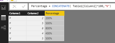
We can not set the same column in different format, if you want to add the % in the column using the formula below, the type will be text. You can not use text data type in value field.
Percentage = CONCATENATE( Table1[Column2]*100,"%")
So for your requirement, we can not displysame column in different format.
Best Regards,
Angelia
Helpful resources

Power BI Monthly Update - April 2026
Check out the April 2026 Power BI update to learn about new features.

Data Days 2026 coming soon!
Sign up to receive a private message when registration opens and key events begin.

New to Fabric Survey
If you have recently started exploring Fabric, we'd love to hear how it's going. Your feedback can help with product improvements.

| User | Count |
|---|---|
| 35 | |
| 32 | |
| 27 | |
| 23 | |
| 16 |
| User | Count |
|---|---|
| 65 | |
| 50 | |
| 30 | |
| 25 | |
| 24 |

