FabCon is coming to Atlanta
Join us at FabCon Atlanta from March 16 - 20, 2026, for the ultimate Fabric, Power BI, AI and SQL community-led event. Save $200 with code FABCOMM.
Register now!- Power BI forums
- Get Help with Power BI
- Desktop
- Service
- Report Server
- Power Query
- Mobile Apps
- Developer
- DAX Commands and Tips
- Custom Visuals Development Discussion
- Health and Life Sciences
- Power BI Spanish forums
- Translated Spanish Desktop
- Training and Consulting
- Instructor Led Training
- Dashboard in a Day for Women, by Women
- Galleries
- Data Stories Gallery
- Themes Gallery
- Contests Gallery
- Quick Measures Gallery
- Notebook Gallery
- Translytical Task Flow Gallery
- TMDL Gallery
- R Script Showcase
- Webinars and Video Gallery
- Ideas
- Custom Visuals Ideas (read-only)
- Issues
- Issues
- Events
- Upcoming Events
To celebrate FabCon Vienna, we are offering 50% off select exams. Ends October 3rd. Request your discount now.
- Power BI forums
- Forums
- Get Help with Power BI
- Desktop
- Change Table Color based on associated slicer sele...
- Subscribe to RSS Feed
- Mark Topic as New
- Mark Topic as Read
- Float this Topic for Current User
- Bookmark
- Subscribe
- Printer Friendly Page
- Mark as New
- Bookmark
- Subscribe
- Mute
- Subscribe to RSS Feed
- Permalink
- Report Inappropriate Content
Change Table Color based on associated slicer selection
Hi All
I'm trying to make the colour of a table change based on the associated slicer selection
Would I need to create a measure for all of the available selections (in this instance I have 4, positive, negative, mixed and neutral) and a table with free-text which fall under one of those 4 categories
For example:
Free Text Sentiment
Blah Blah Blah Neutral
Would I need to create a measure where free-text row = NEUTRAL, add that to the table then set up a conditional format to show if slicer selection = NEUTRAL then table colour = BLUE
If that isn't the case, any links/ideas that might guide me on this one
Thanks
Dan_B
Solved! Go to Solution.
- Mark as New
- Bookmark
- Subscribe
- Mute
- Subscribe to RSS Feed
- Permalink
- Report Inappropriate Content
Hi @Daniel_B
Create a measure similar to below (you'll need to replace the table name with your actual table name):
Sentiment Colour =
VAR SelSentiment = SELECTEDVALUE ( 'Table'[Sentiment] )
VAR Result =
SWITCH (
    TRUE(),
    SelSentiment = "Positive", "Green",
    SelSentiment = "Negative", "Red",
    SelSentiment = "Neutral", "Gray",
    SelSentiment = "Mixed", "Orange"
)
RETURN Result
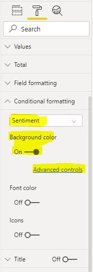
Then, head to the formatting pane of your table visualisation and expand Conditional Formatting.
Select the relevant field and enable 'Background color'.
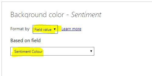
Click Advanced controls
Select format by 'Field value' and then select your newly created measure.
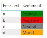
You'll then end up with something like this:
You can find more info here: docs.microsoft.com/en-us/power-bi/desktop-conditional-table-formatting
Hope it helps.
Best regards,
Martyn
- Mark as New
- Bookmark
- Subscribe
- Mute
- Subscribe to RSS Feed
- Permalink
- Report Inappropriate Content
@MartynRamsden , thank you so much for that - works perfectly (colours are a bit bolder than I'd like but I can work on that 🙂 )
Very Much appreciated
- Mark as New
- Bookmark
- Subscribe
- Mute
- Subscribe to RSS Feed
- Permalink
- Report Inappropriate Content
Hi @Daniel_B
No problem!
You can replace the names of the colours in the DAX expression with the hex code of any colour you prefer.
There's an example of this towards the bottom of the article I linked to.
Best regards,
Martyn
- Mark as New
- Bookmark
- Subscribe
- Mute
- Subscribe to RSS Feed
- Permalink
- Report Inappropriate Content
I think this can be accomplished with conditional formatting. Maybe make a calculated field that has a number (1,2,3,4) based on your slicer selection with an "IF" statement?
IF Sentiment = Neutral THEN 0 etc.
Then make a conditional format that colors the values red, orange, green, etc based on the calculated field.


