FabCon is coming to Atlanta
Join us at FabCon Atlanta from March 16 - 20, 2026, for the ultimate Fabric, Power BI, AI and SQL community-led event. Save $200 with code FABCOMM.
Register now!- Power BI forums
- Get Help with Power BI
- Desktop
- Service
- Report Server
- Power Query
- Mobile Apps
- Developer
- DAX Commands and Tips
- Custom Visuals Development Discussion
- Health and Life Sciences
- Power BI Spanish forums
- Translated Spanish Desktop
- Training and Consulting
- Instructor Led Training
- Dashboard in a Day for Women, by Women
- Galleries
- Data Stories Gallery
- Themes Gallery
- Contests Gallery
- QuickViz Gallery
- Quick Measures Gallery
- Visual Calculations Gallery
- Notebook Gallery
- Translytical Task Flow Gallery
- TMDL Gallery
- R Script Showcase
- Webinars and Video Gallery
- Ideas
- Custom Visuals Ideas (read-only)
- Issues
- Issues
- Events
- Upcoming Events
The Power BI Data Visualization World Championships is back! Get ahead of the game and start preparing now! Learn more
- Power BI forums
- Forums
- Get Help with Power BI
- Desktop
- Re: Change Scatter chart Legend Based on Dynamic S...
- Subscribe to RSS Feed
- Mark Topic as New
- Mark Topic as Read
- Float this Topic for Current User
- Bookmark
- Subscribe
- Printer Friendly Page
- Mark as New
- Bookmark
- Subscribe
- Mute
- Subscribe to RSS Feed
- Permalink
- Report Inappropriate Content
Change Scatter chart Legend Based on Dynamic Slicer
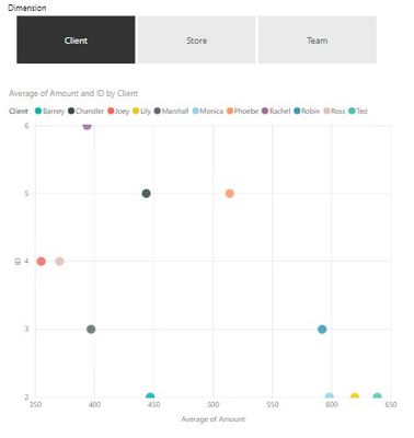
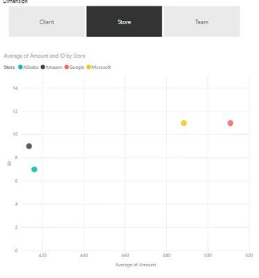
Hi! Is there a way to dynamically change the legend in the scatter chart? For example, if I select Client in the slicer, my scatter plot legend will be based on the client. Then the same for the other slicer options (see below)
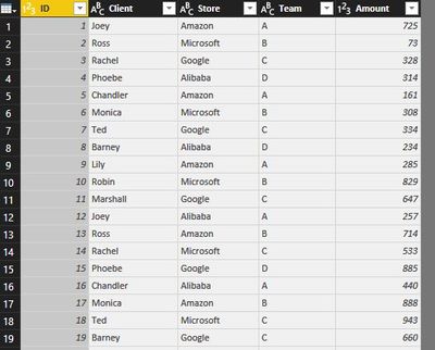
The raw data looks like this
Here's the pbix file Scatter plot legend.
Thanks! ![]()
Solved! Go to Solution.
- Mark as New
- Bookmark
- Subscribe
- Mute
- Subscribe to RSS Feed
- Permalink
- Report Inappropriate Content
Hi @Anonymous,
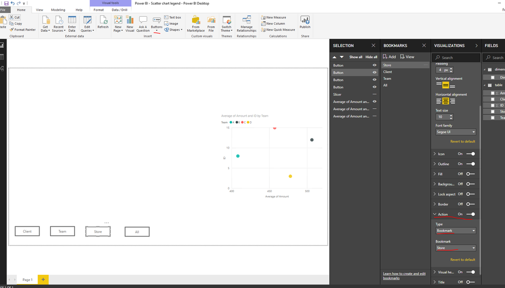
Actually, there is no way to meet the exact same requirement as you described. However we can use bookmark to work around. Here we can just Ctrl click the buttons to get different visuals.
- First , I creates 3 visuals based on different legends. After that, in the selection pane, choose what we need for a bookmark and create a new bookmark.
- Add a blank button and set the button as below to make the button related to the bookmark accordingly. Also we can reach other visuals by the bookmark.
For more details, please check the pbix as attached, also you can refer to the online document
https://www.dropbox.com/s/2o7bk4vqj6su606/Power%20BI%20-%20Scatter%20chart%20legend.pbix?dl=0
Regards,
Frank
If this post helps, then please consider Accept it as the solution to help the others find it more quickly.
- Mark as New
- Bookmark
- Subscribe
- Mute
- Subscribe to RSS Feed
- Permalink
- Report Inappropriate Content
Hi @Anonymous,
Does that make sense? If so , kindly mark the answer as a solution to close the case, thanks in advance.
Regards,
Frank
If this post helps, then please consider Accept it as the solution to help the others find it more quickly.
Helpful resources

Power BI Dataviz World Championships
The Power BI Data Visualization World Championships is back! Get ahead of the game and start preparing now!

| User | Count |
|---|---|
| 41 | |
| 38 | |
| 36 | |
| 30 | |
| 28 |
| User | Count |
|---|---|
| 128 | |
| 88 | |
| 79 | |
| 67 | |
| 62 |


