Join us at the 2025 Microsoft Fabric Community Conference
March 31 - April 2, 2025, in Las Vegas, Nevada. Use code MSCUST for a $150 discount! Early bird discount ends December 31.
Register Now- Power BI forums
- Get Help with Power BI
- Desktop
- Service
- Report Server
- Power Query
- Mobile Apps
- Developer
- DAX Commands and Tips
- Custom Visuals Development Discussion
- Health and Life Sciences
- Power BI Spanish forums
- Translated Spanish Desktop
- Training and Consulting
- Instructor Led Training
- Dashboard in a Day for Women, by Women
- Galleries
- Community Connections & How-To Videos
- COVID-19 Data Stories Gallery
- Themes Gallery
- Data Stories Gallery
- R Script Showcase
- Webinars and Video Gallery
- Quick Measures Gallery
- 2021 MSBizAppsSummit Gallery
- 2020 MSBizAppsSummit Gallery
- 2019 MSBizAppsSummit Gallery
- Events
- Ideas
- Custom Visuals Ideas
- Issues
- Issues
- Events
- Upcoming Events
Be one of the first to start using Fabric Databases. View on-demand sessions with database experts and the Microsoft product team to learn just how easy it is to get started. Watch now
- Power BI forums
- Forums
- Get Help with Power BI
- Desktop
- Re: Can you change the hovering colors of a horizo...
- Subscribe to RSS Feed
- Mark Topic as New
- Mark Topic as Read
- Float this Topic for Current User
- Bookmark
- Subscribe
- Printer Friendly Page
- Mark as New
- Bookmark
- Subscribe
- Mute
- Subscribe to RSS Feed
- Permalink
- Report Inappropriate Content
Can you change the hovering colors of a horizontal slicer?
Recently I noticed that the hovering of a horizontal slicer causes big confusion among the end users.
Case:
- horizontal slicer, due to branding reasons - dark background, font color - white
- when you hover over the items the hovered item becomes light grey, there is no difference in the hover color for selected and non-selected items, the font color is not changed
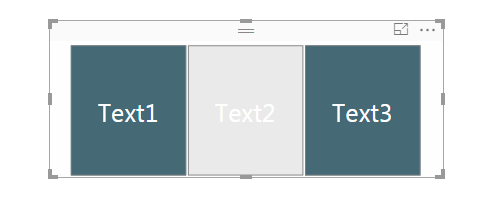
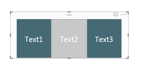
As a result - the user does not understand if the hovered item is selected or not and the item label is barely readable. In the example below - can one tell are data filtered based on "Test1" or not?
Is there a way one to control the colors used for hovering the slicer items?
- Mark as New
- Bookmark
- Subscribe
- Mute
- Subscribe to RSS Feed
- Permalink
- Report Inappropriate Content
This is an issue for us as well. it seems you can only style the way it looks when not selected/hovered over. Power BI sets the rest. Especially the hover with white txt on light grey background is very hard to read.
On top of that, when you use the iOS app to browse a report, this "hovered" state is the one you see when you select a button. Not the "selected" state. Therefore the text on these buttons is bearly readable in iOS.
Please make it possible to be able to set the style for both selected and hovered state in a slicer (just like you can do with buttons) and/or fix this iOS issue.
- Mark as New
- Bookmark
- Subscribe
- Mute
- Subscribe to RSS Feed
- Permalink
- Report Inappropriate Content
Up this topic, still we can't change the color of horizontal data segmentation hover painel effect?
- Mark as New
- Bookmark
- Subscribe
- Mute
- Subscribe to RSS Feed
- Permalink
- Report Inappropriate Content
Has there been an update to this since 2016? I would desperately like the change the colors of my horizontal slicers, but haven't found anything useful on the forum yet.
- Mark as New
- Bookmark
- Subscribe
- Mute
- Subscribe to RSS Feed
- Permalink
- Report Inappropriate Content
Hi @Tsanka,
I don't understand the problem.
If you look at my screenshot you'll see that:
- in the first screenshot "Text2" isn't selected
- in the second screenshot "Text2" is selected
With the mouse over them there are a different shades of grey that allow the users to understand that when the grey is darkest, the filter is selected.
Let me know if it works.
#I'M Not An Expert#
- Mark as New
- Bookmark
- Subscribe
- Mute
- Subscribe to RSS Feed
- Permalink
- Report Inappropriate Content
@Anonymous, if you delete your first image and take a look at the second, are you sure that "Text2" is selected or is just hovered? My answer to this question would be "I am not sure" and that actually is the problem - the users cannot easily understand what is selected (when the visual is set with white text font color and a dark color for the background).
I would be nice if one can easily understand if a filter is applied or not without the need to compare the different shades of grey.
I thought there might be some place where you can change the colors used for hovering. It seems there isn't such a functionality yet. So my workaround is to use black for text and white for background.
- Mark as New
- Bookmark
- Subscribe
- Mute
- Subscribe to RSS Feed
- Permalink
- Report Inappropriate Content
Ok, now I finally understand.
You're right, it will be a great functionality the ability to change the hovering colour.
Have you already submitted this like an idea?
#I'M Not An Expert#
- Mark as New
- Bookmark
- Subscribe
- Mute
- Subscribe to RSS Feed
- Permalink
- Report Inappropriate Content
No, I have not submitted it.
I was hoping there is something I have missed that could help. The discussion here might also ring the bell to someone not to use horizontal filters with dark background 🙂
- Mark as New
- Bookmark
- Subscribe
- Mute
- Subscribe to RSS Feed
- Permalink
- Report Inappropriate Content
Is this a chicklet slicer or something like that?
* Matt is an 8 times Microsoft MVP (Power BI) and author of the Power BI Book Supercharge Power BI.
I will not give you bad advice, even if you unknowingly ask for it.
- Mark as New
- Bookmark
- Subscribe
- Mute
- Subscribe to RSS Feed
- Permalink
- Report Inappropriate Content
It is a slicer, chosen from the standard visuals galery and set to be with horizontal orientation.
- Mark as New
- Bookmark
- Subscribe
- Mute
- Subscribe to RSS Feed
- Permalink
- Report Inappropriate Content
Hello,
Any update on this.
It would be nice if the Horizontal Tile Slicer did not react to Hover. It looks like it is unselected when you hover over it.
Michael
Helpful resources

Join us at the Microsoft Fabric Community Conference
March 31 - April 2, 2025, in Las Vegas, Nevada. Use code MSCUST for a $150 discount!

We want your feedback!
Your insights matter. That’s why we created a quick survey to learn about your experience finding answers to technical questions.

Microsoft Fabric Community Conference 2025
Arun Ulag shares exciting details about the Microsoft Fabric Conference 2025, which will be held in Las Vegas, NV.

| User | Count |
|---|---|
| 124 | |
| 89 | |
| 84 | |
| 70 | |
| 51 |
| User | Count |
|---|---|
| 206 | |
| 143 | |
| 97 | |
| 79 | |
| 68 |


