New Offer! Become a Certified Fabric Data Engineer
Check your eligibility for this 50% exam voucher offer and join us for free live learning sessions to get prepared for Exam DP-700.
Get Started- Power BI forums
- Get Help with Power BI
- Desktop
- Service
- Report Server
- Power Query
- Mobile Apps
- Developer
- DAX Commands and Tips
- Custom Visuals Development Discussion
- Health and Life Sciences
- Power BI Spanish forums
- Translated Spanish Desktop
- Training and Consulting
- Instructor Led Training
- Dashboard in a Day for Women, by Women
- Galleries
- Community Connections & How-To Videos
- COVID-19 Data Stories Gallery
- Themes Gallery
- Data Stories Gallery
- R Script Showcase
- Webinars and Video Gallery
- Quick Measures Gallery
- 2021 MSBizAppsSummit Gallery
- 2020 MSBizAppsSummit Gallery
- 2019 MSBizAppsSummit Gallery
- Events
- Ideas
- Custom Visuals Ideas
- Issues
- Issues
- Events
- Upcoming Events
Don't miss out! 2025 Microsoft Fabric Community Conference, March 31 - April 2, Las Vegas, Nevada. Use code MSCUST for a $150 discount. Prices go up February 11th. Register now.
- Power BI forums
- Forums
- Get Help with Power BI
- Desktop
- Re: Can not find "align zero" in Line Chart settin...
- Subscribe to RSS Feed
- Mark Topic as New
- Mark Topic as Read
- Float this Topic for Current User
- Bookmark
- Subscribe
- Printer Friendly Page
- Mark as New
- Bookmark
- Subscribe
- Mute
- Subscribe to RSS Feed
- Permalink
- Report Inappropriate Content
Can not find "align zero" in Line Chart settings
Hi everyone,
I am using Power BI RS September 2022 to develop reports.
There are two measures in a Line Chart and these two measures are set to percentage format.
But when choosing some items on the slicer, the Y axis of Line Chart will show two Y axis.
I remember there was a "align zero" option in the secondary Y axis, but I can not find it.
Finally, I choose Line and clustered cloumn chart to replace Line Chart and find the "align zero" option.
Is there any consideration that not put the "align zero" option in the Line Chart?
Solved! Go to Solution.
- Mark as New
- Bookmark
- Subscribe
- Mute
- Subscribe to RSS Feed
- Permalink
- Report Inappropriate Content
- Mark as New
- Bookmark
- Subscribe
- Mute
- Subscribe to RSS Feed
- Permalink
- Report Inappropriate Content
I am used to dual axis charts in Tableau with a native option to synchronize axes, which is necessary to display 2 different series together. I realized that in Power BI, multiple series can be placed on the same Y-axis in a line chart, eliminating the need to use the secondary y-axis for a synchronized axis effect. In Power BI, the secondary y-axis in a line chart seems purpose built to have a different range than the main axis.
- Mark as New
- Bookmark
- Subscribe
- Mute
- Subscribe to RSS Feed
- Permalink
- Report Inappropriate Content
Hi , @Vanchy_Liao
According to your description, you want to enable the "align zero" option in the line chart. According to my local test, this option does not seem to exist in the Line Chart, only in the second-y axis in the Line and clustered cloumn chart. .
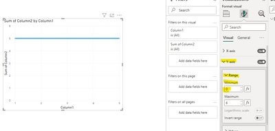
For this problem, you can try to set the minimum value in the Y axis of the Line Chart to achieve.
If the modification does not take effect after the modification is completed, you can try to delete the value of the Y axis and then reposition it.
Thank you for your time and sharing, and thank you for your support and understanding of PowerBI!
Best Regards,
Aniya Zhang
If this post helps, then please consider Accept it as the solution to help the other members find it more quickly
- Mark as New
- Bookmark
- Subscribe
- Mute
- Subscribe to RSS Feed
- Permalink
- Report Inappropriate Content
Hi @v-yueyunzh-msft ,
I tried this setting before, but I found another problem that if the two measure contains negative number, your solution would not working. It could not show the negative part on the visual.
My purpose is not to show two "zero axis" on the visual.
I think Mircrosft should add "align zero" to the line chart.
Thank you for your reply.
- Mark as New
- Bookmark
- Subscribe
- Mute
- Subscribe to RSS Feed
- Permalink
- Report Inappropriate Content
Hi , @Vanchy_Liao
Thanks for your quick response!
I tested it in my side , and there is indeed no corresponding configuration of "align zero" in the Line Chart. For your needs, you can try to use other visual objects as workarounds, and you can also publish your ideas to Power BI idea .
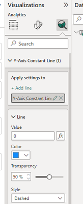
Secondly, if you want to display the 0 scale line, you can try to use Y-axis Constant Line to see if it can meet your needs:
Thank you for your time and sharing, and thank you for your support and understanding of PowerBI!
Best Regards,
Aniya Zhang
If this post helps, then please consider Accept it as the solution to help the other members find it more quickly
- Mark as New
- Bookmark
- Subscribe
- Mute
- Subscribe to RSS Feed
- Permalink
- Report Inappropriate Content
Helpful resources

Join us at the Microsoft Fabric Community Conference
March 31 - April 2, 2025, in Las Vegas, Nevada. Use code MSCUST for a $150 discount! Prices go up Feb. 11th.

Power BI Monthly Update - January 2025
Check out the January 2025 Power BI update to learn about new features in Reporting, Modeling, and Data Connectivity.

| User | Count |
|---|---|
| 147 | |
| 85 | |
| 66 | |
| 52 | |
| 46 |
| User | Count |
|---|---|
| 215 | |
| 90 | |
| 83 | |
| 66 | |
| 58 |


