A new Data Days event is coming soon!
This time we’re going bigger than ever. Fabric, Power BI, SQL, AI and more. We're covering it all. You won't want to miss it.
Learn more- Power BI forums
- Get Help with Power BI
- Desktop
- Service
- Report Server
- Power Query
- Mobile Apps
- Developer
- DAX Commands and Tips
- Custom Visuals Development Discussion
- Health and Life Sciences
- Power BI Spanish forums
- Translated Spanish Desktop
- Training and Consulting
- Instructor Led Training
- Dashboard in a Day for Women, by Women
- Galleries
- Data Stories Gallery
- Themes Gallery
- Contests Gallery
- QuickViz Gallery
- Quick Measures Gallery
- Visual Calculations Gallery
- Notebook Gallery
- Translytical Task Flow Gallery
- TMDL Gallery
- R Script Showcase
- Webinars and Video Gallery
- Ideas
- Custom Visuals Ideas (read-only)
- Issues
- Issues
- Events
- Upcoming Events
Level up your Power BI skills this month - build one visual each week and tell better stories with data! Get started
- Power BI forums
- Forums
- Get Help with Power BI
- Desktop
- Calendar Visual
- Subscribe to RSS Feed
- Mark Topic as New
- Mark Topic as Read
- Float this Topic for Current User
- Bookmark
- Subscribe
- Printer Friendly Page
- Mark as New
- Bookmark
- Subscribe
- Mute
- Subscribe to RSS Feed
- Permalink
- Report Inappropriate Content
Calendar Visual
Hi All,
I am trying to create a calendar visual that shows the total number of employees on site on any given day.
Dataset 1 - All employees who should be available on any given day.
| Employee Name | Trade |
| Jone Jones | Scaffolder |
| Andy Blue | Fitter |
Dataset 2 - Sickness
| Employee Name | Start Date | End Date |
| Jone Jones | 01/01/2021 | 10/01/2021 |
| Andy Blue | 01/05/2021 | 10/05/2021 |
Dataset 3 - Holiday
| Employee Name | Start Date | End Date |
| Jone Jones | 11/01/2021 | 12/01/2021 |
| Andy Blue | 11/05/2021 | 12/05/2021 |
The logic behind this visual will consist of the following
- All employees in dataset 1 should be on site at any given day.
- If employees have dates in datasets 2 & 3, these will need to be subtracted from the given days in the calendar visual
For example, the calendar visual for January 2021 will show that Andy Blue is available every day but Jone Jones is not available between dates. 01/01/2021 - 12/01/2021
Any ideas on how this can be achieved?7
Many thanks,
Solved! Go to Solution.
- Mark as New
- Bookmark
- Subscribe
- Mute
- Subscribe to RSS Feed
- Permalink
- Report Inappropriate Content
Hi @Anonymous ,
Here are the steps you can follow:
1. Create calculated column.
Column =
IF(TODAY()>=[Start Date]&&TODAY()<=[End Date],1,0)
2. Create measure.
vailable =
var _noavailable=SUM(Merge[Column])
return
COUNT(Dataset1[Employee Name])-_noavailable
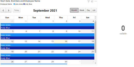
3. Use the card chart to place the measure in
4. Result:
Today is 2021.9.16. According to the conditions, neither of them is in working hours, so no one today
Best Regards,
Liu Yang
If this post helps, then please consider Accept it as the solution to help the other members find it more quickly
- Mark as New
- Bookmark
- Subscribe
- Mute
- Subscribe to RSS Feed
- Permalink
- Report Inappropriate Content
Hello,
We offer building custom visuals or enhancing existing visuals. Based on your asks and attached mock-up we will be able to build a custom visual for your needs.
If you have an urgent need for a custom feature or visual, please contact sales@MAQSoftware.com
- Mark as New
- Bookmark
- Subscribe
- Mute
- Subscribe to RSS Feed
- Permalink
- Report Inappropriate Content
Hi @Anonymous ,
Here are the steps you can follow:
1. Create calculated column.
Column =
IF(TODAY()>=[Start Date]&&TODAY()<=[End Date],1,0)
2. Create measure.
vailable =
var _noavailable=SUM(Merge[Column])
return
COUNT(Dataset1[Employee Name])-_noavailable
3. Use the card chart to place the measure in
4. Result:
Today is 2021.9.16. According to the conditions, neither of them is in working hours, so no one today
Best Regards,
Liu Yang
If this post helps, then please consider Accept it as the solution to help the other members find it more quickly
- Mark as New
- Bookmark
- Subscribe
- Mute
- Subscribe to RSS Feed
- Permalink
- Report Inappropriate Content
Hi @Anonymous ,
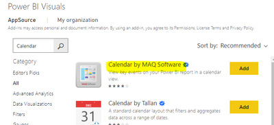
You can find Calendar by MAQ Software in Get more visual.
Here are the steps you can follow:
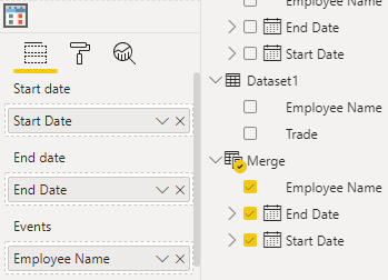
1. Create calculated table
Merge = UNION('Dataset 2 - Sickness','Dataset 3 - Holiday')2. Open Calendar by MAQ Software. Visual object, and place the columns of the Merge table below.
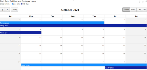
3. Result:
When Employee is available on a certain day, the color is not displayed. When Employee is not available on a certain day, it is displayed in the specified color.
This is the relevant information of Calendar by MAQ Software:
https://appsource.microsoft.com/en-us/product/power-bi-visuals/WA104381844
https://www.c-sharpcorner.com/article/create-event-calendar-in-power-bi/
Best Regards,
Liu Yang
If this post helps, then please consider Accept it as the solution to help the other members find it more quickly
- Mark as New
- Bookmark
- Subscribe
- Mute
- Subscribe to RSS Feed
- Permalink
- Report Inappropriate Content
Hi,
This is great. Is it possible to lay the visual out as follows?
Each day tell me the total amount of employees available (count of dataset 1 - employees with sickness and holiday days)
Many thanks,
E
- Mark as New
- Bookmark
- Subscribe
- Mute
- Subscribe to RSS Feed
- Permalink
- Report Inappropriate Content
what were you expecting to see? there are plenty of calendar type custom visualisations https://appsource.microsoft.com/en-us/marketplace/apps?product=power-bi-visuals&search=calendar&page...
which may or may not work for you. It just depends on what your expectation is. You need to give a clearer idea of what how you are wanting to display this information.
If I took the time to answer your question and I came up with a solution, please mark my post as a solution and /or give kudos freely for the effort 🙂 Thank you!
Proud to be a Super User!
- Mark as New
- Bookmark
- Subscribe
- Mute
- Subscribe to RSS Feed
- Permalink
- Report Inappropriate Content
Hi,
Thanks for your response. I have tried numerous of these calendar visuals but couldn't achieve the desired look.
Please find an example report visual attached.
Hope this helps.https://www.dropbox.com/scl/fi/xh5axxgbpy65rlnfr3x3c/Labour-Availability-Example.docx?dl=0&rlkey=n9e...
- Mark as New
- Bookmark
- Subscribe
- Mute
- Subscribe to RSS Feed
- Permalink
- Report Inappropriate Content
unfortunately if you can't find the correct visual in the custom options then it doesn't exist. You either need to develop your own visual which for most people isn't really realistic or think about adjusting your requirements in how you demonstrate this. There is however this which is charticulator which might be of use to you, i haven't used it but it looks like it might have potential.
https://www.burningsuit.co.uk/blog/2021/06/charticulator-in-power-bi-1/
https://www.youtube.com/watch?v=ORKTLUAFXnI
If I took the time to answer your question and I came up with a solution, please mark my post as a solution and /or give kudos freely for the effort 🙂 Thank you!
Proud to be a Super User!
Helpful resources

Power BI Monthly Update - April 2026
Check out the April 2026 Power BI update to learn about new features.

Data Days 2026 coming soon!
Sign up to receive a private message when registration opens and key events begin.

New to Fabric Survey
If you have recently started exploring Fabric, we'd love to hear how it's going. Your feedback can help with product improvements.

| User | Count |
|---|---|
| 37 | |
| 28 | |
| 28 | |
| 20 | |
| 18 |
| User | Count |
|---|---|
| 66 | |
| 36 | |
| 29 | |
| 25 | |
| 23 |


