New Offer! Become a Certified Fabric Data Engineer
Check your eligibility for this 50% exam voucher offer and join us for free live learning sessions to get prepared for Exam DP-700.
Get Started- Power BI forums
- Get Help with Power BI
- Desktop
- Service
- Report Server
- Power Query
- Mobile Apps
- Developer
- DAX Commands and Tips
- Custom Visuals Development Discussion
- Health and Life Sciences
- Power BI Spanish forums
- Translated Spanish Desktop
- Training and Consulting
- Instructor Led Training
- Dashboard in a Day for Women, by Women
- Galleries
- Community Connections & How-To Videos
- COVID-19 Data Stories Gallery
- Themes Gallery
- Data Stories Gallery
- R Script Showcase
- Webinars and Video Gallery
- Quick Measures Gallery
- 2021 MSBizAppsSummit Gallery
- 2020 MSBizAppsSummit Gallery
- 2019 MSBizAppsSummit Gallery
- Events
- Ideas
- Custom Visuals Ideas
- Issues
- Issues
- Events
- Upcoming Events
Don't miss out! 2025 Microsoft Fabric Community Conference, March 31 - April 2, Las Vegas, Nevada. Use code MSCUST for a $150 discount. Prices go up February 11th. Register now.
- Power BI forums
- Forums
- Get Help with Power BI
- Desktop
- Calculation of percentage and a piechart diagram
- Subscribe to RSS Feed
- Mark Topic as New
- Mark Topic as Read
- Float this Topic for Current User
- Bookmark
- Subscribe
- Printer Friendly Page
- Mark as New
- Bookmark
- Subscribe
- Mute
- Subscribe to RSS Feed
- Permalink
- Report Inappropriate Content
Calculation of percentage and a piechart diagram
Dear all, happy new 2024 year!!
I'm currently struggling with the last calculation for my statistics research..
I’ve got a dataset with the European survey results (58.347 respondents, each with a separate ID number = column IDno in the spreadsheet).
The respondents are aged 15 to 90; they've answered the questions about xenophobia (question codes impcntr, imsmetn and imdfetn = the columns names) and these people who have chosen 4 as an answer in these columns can be considered xenophobic.
My goal is to make a piechart or a diagram with many pillars (one pillar per age) to show the percentage of xenophobes per age (for instance there are 129 respondents aged 88 and 11 out of them are xenophobic, so that's 8,5% percent.. and there are 184 respondents aged 15 and 6 out of them are xenophobic and that's 3,2 percent).
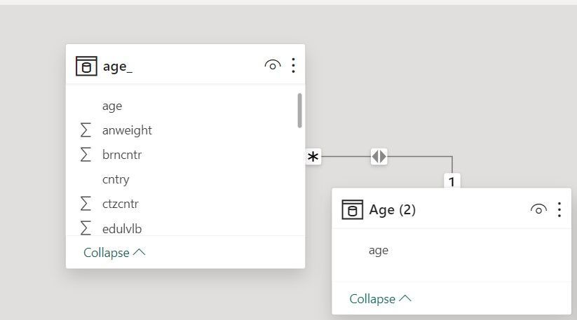
I've created a dimension table Age (2), where I've put all ages of the respondents one by one:
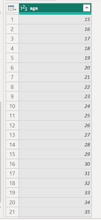
Then I've linked the code column to the code column of the main table ('age') one to many.
Here are my measures..
All xenophobes =CALCULATE(COUNTROWS('age_'), 'age_'[imsmetn]=4 && 'age_'[imdfetn]=4 && 'age_'[impcntr]=4)
Percentage of xenophobes in EU_ = divide([Xenophobes_], DISTINCTCOUNT('age_'[idno]))
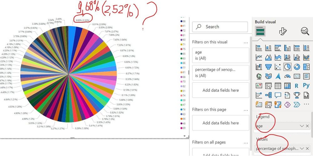
But something doesn't add up... here's my piechart, where i see the percentage numbers 2 times by every "slice" of a pie!
why?.. i can't understand this.. can anyone help me to solve this riddle...?
thank you in advance for your advise/support !!!!!
Solved! Go to Solution.
- Mark as New
- Bookmark
- Subscribe
- Mute
- Subscribe to RSS Feed
- Permalink
- Report Inappropriate Content
Hi @Katja262373 ,
Please try to use the following measures.
Xenophobes by Age Group = CALCULATE(COUNTROWS('age_'), 'age_'[imsmetn]=4 && 'age_'[imdfetn]=4 && 'age_'[impcntr]=4, ALLEXCEPT('age_', 'age_'[Age]))Total Respondents by Age Group = DISTINCTCOUNT('age_'[idno])Percentage of Xenophobes by Age Group = DIVIDE([Xenophobes by Age Group], [Total Respondents by Age Group])Why my measure returns the wrong total? How to fix that? (vahiddm.com)
How to Get Your Question Answered Quickly
If it does not help, please provide more details with your desired output and pbix file without privacy information (or some sample data) .
Best Regards
Community Support Team _ Rongtie
If this post helps, then please consider Accept it as the solution to help the other members find it more quickly.
- Mark as New
- Bookmark
- Subscribe
- Mute
- Subscribe to RSS Feed
- Permalink
- Report Inappropriate Content
Dear Rongtie,
you are amazing! Thank you very much for your advice- it works now!
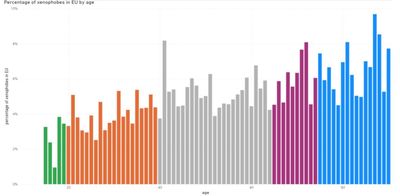
indeed, I overlooked the situation with filters and have filtered the AGE column as well, which has caused the erroneous calculation. Hereby my adjusted graph (I've chosen a pillar diagram instead of a pie chart).
thank you for the link as well! !!
- Mark as New
- Bookmark
- Subscribe
- Mute
- Subscribe to RSS Feed
- Permalink
- Report Inappropriate Content
For visualizing something like, I'd suggest a horizontal bar chart instead of a pie so it's easier to view the anomalies across the ages.
Depending on what you have selected under the "Data Labels", it looks like the percent inside the paranthesis is the percent of the total. I think you're wanting to select just "Data value" instead?
- Mark as New
- Bookmark
- Subscribe
- Mute
- Subscribe to RSS Feed
- Permalink
- Report Inappropriate Content
Hello Rainandsnow,
thank you very much for your advice! I've chosen the pillar diagram eventually. It looks good now!
Helpful resources
| User | Count |
|---|---|
| 115 | |
| 73 | |
| 60 | |
| 48 | |
| 47 |
| User | Count |
|---|---|
| 173 | |
| 123 | |
| 60 | |
| 59 | |
| 57 |
